More Than A Menu:
Inside The Walking Dead Final Season’s Inventive User Interface
Article was originally written for the
Telltale Blog
Year: 2018
Role: Author
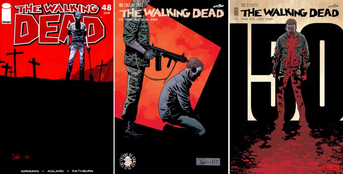
When starting on The Walking Dead: The Final Season, the user interface team — which includes myself (Adrienne Pugh), Crystal Langley, Katie Zammit and Chris Fodge — took cues from the game’s environment and art style to define what the user experience and interface should look like. Originally we were inspired to bring back the comic look, so we plastered our office with every single comic book cover of The Walking Dead.
Issues 48, 169, and 150 in particular provided some of the starting points for the look and feel. It’s graphic, it’s bold, and it’s a bit like the constructivism movement with the shapes and use of colors. This was our diving board into how the game UX and UI could feel.
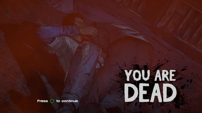
Early on, a lot of gameplay and systems were still being designed, so a relatively safe aspect for our team to work on was the death screen. Everyone’s gotta have one, especially The Walking Dead. For comparison, here’s what the death screen looked like in The Walking Dead: A New Frontier:
So, how do you take the old “blood overlay” death screen and make it look more like a graphic comic book cover? To start, we looked at the new graphic technologies our art and environment teams were using to make The Walking Dead look like a comic book to see if we could utilize the same tech. The two most exciting new tech features were “Graphic Black” — which sounds like a cool metal band — and the “Gradient Property.”
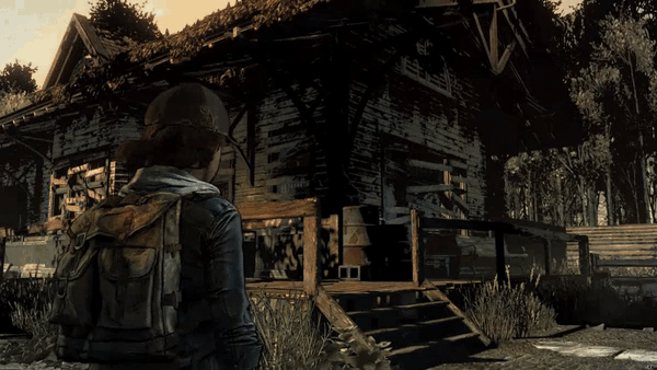
Graphic Black allows for objects in the environment to appear more black and graphic the further away you are. Then as you move closer, the environment reveals more details. Here’s an example:


Here’s English and Italian side by side. Once we got a feeling for how the death screen looked, that became the benchmark for the art treatment of all the UI and menus moving forward. Kind of unexpected it was a death screen, but that’s what got all of us excited about this new style.
The end-of-episode stat screens were the next feature to get a redesign in this style. We wanted to reimagine the stats as individual comic book covers rather than screenshots overlaid with bar graphs. Here’s what The Walking Dead: A New Frontier stat screens looked like:

The team enjoyed this style so much that gradients, black graphic framing, and characters in black and white became the primary style guide. We even applied this style to the Story Builder to maintain a cohesive aesthetic. This treatment allowed the Story Builder to feel like an interactive comic but also to look like our in-game death and stats screens.

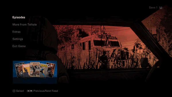
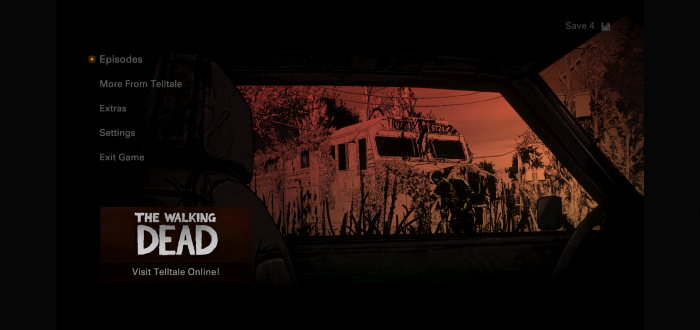
This art style then inspired our approach to creating a unique menu for The Final Season. The goal of the menu is to lead you into each environment by first looking through a window of some kind and then displaying more of that environment while expanding into the episode’s menu. For example, in the main menu, you’re looking through the car window at the train station and then it reveals more of the train station in the episodes menu.
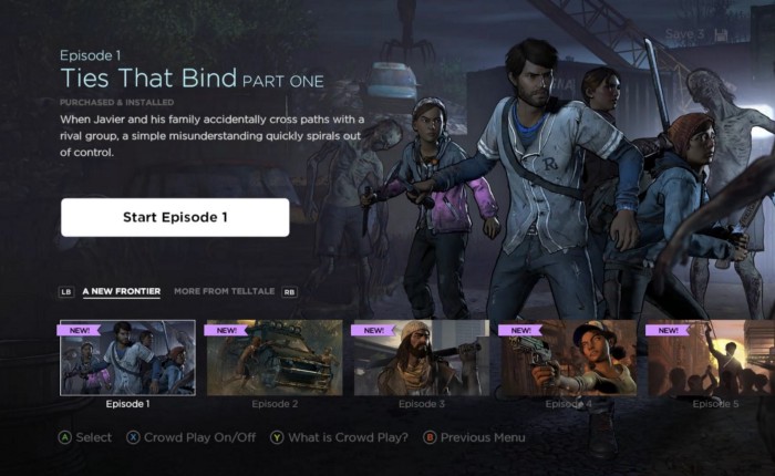
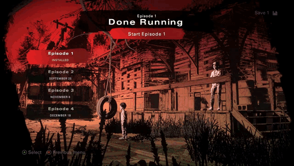
Previous episode menus (like one shown above) used flats and thumbnails to showcase the individual episodes, but in The Final Season, we wanted to make these menus more dynamic with 3D models and environments that felt alive. In addition, episodes are themed to a different color that actually matches the colors used in the online Story Builder, allowing us to maintain consistency throughout the UX/UI.
The episodes menu went through some major user experience changes. Instead of showing information for only one episode at a time, we show all the episode information on each screen. All the information you need is always on screen with the proper visual hierarchy.
For most of Telltale’s UI and UX, the menu is the last idea to get finalized because, like a book title, it’s the summary of the entire user interface experience. The menu is the culmination of the entire art and design process that puts the final exclamation mark on the UX/UI of Walking Dead. That’s when you can name it, put down the pen, and let it out into the world.