LATEST PROJECT
︎Dead By Daylight
Various Games or Projects
Portfolio
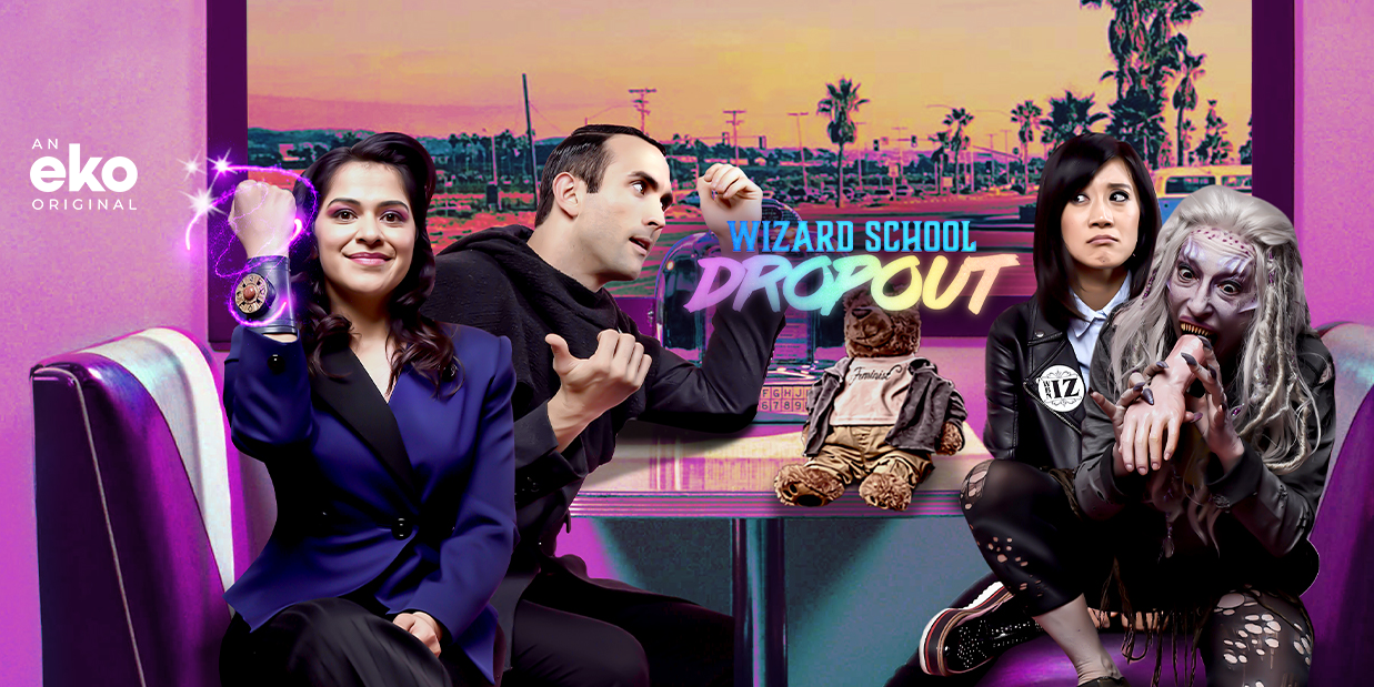
Wizard School Dropout
Episodes: 1-12
Year: 2019
Role: UX Director
Tech: Eko Studio, Javascript Platforms: Eko
Wizard School Dropout is an interactive 12 episode TV series made for Eko by Effin Funny Productions.
I directed and oversaw the interactivity/gameplay for the show in the context of the creative, that meant making sure the player feats of magic actions happen seamlessly with the video footage resulting in gameplay that feels both rewarding and magical. This meant working between the show’s director, Sandeep Parikh, to make sure his video footage synced up with the devs and designers, Blue Cadet, who were creating the interactivity.
Additionally after the show launched I listened to and analyzed user feedback and data to make minor tweaks. For instance, some magic spells were too challenging to perform based on user feedback and success rate data, I analyzed that data and tweaked the spells to make them easier and more engaging for users.
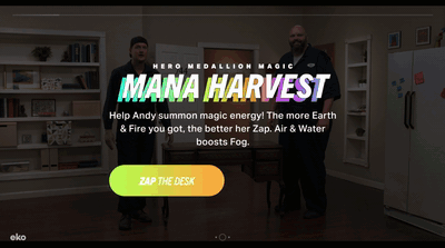
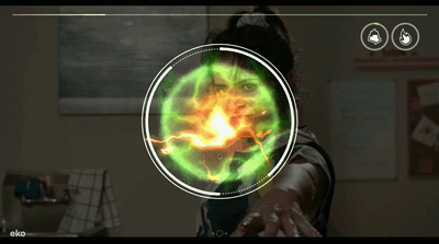
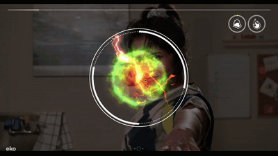
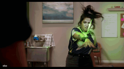
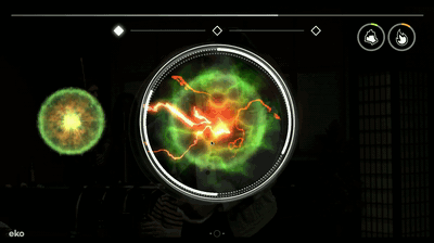
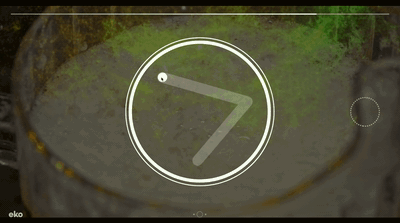
Magic Spells
There are two types of main magic in Wizard School Dropout, Zap and Fog. Each uses a different behavior mechanic to simulate the different style of magic. Zap magic requires tapping and Fog requires swirling. Each magic the user can succeed or fail the magic sequence and see a different result:
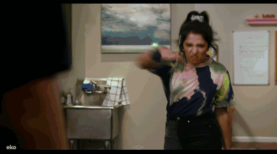
Zap Magic Success
![]()
![]()
![]()
Zap Magic Failure
![]()
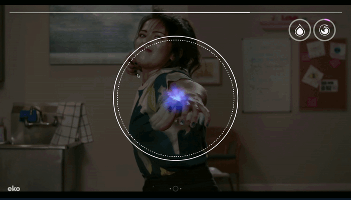
Fog Swirling Behavior
![]()
![]()
![]()
![]()
There are other magic gameplay mechanics that are sprinkled throughout the series. Rune tracing appears often, a Whack-a-Mole mechanic that plays over a video montage, a swipe the mist away story beat, and a detective clue spotlight inspection.
![]()
Rune Tracing Mechanic
User Testing
It was important to make sure the user felt that there were consequences to the magic in the world. After user testing we were validated that the audience enjoyed the magic moments and felt that it had an impact over the results. What they were confused about after user testing was how the magical stats of earth, air, water, and fire accumulated in the show.
![]()
Zap Magic Failure
Fog Swirling Behavior
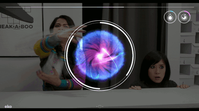
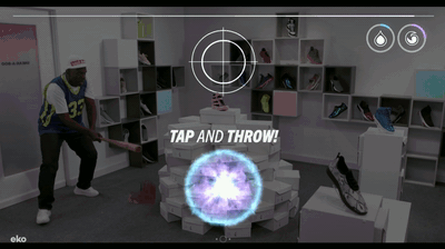
The magical gameplay mechanics get harder throughout the series, so instead of just completing one mana circle later in the show there are moments to harvest multiple mana circles, such as the Zap multi-mana harvest. Or take that mana ball and toss it to a target, like the Fog mana harvest and Throw:
There are other magic gameplay mechanics that are sprinkled throughout the series. Rune tracing appears often, a Whack-a-Mole mechanic that plays over a video montage, a swipe the mist away story beat, and a detective clue spotlight inspection.
Rune Tracing Mechanic
User Testing
It was important to make sure the user felt that there were consequences to the magic in the world. After user testing we were validated that the audience enjoyed the magic moments and felt that it had an impact over the results. What they were confused about after user testing was how the magical stats of earth, air, water, and fire accumulated in the show.

After the User Testing we made these “midtros” with animation and narration that were in the middle of the episode breaks to help explain the magical stats. Depending what dialogue choice the user selected, they correlate to magic stats and their personality types. We placed one midtro in episode one after the first choice/result videos. And one in episode 2 after the first relationship choice/result video to help reinforce your choices are altering the stats and relationships.
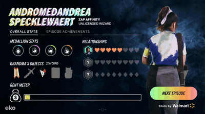
Achievements & Stat Screen
Achievements and Stats were a big part of the creative concept and I steered the stats to be an interactive end screen where a viewer could see their progress and what Grandma objects or Achievements they picked up in the episode. It was also a great way to show user progress on Rent, Magical Abilities, and Relationships:
![]()
![]()
Rather than have these achievements halt the story in the middle of an episode, we had the stat screen become the center of lore and details of the world.
Rather than have these achievements halt the story in the middle of an episode, we had the stat screen become the center of lore and details of the world.
Post Launch Iterations & Optimizations
An interactive show doesn’t need to end when the show launches. Eko is similar to a video game where we can continue to tweak the show to make a better experience for the users. We made sure that we had data dashboards ready after launch to start collecting information so we could optimize and find any pain points from users.
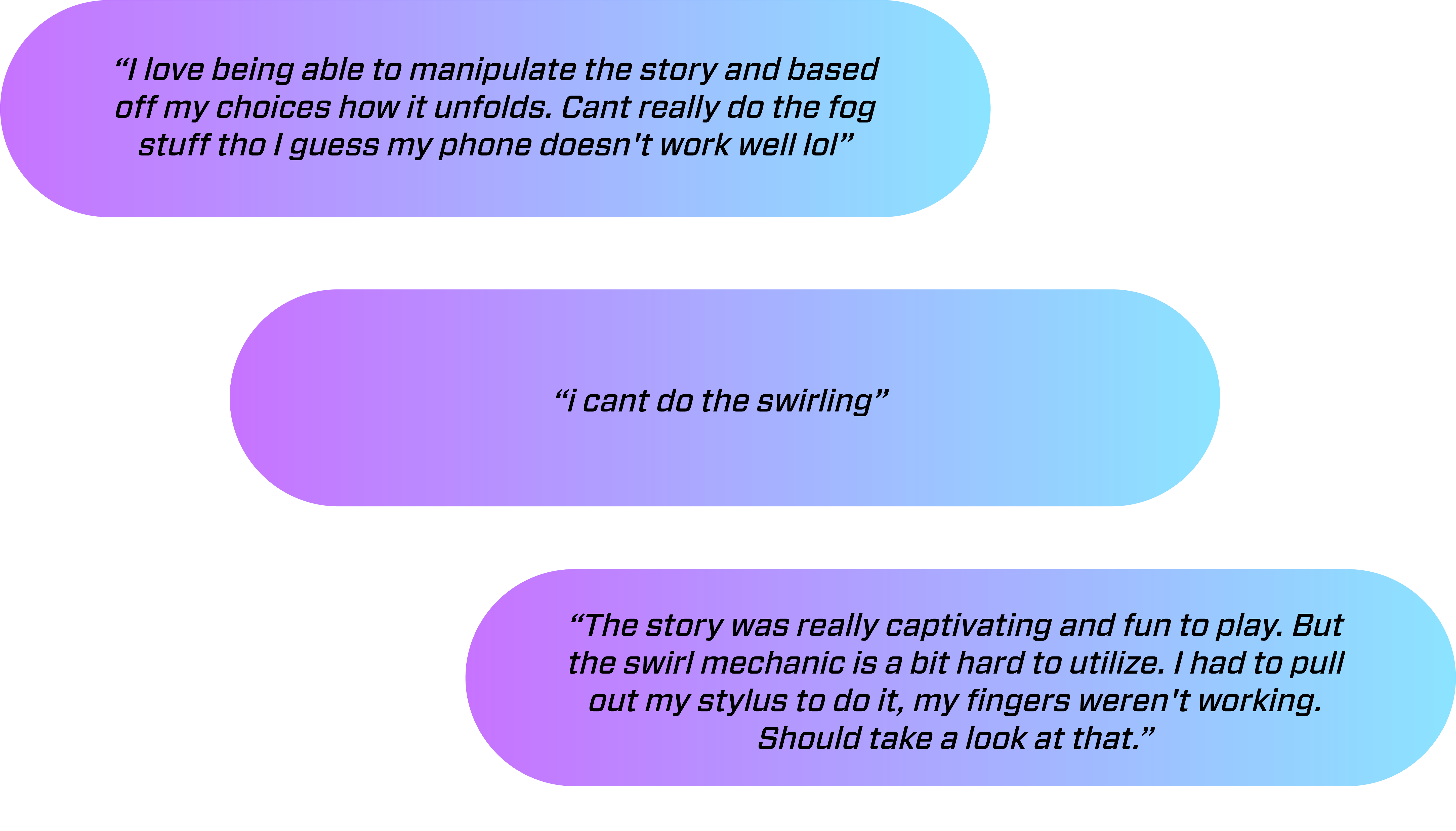
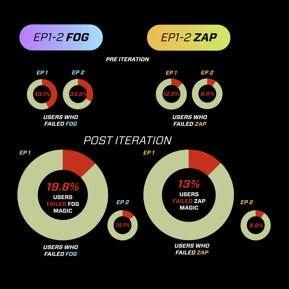
In the data and in our user feedback on social media and inside the show feedback submissions users were drawing attention to the Fog magic mechanic was too difficult.
If I look at the numbers in episode 1 where the Fog and Zap magic is easiest we see a very clear disparity between Fog and Zap.
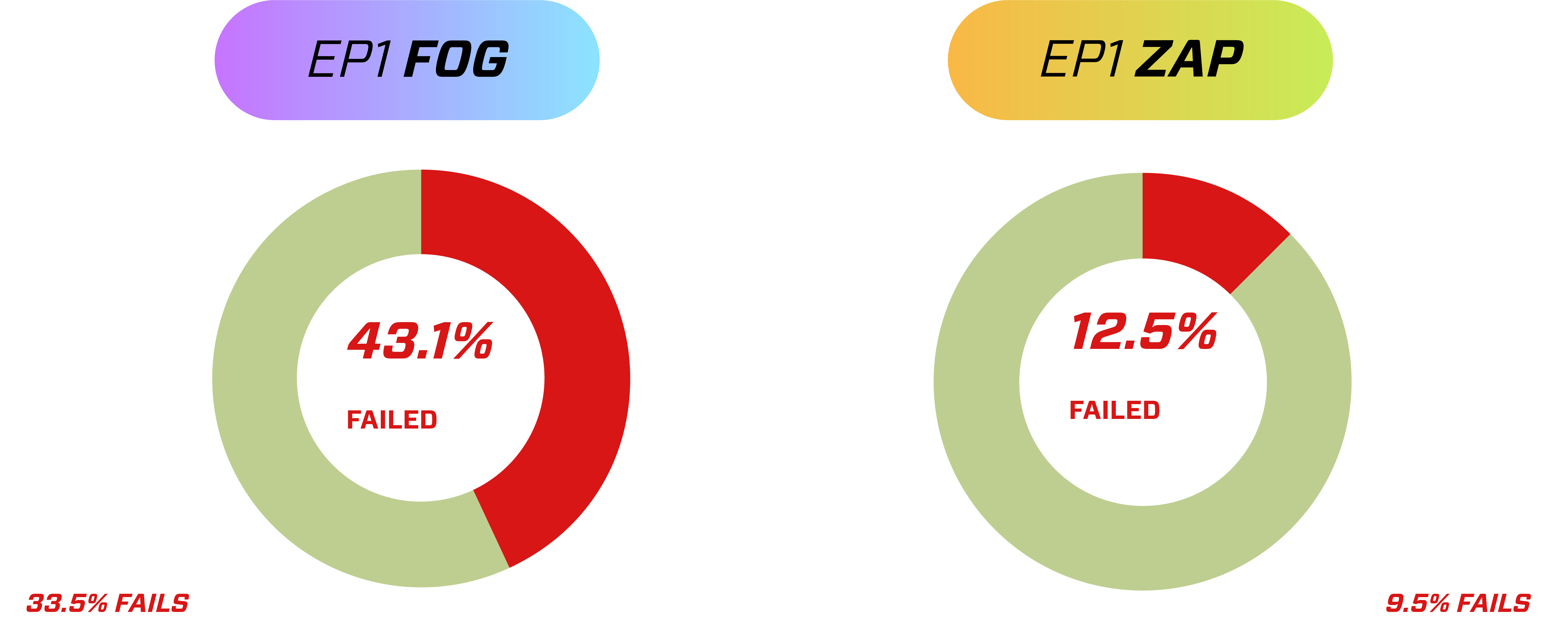
It was encouraging to see that users were improving with Fog and Zap by episode 2 but the numbers were still had a very large disparity between them and were worrisome. So I broke it down further and wanted to make sure that the magic failures were not causing a significant drop off of users who stopped watching the show. And while user feedback and data proved that Fog was clearly more difficult it was not causing any significant drop off:
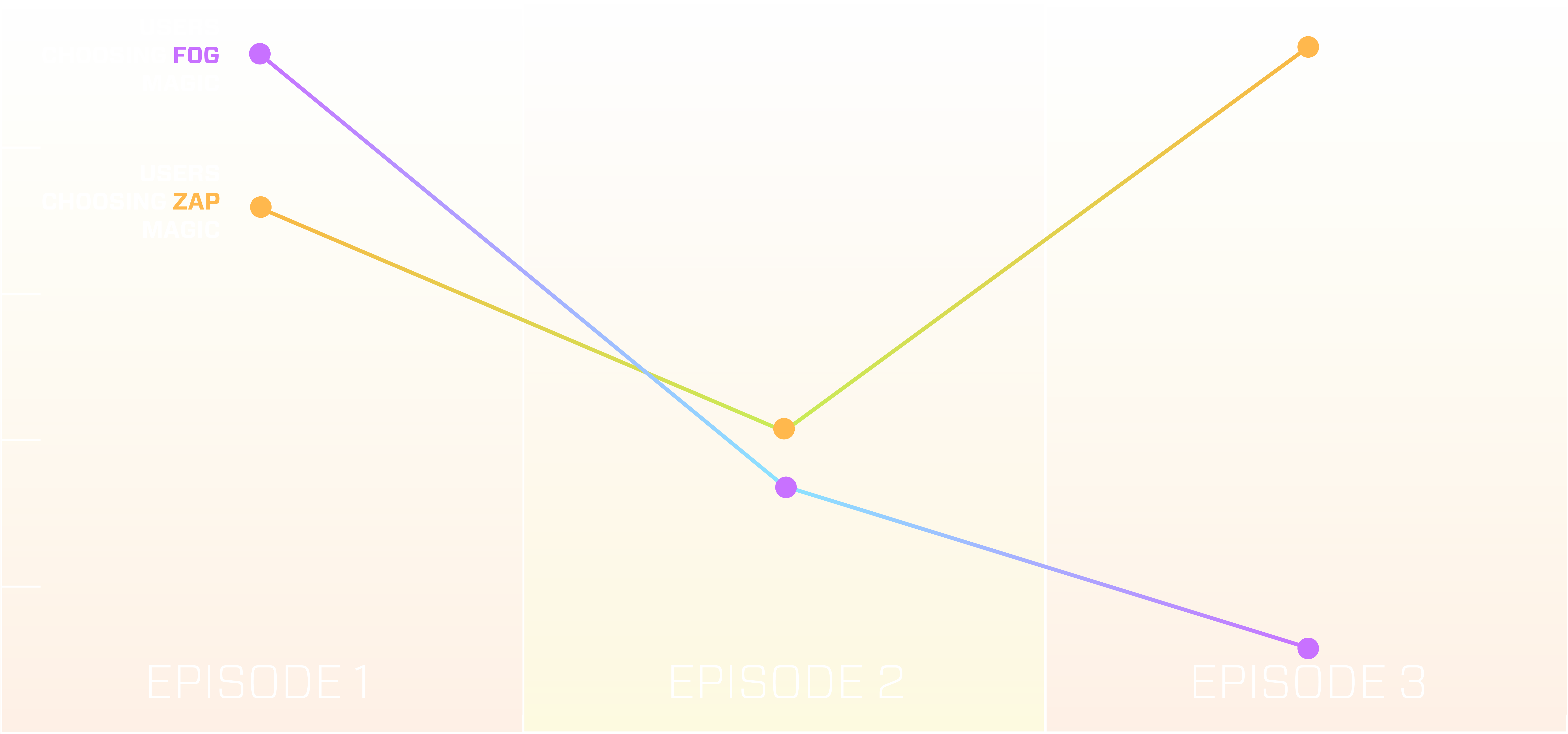
Then I looked at which magic style users chose to deploy across the first three episodes and noticed a very clear trend, Fog is clearly unfavored. Users chose Fog more than Zap magic in episode 1, it’s neck and neck in episode 2, but by episode 3 users have all favored Zap magic over Fog... most likely because it’s easier to succeed.
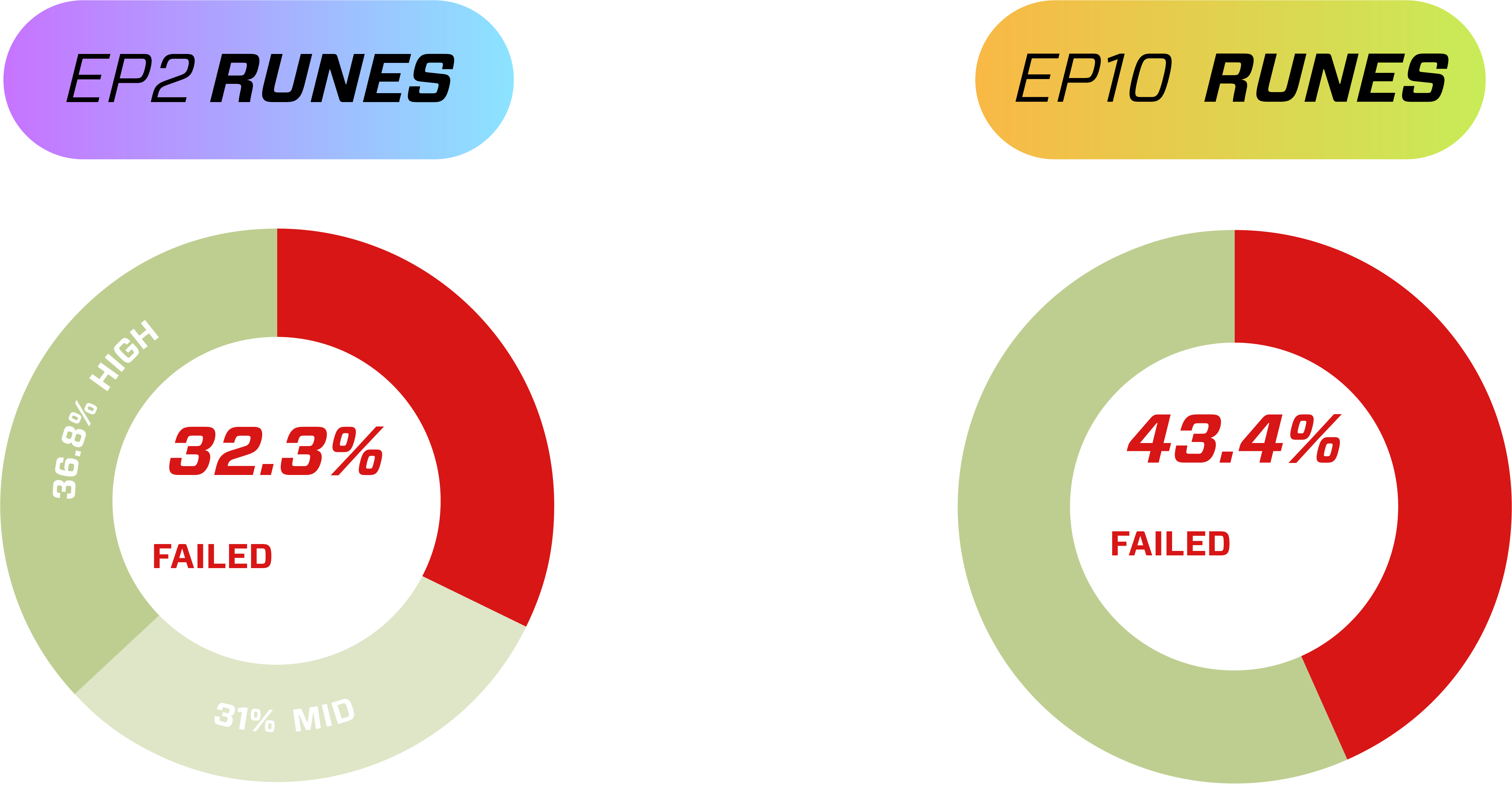
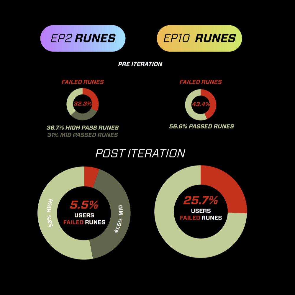
It wasn’t just Fog magic, the Rune tracing was also getting the better of the users with it’s ramping difficulty. What made Runes harder to adjust for was lack of frequency in episodes unlike Fog or Zap. A user doesn’t have a lot of time to get better at the mechanic before it gets significantly harder because it’s not as prevalent in the series. I took a look at episode 2 where Runes are introduced as a mechanic we have a pretty even split of high, medium, and low success rates. But by episode 10 which is before the finale wizard fights were Runes are at their hardest, the failure rates are higher than in episode 2.
These trends were clear evidence we should scale back the difficulty of Fog magic and make Runes easier for users. While it was not causing any clear drop off in the episodes themselves, I have a goal to balance the difficulty closer to Zap and see if we can make Fog more equal in both difficulty and use rates.
We chose to make Fog 50% Easier and Runes 75% easier and these were the results

Timeline
Episodes: 1-8
Year: 2019
Role: UX Director
Tech: Eko Studio, Javascript Platforms: Eko
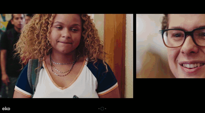
Timeline is an interactive 8 episode TV series made for Eko by Olivebridge. It’s a story about a high school girl named Dee, and through a gross accident can see the future up to 24hrs on her phone’s fomo feed. The decisions you make will affect how the future timelines play out. It was a unique show for me to work on as the interactivity and footage was done and generally locked before I started at Eko. I took it as an opportunity to apply User Testing and help validate hunches and improve the show before launch to make sure it was a successful user experience.
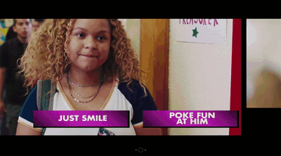
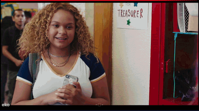
We ran a User focus group in LA and identified some issues with the show’s choice mechanic. Dee (The main character) Feels/Act double choices were confusing to the viewers in the focus group. The emojis also were difficult for viewers to understand the context of what a certain emoji means in a particular choice. For instance Dee is talking to her crush and a heart vs smily face emoji isn’t quite clear to the viewer what they are selecting. So after the user focus group a co-worker and I re-edited the first episode to flow different, showcase different UX choice mechanics, and re-enforce conciquences to choices. Then we ran an A/B test of the original edit of episode 1 to our new test edit version to see various user performance and feedback.
Original Choice UX (A)
Test Choice UX (B)
The results of the A/B test were really interesting. We thought that having text choices instead of emojis would mean a higher engagement rate, both were pretty compariable. Instead the change of the flow of the intro kept viewers engaged after the initial dropoff. Viewers connected to the story quicker and didn’t go through a long onboarding tutorial, they were thrown into the action and therefore stuck around longer.

Earlier appearance of first interaction =
slightly higher engagement rate
Lower drop-offs and higher audience retention = much higher completion rate
Replay click-through quadrupled = Viewers felt choices were more impactful
Replay click-through quadrupled = Viewers felt choices were more impactful
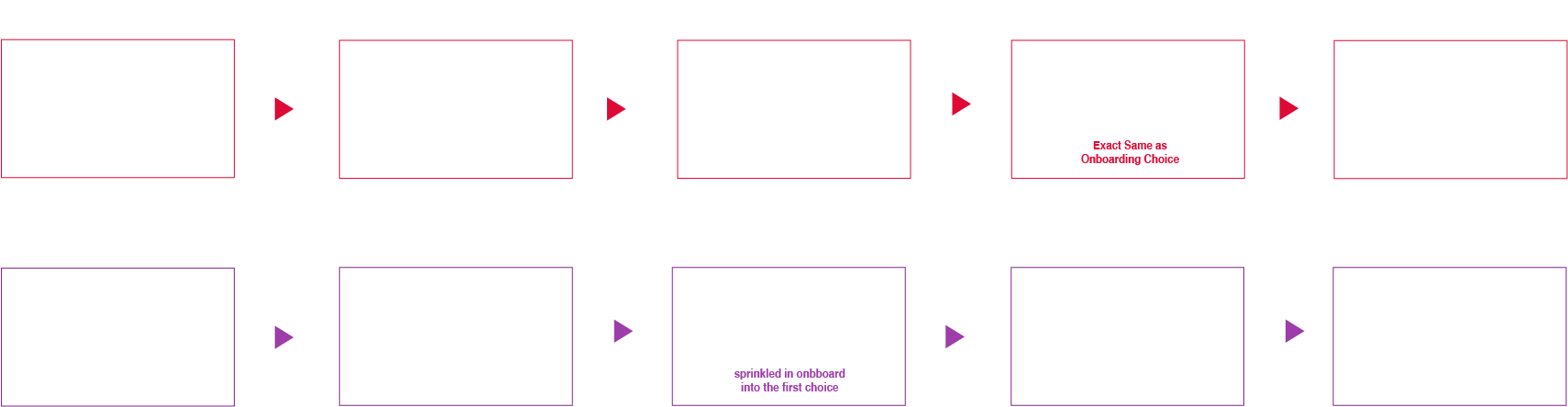
Taking these results into account and what we could execute with a deadline quickly approaching we decided to edit the intro to make the flow quicker into an interaction. That meant we cut the mall scene significantly shorter and added a “start” button so the viewer would tap and engage, taking a cue from the Original Edit (A)’s better engagement rate. Then we put the Dee Act/Feel onboarding inside the first choice moment that was successful from our Test Version (B) results.

Start Screen & final Choice UX
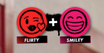
Lastly we wanted to smooth out the Feel/Act moments. We decided on episode one whe would put one word text prompts to help identify what kind of choice you were making, as well as made the emojis syncronize with the text. Then we added a “+” on the little notification up top to help the user understand it’s a combination of Flirty and Smiley that gets the response from Dee. With all of those little tweaks we were able to get the best of both A/B versions of the show into the final version.
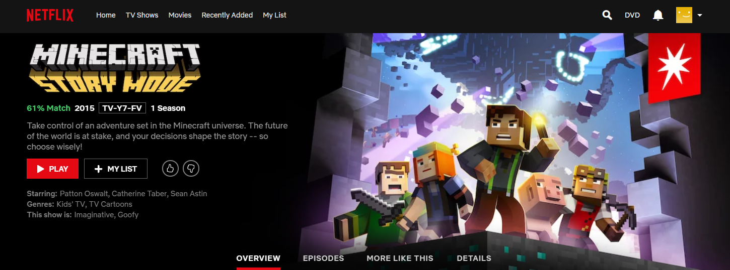
Minecraft Story Mode: Netflix
Episodes: 1-5
Year: 2018
Role: UI/UX Designer
Tech: Maya, Photoshop, Illustrator, Netflix
Platforms: Netflix
Role: UI/UX Designer
Tech: Maya, Photoshop, Illustrator, Netflix
Platforms: Netflix
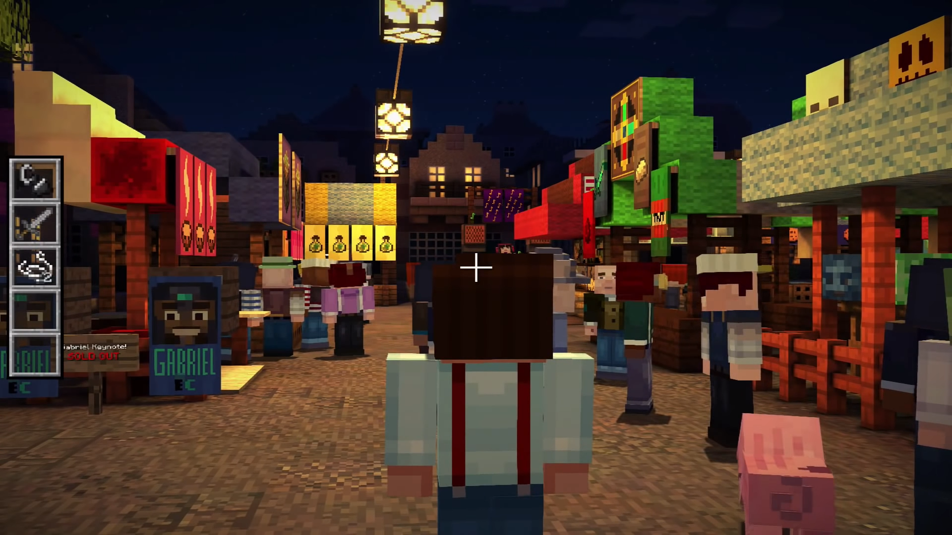
Adapating Minecraft Storymode for Netflix
Minecraft: Story Mode is an interactive 5 episode TV series made for Netflix by Telltale, adapted from the original game for Netflix platform. The new platform reshaped the original game into something enteirly new -- an interactive medium.
My role on the project was to design and ideated a new UI look/feel and new UX for the show to work with Netflix’s platform. In doing so I created over +700 pixel perfect assets and changed the gameplay to something more condusive for a TV streaming service platform. The diverse viewer controls included gamepads, TV remotes, touch devices, and standard mouse/keyboard.
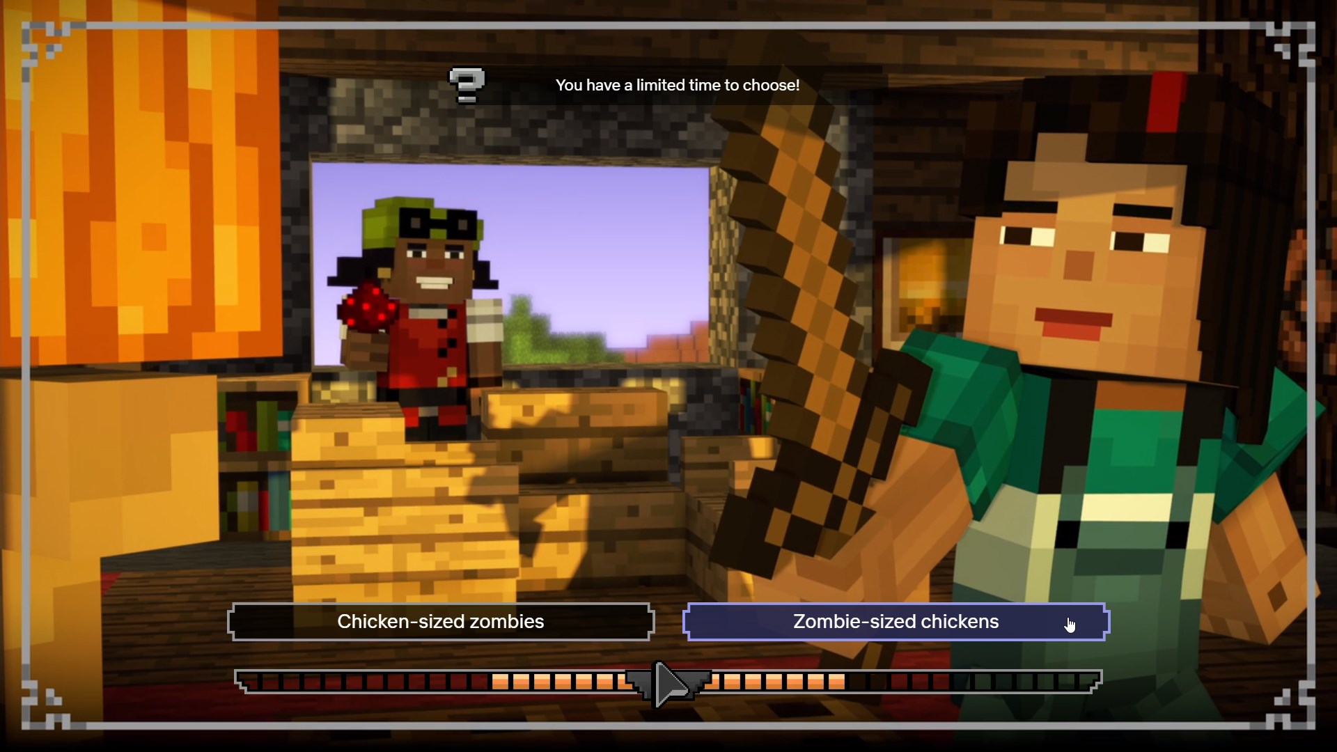
New Dialogue Buttons, select states, timer, platform indicator, tutorial notification, choice indicator (frame around video)
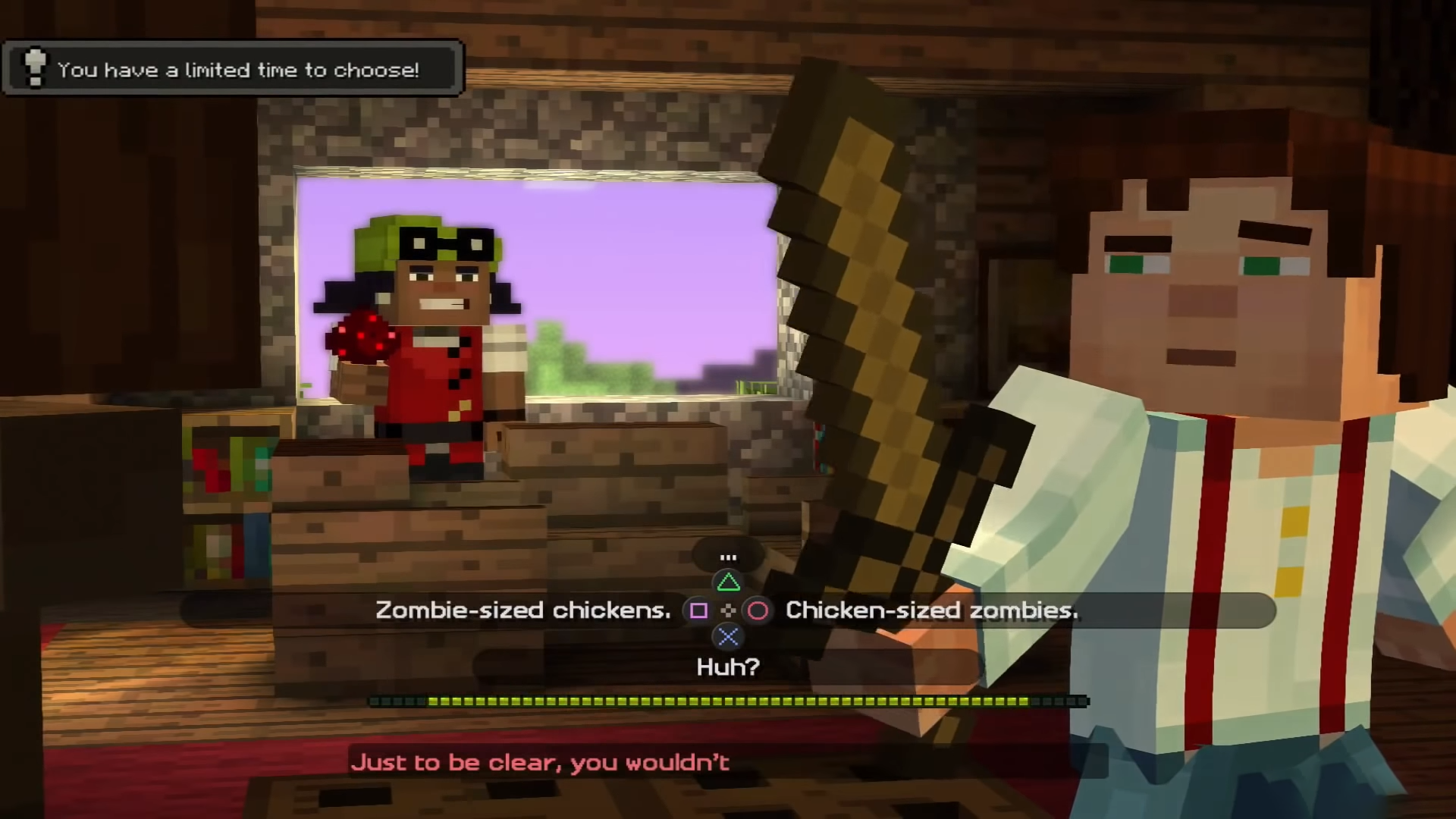
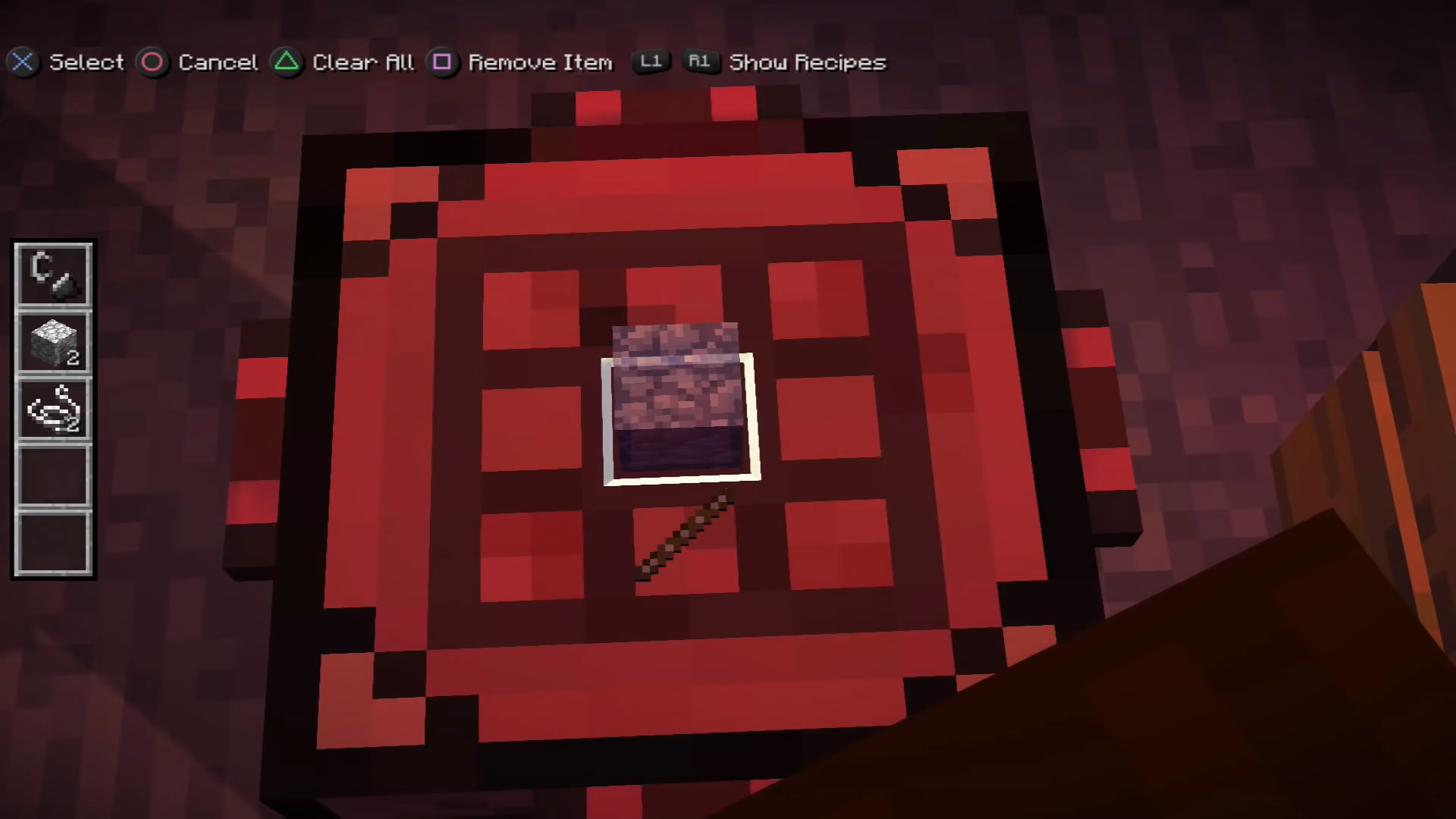
Original Minecraft Story Mode
![]()
New Freewalk UI and UX
![]()
Original Minecraft Story Mode
![]()
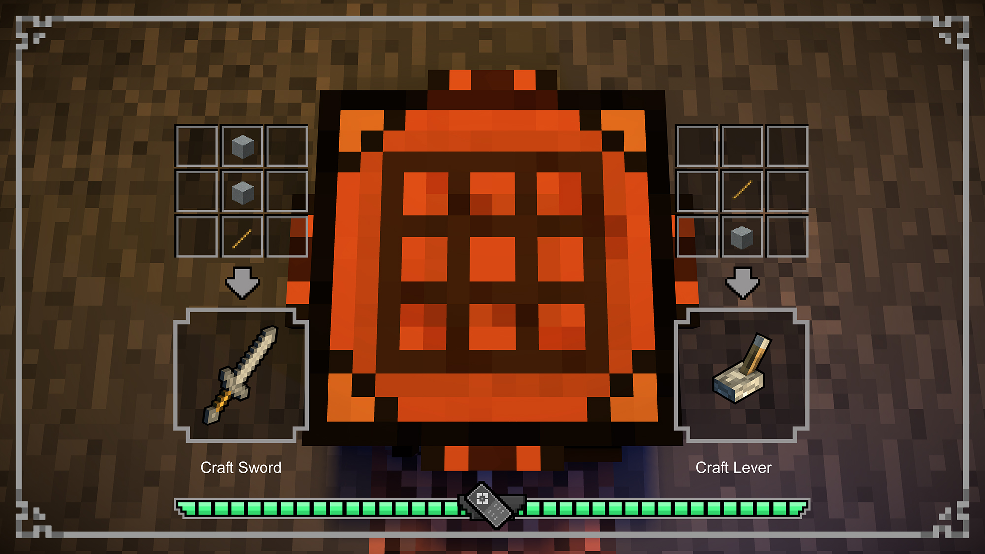
New Crafting UI and UX
![]()
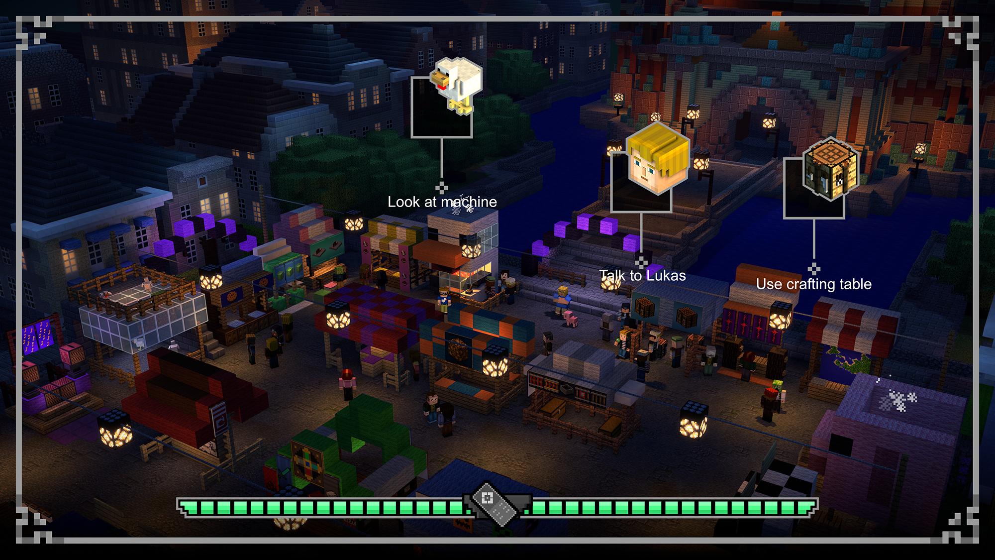
New Freewalk UI and UX
Original Minecraft Story Mode
New Crafting UI and UX
Original Minecraft Story Mode
Walking Dead: The Final Seasons
Episodes: 1-4
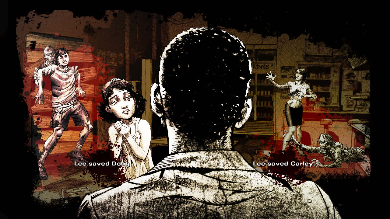
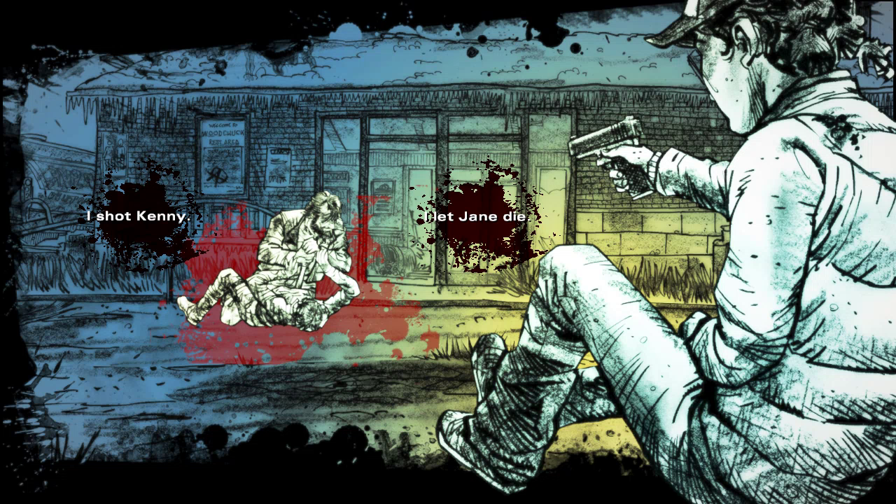
Season Four of the Walking Dead wanted to get back to it’s roots of the comic and what made season one so great. So from the UI standpoint we went with the comic book style and incorporated that in all the UI in the final season
Year: 2018
Role: UI/UX Lead
Tech: Maya, Photoshop, Illustrator, Telltale Tool, After Effects
Platforms: PS4/XBOX One/PC/Switch
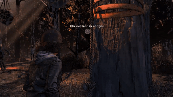
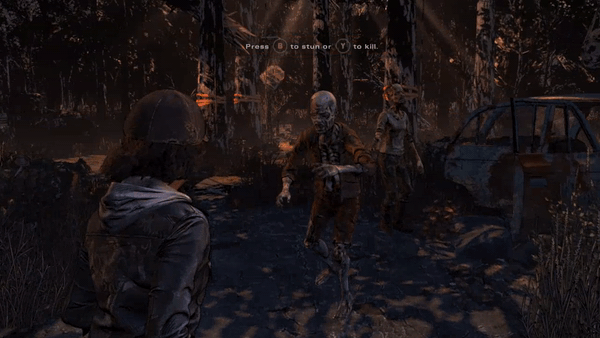
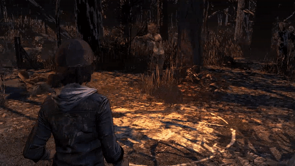
New Gameplay Features:
Zombie Combat was introduced in Walking Dead and specifically in episode one we had a trap system as well. The challenge with zombie combat and traps was being very clear to the user what zombie they could attack and when was the trap clear to use. We used the QTE (Quick Time Event) Buttons to appear on the zombie to indicate which zombie you could attack and we used a decal system to change the color of the decal on the traps to indicate when you could kill the zombie.
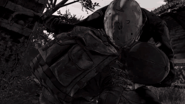
Death Screen was the first screen to get the Walking Dead comic book treatment. We were able to use a few new tech features like “Graphic Black” an ability to draw in more blacks and an on screen gradient to combine them to make the Death Screen appear as if it’s a comic book panel.
Configurator/Choose your Own Story is the Telltale method to choose to recreate your save data. In previous games we put the configurator in the menu and often times asked 10-20 questions. So as the user it can be quite confusing to answer what happened in previous seasons and then enter a main menu. We decided to integrate the configurator into the start of the game, so that it served two purposes both to summarize what has happened in previous seasons and asking to recreate if viable.


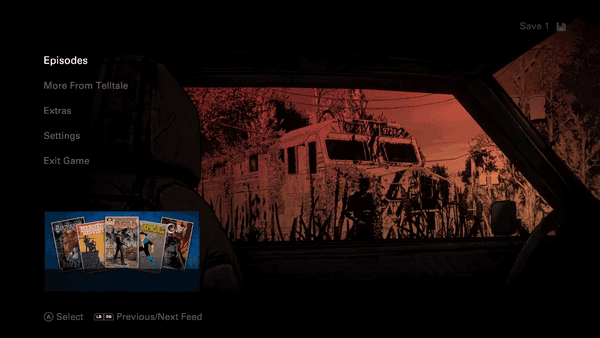
New Menu Features:
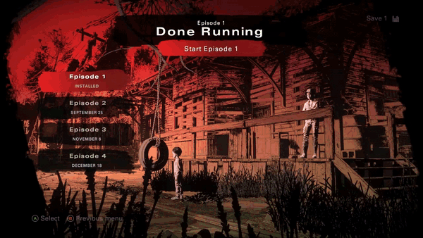
Boot to Play was an idea that started with the desire to get the user into the game as fast as possible. In pervious Telltale menus it could take up to 5-8 button presses from the initial boot screen to get you in game, along with the distractions of 3 different menus. In the final season we consolidated it down to 3 button presses and one menu on users first encounter with the game.

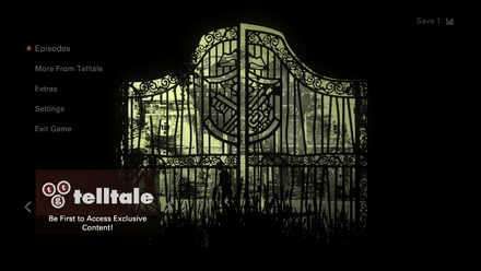
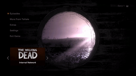
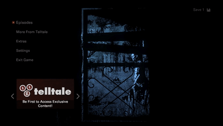
Menu Key Art’s purpose is to lead you into each environment by first looking through a window of some kind and then displaying more of that environment while expanding into the episode’s menu. For example, in the main menu, you’re looking through the car window at the train station and then it reveals more of the train station in the episodes menu.
Each episode installed would show you a new “window” to look through and the colors would match the episode dioramas that are similar scenes to the keyart. See below the School Doors key art lead into the Dorm Room with Clem and AJ with the same colors and style.
![]()
![]()


Menu Dioramas were all themed to locations centered around each episode and the relationship between AJ and Clem in the shot. The environments were a blend of flats and actual models to make sure our scene load was very minimal and we didn’t have to load all those environments and textures. The comic book cover style persisted into the menu and made it look dynamic and unique.
Extras
Collectables Usables are found all throughout each episode and instead of showing a regular POI on the collectable which would be easy to spot instead we created a material that applies a “sheen” on the object to indicate it’s something you can pick up.
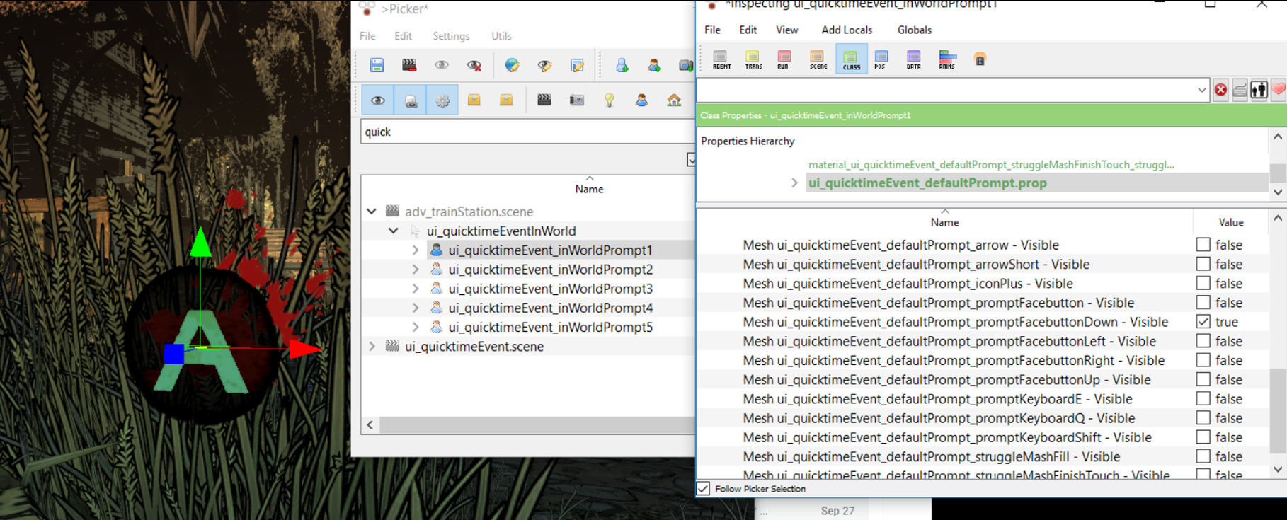
New Maya & Pipeline Process for Walking Dead The Final Season I was able to completely redesign the entire Quick Time Event Prompt. I took all the individual agents we have modeled over the many years and placed them together in as submeshes of the same agent. Therefore in the Telltale engine you didn’t have to load 20+ agents in every scene, you only needed to load 5 agents (because we could have a max of 5 buttons up on screen at once). It made it easier for the UI artists and the Cinematic artists to animate the buttons in various fight sequences. Rather than searching for the exact button you needed for a fight scene and making sure you animated that agent, the artist only needed to animate prompt1. In the case of two buttons up at the same time it was prompt1 and prompt2.
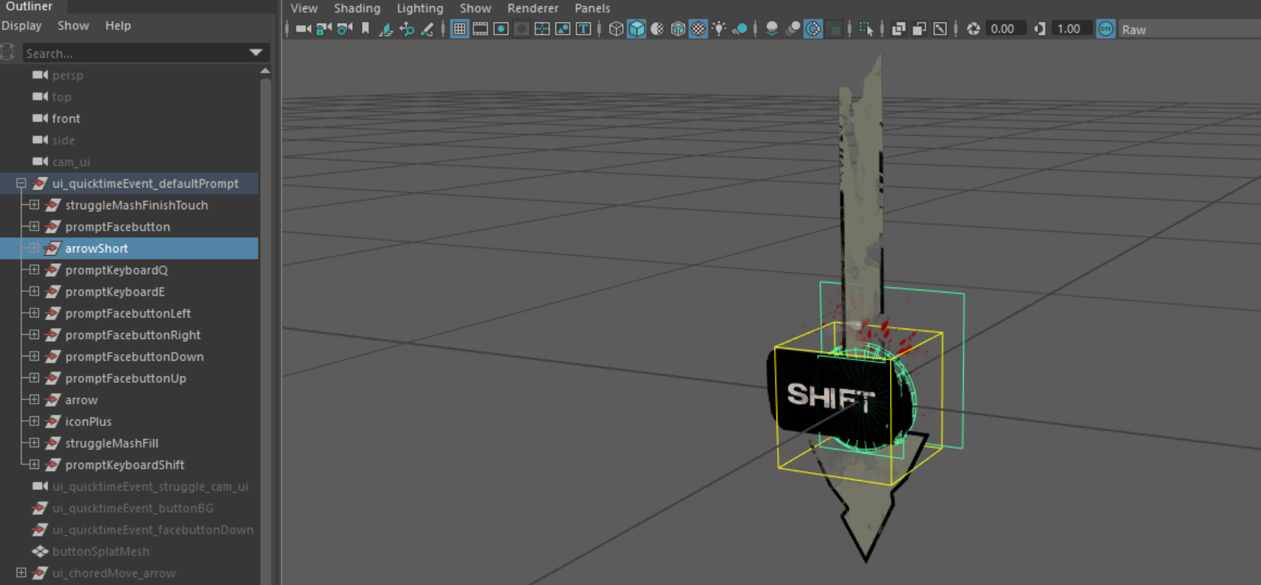


Success Button Press Animation
Failed Button Press Animation
There were some other fun considerations like making sure the animations that played on the agent could be broad that one animation would apply on every type of button possible. It was a balance of animating certain material properties cleverly while not affecting others. I also made sure the model no longer included the physical model letter “A” and it was replaced with a texture that way we could easily localize the button to any platform by replacing a texture and not have to model out an entirely new button say for Nintendo Switch.