
Timeline
Episodes: 1-8
Year: 2019
Role: UX Director
Tech: Eko Studio, Javascript Platforms: Eko
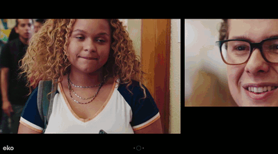
Timeline is an interactive 8 episode TV series made for Eko by Olivebridge. It’s a story about a high school girl named Dee, and through a gross accident can see the future up to 24hrs on her phone’s fomo feed. The decisions you make will affect how the future timelines play out. It was a unique show for me to work on as the interactivity and footage was done and generally locked before I started at Eko. I took it as an opportunity to apply User Testing and help validate hunches and improve the show before launch to make sure it was a successful user experience.
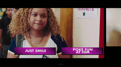
We ran a User focus group in LA and identified some issues with the show’s choice mechanic. Dee (The main character) Feels/Act double choices were confusing to the viewers in the focus group. The emojis also were difficult for viewers to understand the context of what a certain emoji means in a particular choice. For instance Dee is talking to her crush and a heart vs smily face emoji isn’t quite clear to the viewer what they are selecting. So after the user focus group a co-worker and I re-edited the first episode to flow different, showcase different UX choice mechanics, and re-enforce conciquences to choices. Then we ran an A/B test of the original edit of episode 1 to our new test edit version to see various user performance and feedback.
Original Choice UX (A)
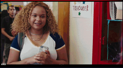
Test Choice UX (B)
The results of the A/B test were really interesting. We thought that having text choices instead of emojis would mean a higher engagement rate, both were pretty compariable. Instead the change of the flow of the intro kept viewers engaged after the initial dropoff. Viewers connected to the story quicker and didn’t go through a long onboarding tutorial, they were thrown into the action and therefore stuck around longer.

Earlier appearance of first interaction =
slightly higher engagement rate
Lower drop-offs and higher audience retention = much higher completion rate
Replay click-through quadrupled = Viewers felt choices were more impactful
Replay click-through quadrupled = Viewers felt choices were more impactful
Taking these results into account and what we could execute with a deadline quickly approaching we decided to edit the intro to make the flow quicker into an interaction. That meant we cut the mall scene significantly shorter and added a “start” button so the viewer would tap and engage, taking a cue from the Original Edit (A)’s better engagement rate. Then we put the Dee Act/Feel onboarding inside the first choice moment that was successful from our Test Version (B) results.

Start Screen & final Choice UX
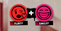
Lastly we wanted to smooth out the Feel/Act moments. We decided on episode one whe would put one word text prompts to help identify what kind of choice you were making, as well as made the emojis syncronize with the text. Then we added a “+” on the little notification up top to help the user understand it’s a combination of Flirty and Smiley that gets the response from Dee. With all of those little tweaks we were able to get the best of both A/B versions of the show into the final version.