
Tech Art Chronicles: UMG Tips and Tricks
Unreal’s UMG doesn’t have much documentation or examples so here’s what I’ve learned so far.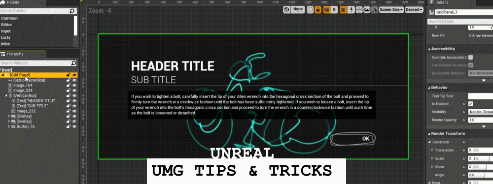
I’ve spent maybe the last 9 months learning and understanding UMG and it’s not intuitive off the bat if you did not learn web design along with absolute vs relative pixel layout spaces. Ontop of that the widgets they provide you to design with are often super robust or simple or over designed and inflexible. So I wanted to just record down a bit of tips and tricks that helped me navigate UMG well. This wont be a full blown tutorial of all the ins and outs of UMG but hopefully this is more for those who are just beginning to design with UMG or for those who have been in it for a while to pick up some useful tidbits of information.
TIP 1: Container Widgets
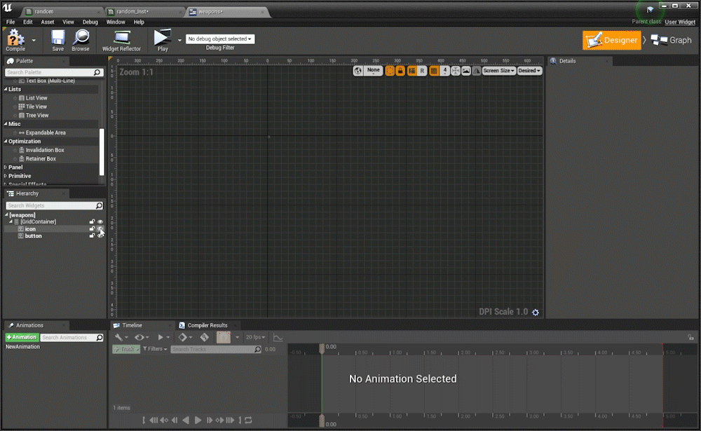
Container widgets only take up layout space to the largest thing inside themWith UMG widgets I see 2 kinds of widgets normally, ones that take up layout space such as images/text and the containers that hold these widgets such as grid/overlay/horizontal and vertical boxes. Note Canvas is a weird widget and I generally ignore in all of my layouts until the very end. To get the hang of designing in UMG just remember that a container will only be as big as the largest widget inside it.
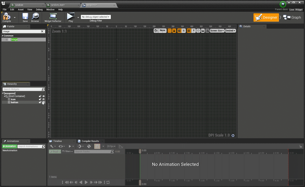
The grid container here is only as big as the largest thing inside, so it’s 0x0 pixels then the icon gets turned on the grid becomes 256x256 pixels in size, and even when turning on a smaller sized image it still stays at 256x256 because the layout depends on the largest thing inside. I also use grid containers more like smarter overlays I rarely use the row/column features
Most of the time when I’m working I see lots of crazy layouts including multiple size boxes and canvas nested in another canvas and all these other ways to try to control the layout size. These then become fragile and overly complicated widgets (that also have bad performance) because the designer/programmer is wrestling UMG’s core desire of a container to be the size of the largest thing inside. It’s very much like web design and divs, a div is only as big as the screen percentage it renders at OR the largest thing inside a div taking up space.
These are some examples of the widgets I use on the regular:
Container Widgets
- Grid
- Overlay
- Horizontal Box
- Vertical Box
- Scale Box
- Grid
- Overlay
- Horizontal Box
- Vertical Box
- Scale Box
Layout Space Widgets
- Image
- Text
- Progress Bar
- Button
- Spacer
- Size Box
- Image
- Text
- Progress Bar
- Button
- Spacer
- Size Box
Now vertical and horizontal boxes are a tad bit different as their layout space is the SUM of the content inside them either in the vertical Y axis or the horizontal X axis
The vertical box container here is as big as the sum of the Y heights of all objects inside, so it’s 0x0 pixels then the icon gets turned on and it becomes 256x256 pixels in size, and then turning on a smaller sized image it still stays at 256x256 + 128x128 so now it’s a container that is 256 + 128 in the Y and 256 in the X.
Container is now: 256x384
Container is now: 256x384
TIP 2: Negative Padding
Now that containers are the size of their images/text inside how do you get around power of 2 textures? Negative Padding should allow you to change or adjust layout sizes and maintain your layout space.The next puzzle to solve is if you’re using power of 2 textures in your UMG (which is arguable you probably should) And say you’ve got a button with a hit area of this texture and the texture has white space and isn’t flush to the edge? The trick is to negative pad your button to compensate for the blank space in your texture.
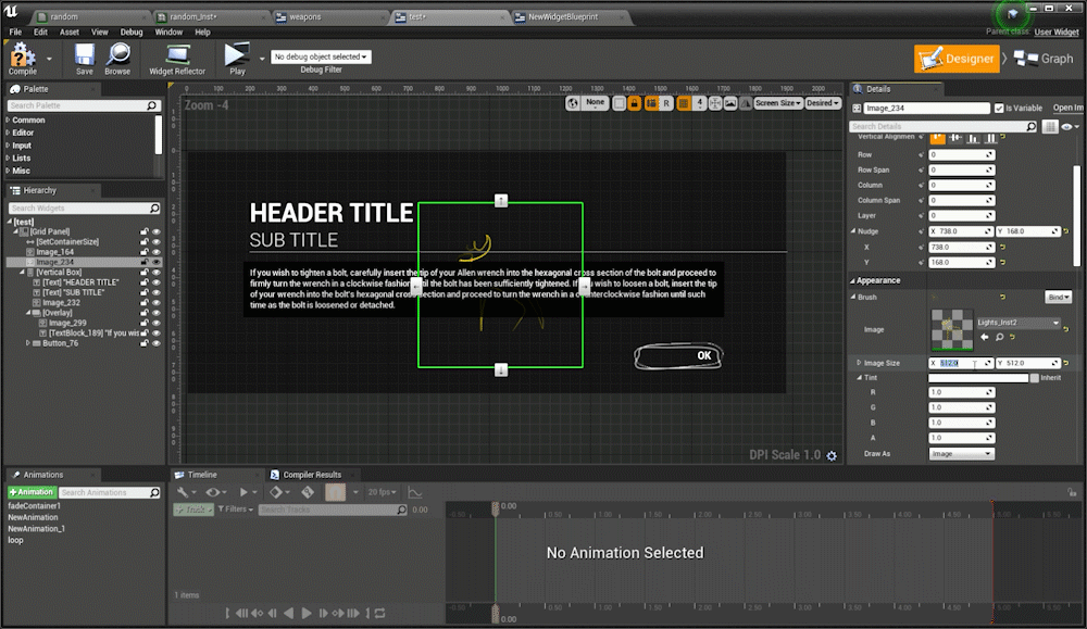
I’ve got a photoshop PNG made of a button and then I put that into my button widget inside a grid container and it’s now got this hit area that’s much bigger than button itself:
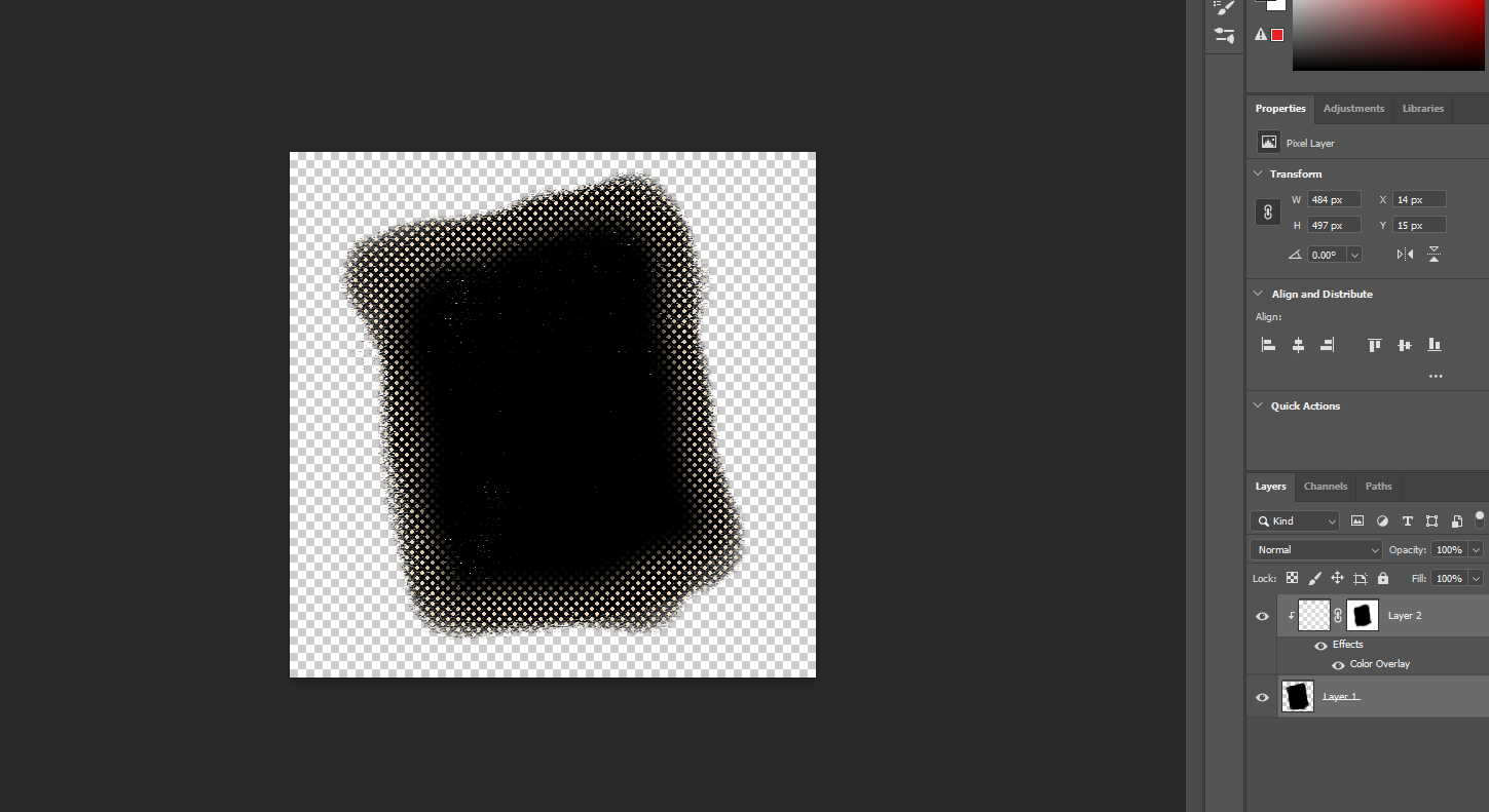
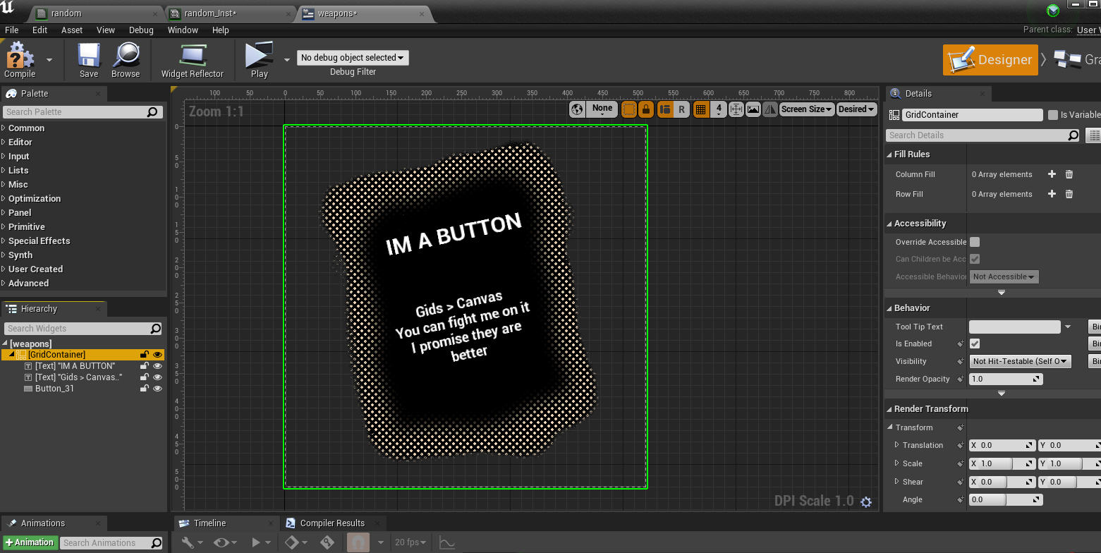
To fix this in the layout I’m going to NEGATIVE pad the button to make the overall container tighter around the power of 2 button texture that is 512x512.
First thing’s first I’ll show off how you can have pixel perfect accuracy in photoshop with a hit area:
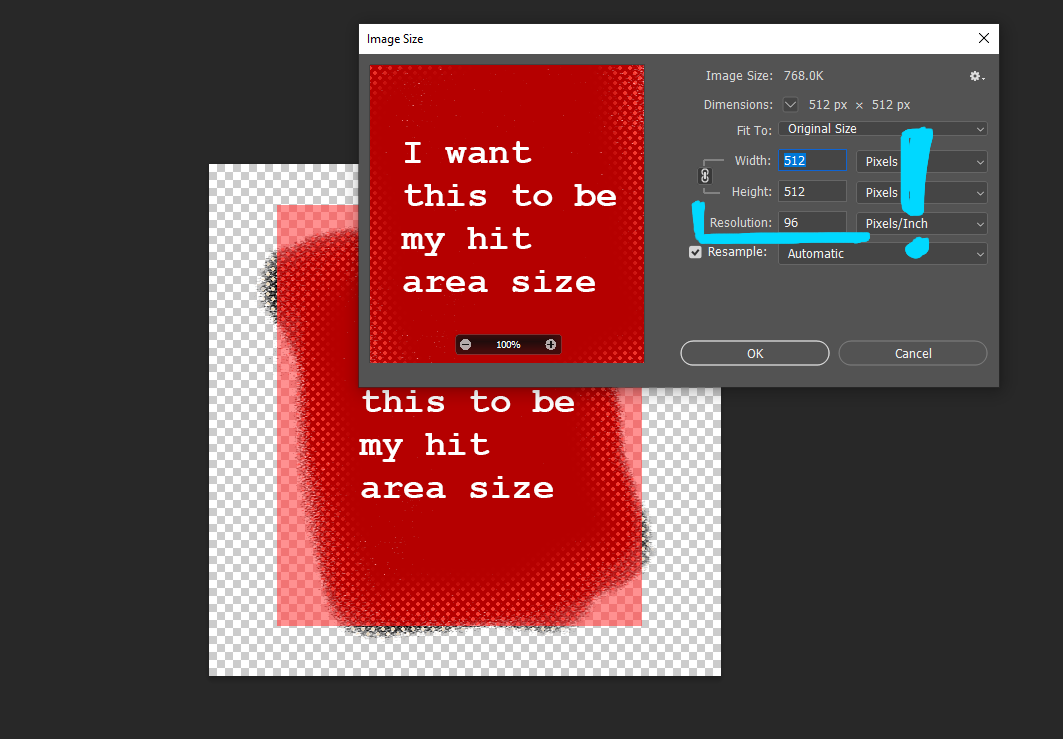
You want to make sure your photoshop document is in 96 DPI this is important because SLATE is at 96DPI and not at 72 therefore none of your pixel coordinates will be 100% acurate at 72. What does this mean for your layouts!?? Well if you set a font size to like 33pts in photoshop at 72 DPI it will not be the same font size you need to set in Unreal at 96DPI, instead 33pts in photoshop at 72 is 24.75pts in photoshop. This also is true for say pixel perfect anchoring, like if you know in your photoshop file from the edge of your document up 100 pixels to have it work in editor the same way you need to use 96 DPI in your photoshop file to match editior. This does not affect images or textures and they do not need to be at 96 DPI (but I do just because photoshop file is set that way) The industry standard is 72DPI for images and if you just know to get pixel perfect accuracy you need to change your photoshop file to 96 DPI but keep the same size (1920x1080 for example keep the same size but change to 96 DPI) you should be good.
Hopefully this is a great summary by a anonymous dev I talked to on this topic:
“The goal of using 96DPI in Photoshop is to be able to measure pixels accurately [from Photoshop to UMG]”
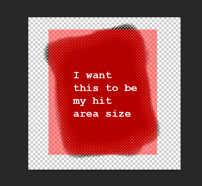
After I make sure my document is 96 DPI I want to measure the bottom-left corner and the top-right corner’s width/height to get the hit area dimensions:
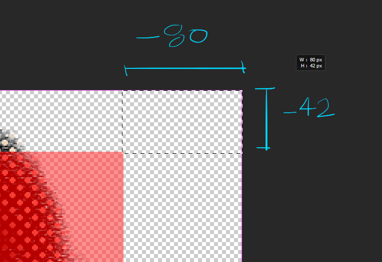
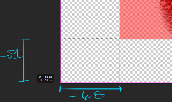
So now when I go back to my padding on my button I can put in these negative values:
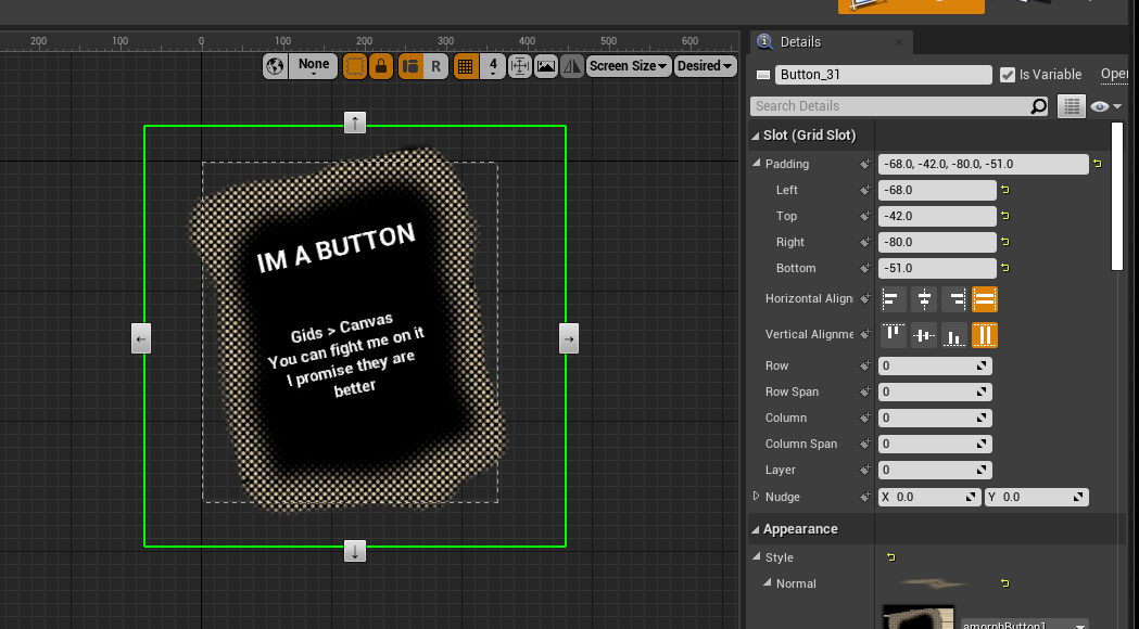
And now my container size is pixel perfect exactly to my photoshop hit area:
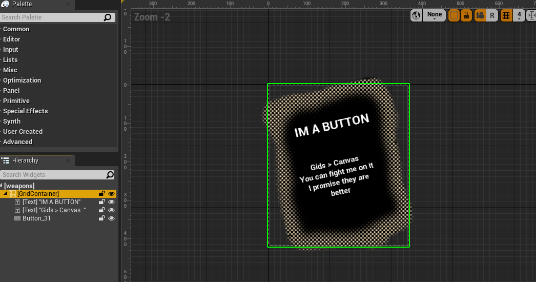
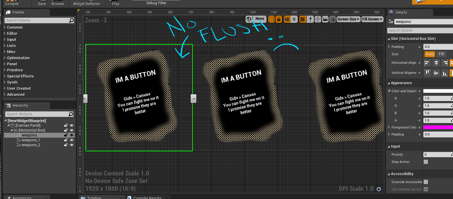
So flush that if I were to nest this widget in another widget and say horizontal stack them they would overlap a bit because Unreal thinks the UMG widget is as only big as it’s container size... and because of negative padding it’s size is smaller than a 512x512 texture. But if you have no negative padding then you wont get nice flush widgets and instead will likely try to force a scale box, size box or canvas size to counteract the texture white space. This costs you more performance, so get the hang of negative paddings and control UMG layouts much better.
TIP 3: Grid Panels are so useful - use them over Canvas
Grids are the most useful widget in UMGI have a whole twitter thread on my grid appreciation over canvases and it’s because they are really useful widgets with the NUDGE and LAYER you can do a lot of crazy and great things with them. I’mma basically just copy what I posted on twitter but Grids allow you manipulate the things that will or will not take up layout space AND allow you to layer stuff with z-order quite efficiently.
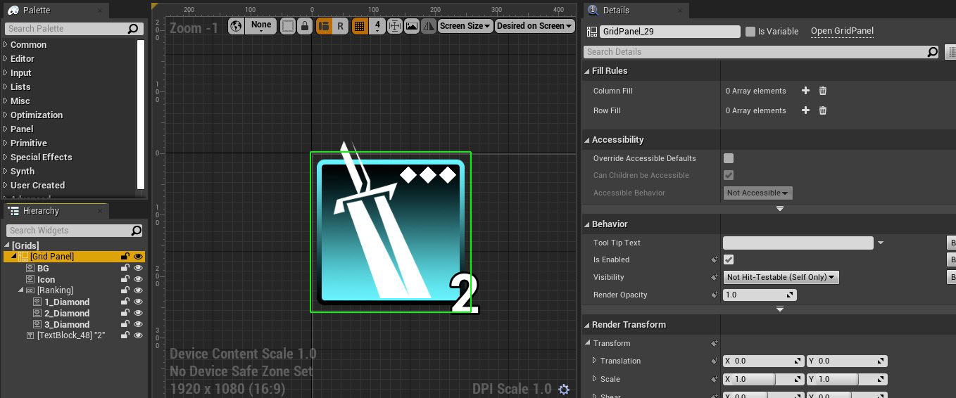
The layout goes like this:
Grid Panel (Total size 256x256)
- BG Image (256x256)
- Icon Image (256 x 256)
- Horizontal Box (Aligned Top Right with a nudge)
> Diamond Image (32x32)
> Diamond Image (32x32)
> Diamond Image (32x32)
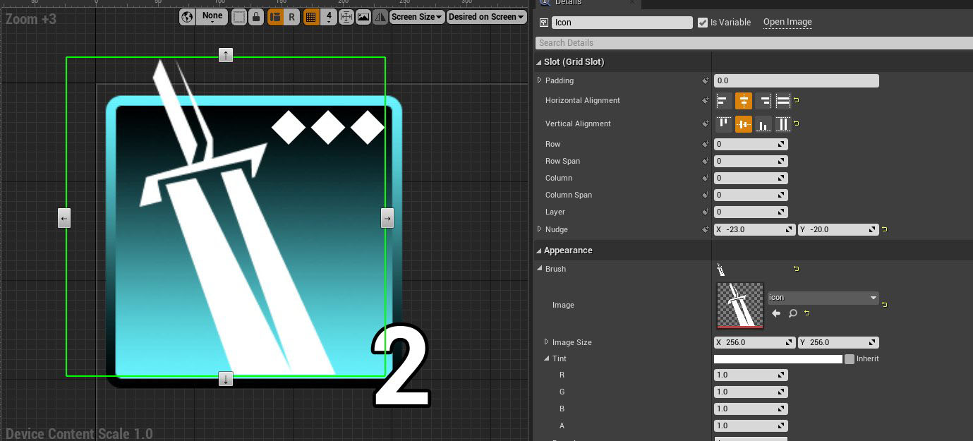
- Text (Aligned Bottom Right with a nudge)
Inside my horizontal box slot for the Grid I’ve aligned it to be top right, and then I counter nudged it to be
-30 in the X and 20 in the Y so it sits super nice in that top corner:
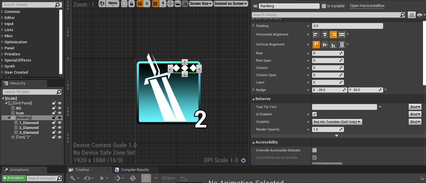
For the text I’ve done something similar but I’ve aligned bottom right and nudged it OUTSIDE of the container by 20 in the X and 30 in the Y.
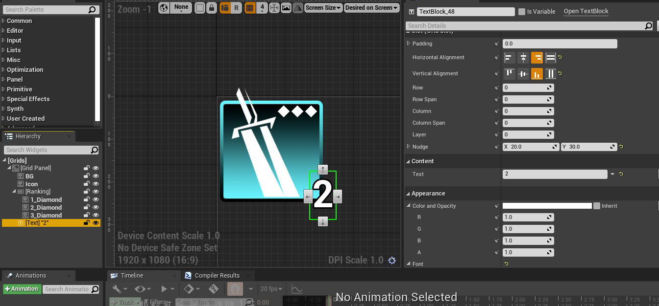
However when you nudge with the Grid container you do not take up layout space therefore my “2” is super flush when I load them together in a horizontal box:
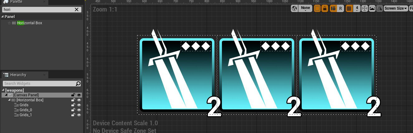
This is also how I got the icon to extend past the border of the background, I nudge negative up and negative to the left and now I have a dynamic layout that’s always 256x256 but peaking outside the layout calculations are my “2” text position and my icon sword’s top position.
Use Grids as like a smarter Overlay widget where you can control the z-sorting independently with Layer AND you can use Nudge and alignment to place anything anywhere inside/even outside your grid widget.
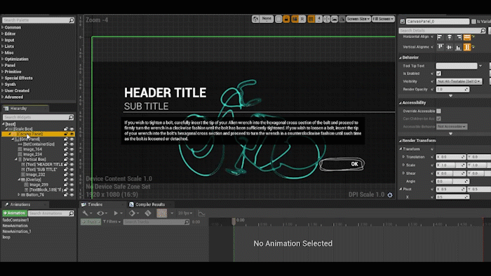
TIP 4: Use Wrap with/Replace with
UMG has this handy wrap with and replace with, use it often to try out new things in your layoutUMG layouts are a constant trial and error of wrapping/replacing containers with other containers and testing out your layouts. So use the handy “Wrap With/Replace With” often to keep the same slot settings but trying out different containers quickly and effectively.
When you want to get rid of a widget use “replace with child”:
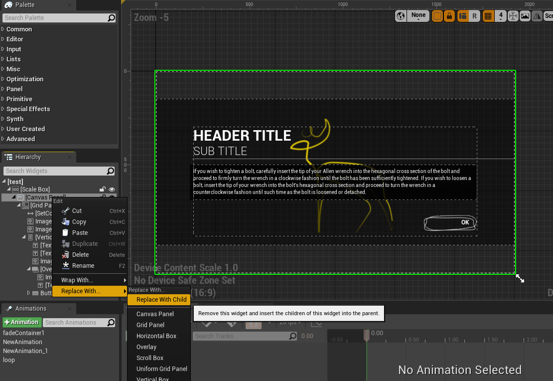
I can easily replace my canvas and scale box without messing up my layouts too badly and work quite effectively:
The same goes for “wrap with” and “replace with” you can quickly change any kind of layout container to use what you want:
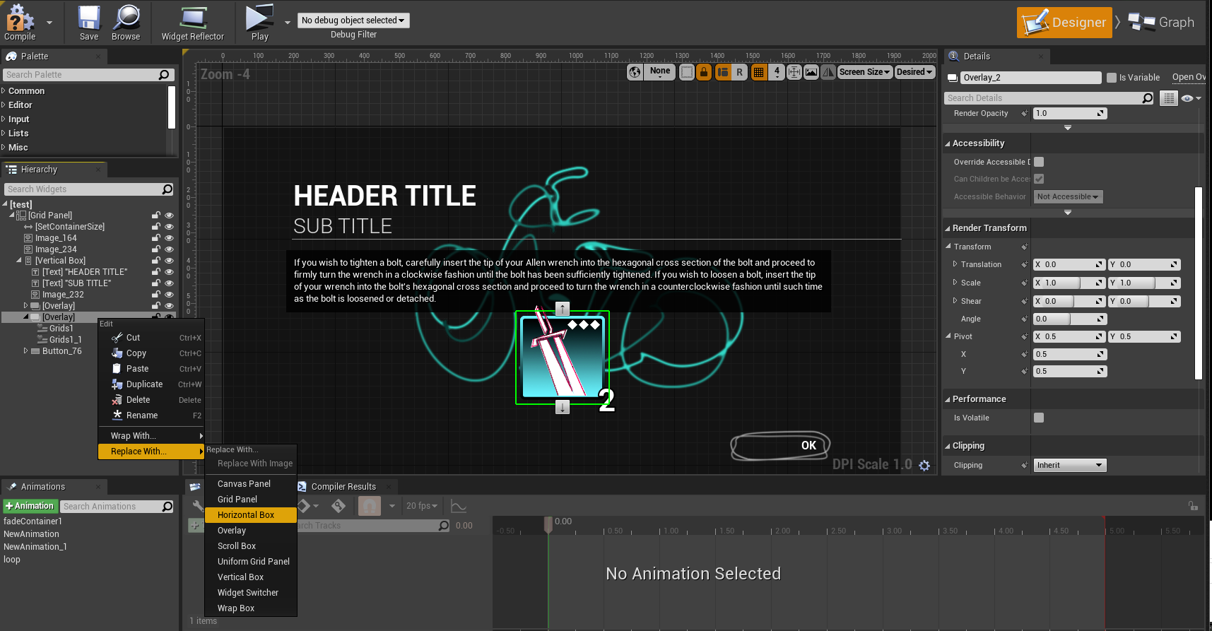
Using these should quickly speed up your workflow and allow you to adjust your layouts quickly and test out all kinds of containers and layouts.
TIP 5: Render Transforms when to use them
Render transforms are quite useful when you want to scale/size/rotate/pivot something but do not want to change your layout size.UMG has a useful bit of settings called Render Transforms and these are what UMG wants you to animate with. But they also can be useful for modifying your layout but not changing your rendering layout scale. Take for instance here I have a layout where I want to scale up this image that’s a material I made:
I can attempt to scale it by changing the image size:
But that will ultimately scale my entire widget size because again a container is only as big as it’s largest thing inside of it. The same goes for using a scale box or even size box because those widgets take up layout space therefore my layout will get larger if I scale up the image in that way.
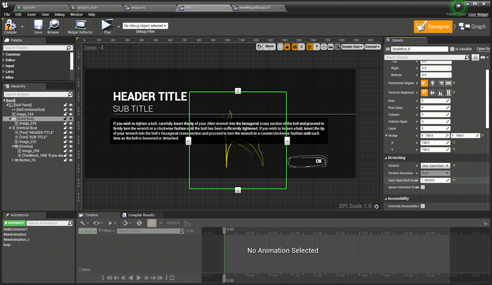
Scaling via a Scale box set to user specified
Then of course people then want to use canvas widgets for a scale but that’s not necessary because UMG has a way to scale/rotate/translate things without changing the layout and that’s through Render Transforms. So if I scale this image via render transforms while UMG “thinks” it’s image size is 512x512 in the layout size calculations it’s actually rendering it at 1024x1024.
This is also how the UMG sequencer animations work they use the same transforms so you can animate and not change your layouts/positions. This all goes back to understanding UMG’s layout calculations, what is your container size? Do you need to use render transforms to avoid changing that container size? Or do you want your widget to take up layout size space? Mastering when and when you do not want an object to take up layout space will make quick work of having more flexible and modular UMG layouts.
Here are some videos discussing some of these topics and more I’ve made as a test template for video content: