
Various Articles about UMG and Technical Art
Articles
2D Tech Art Chronicles: Lerp
Image Layering in a Material
With Linear Interpolation!A lot of times it helps artists to understand shaders better if I reference the image editor counterpart such as photoshop or figma or any other 2D image editor. So I’m going to put some basic translations from Photoshop (but this can be any image editing software) to Shaders.
Image Editing Software
- Layers
- Clipping Masks
- Layers
- Clipping Masks
Shaders
- Linear Interpolation
- Linear Interpolation or Multiply
- Linear Interpolation
- Linear Interpolation or Multiply
Layers to Linear Interpolation
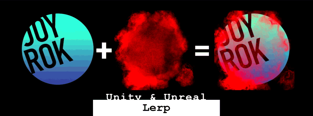
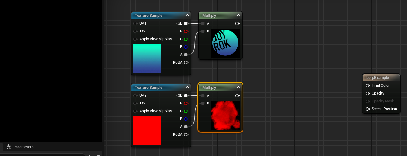
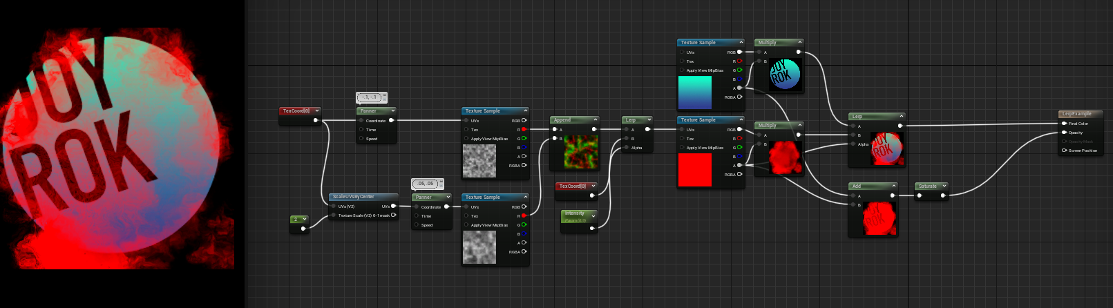
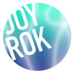
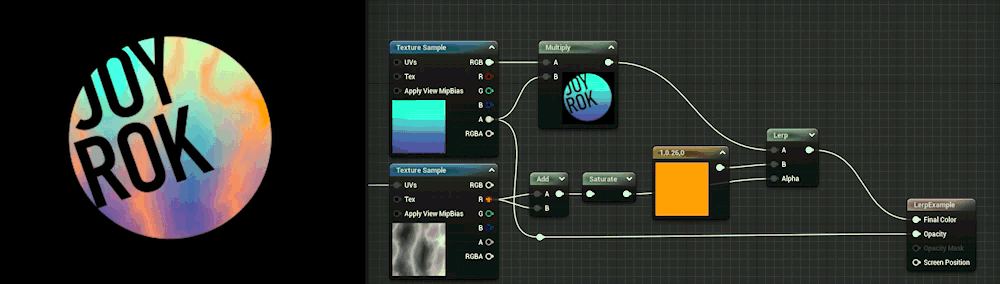
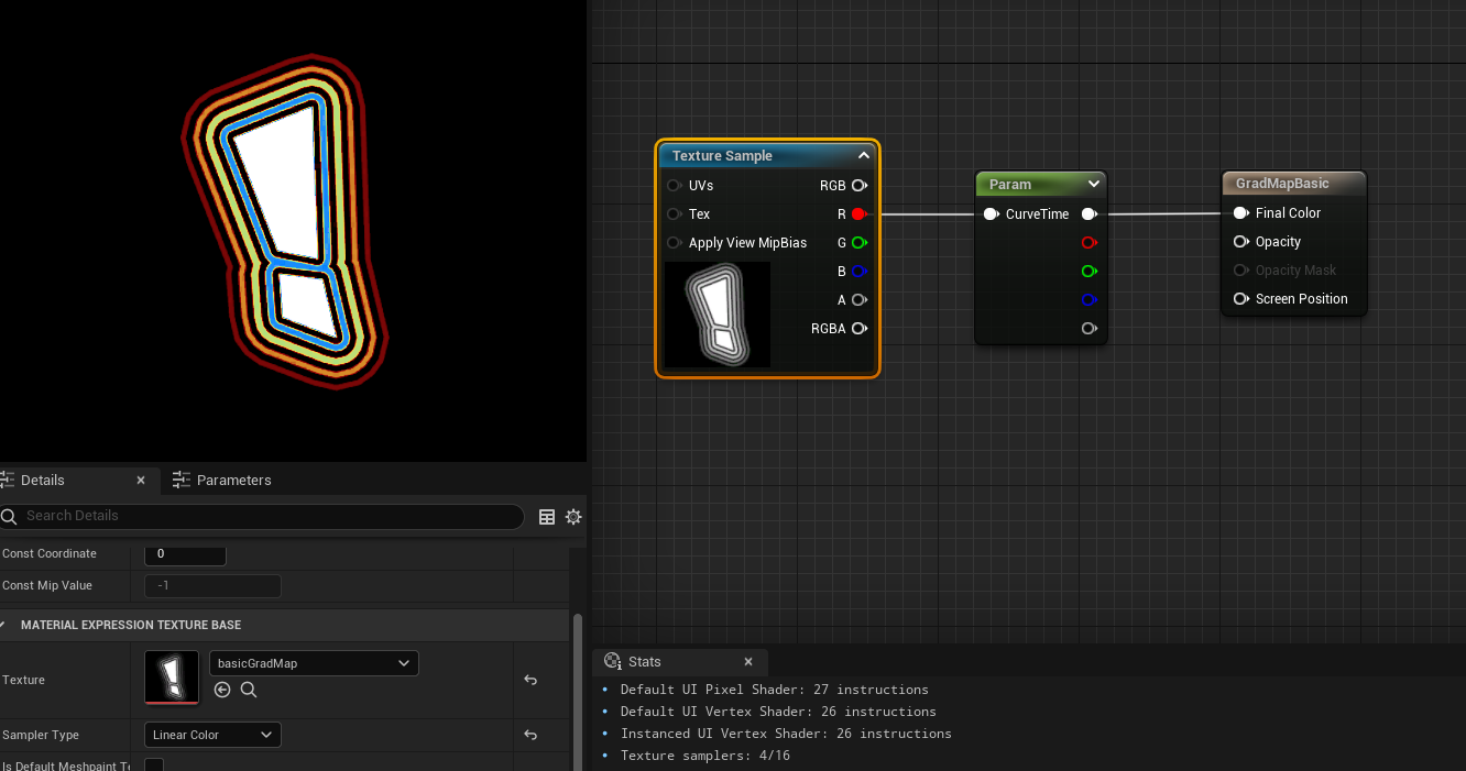
The first one is how to layer 2 textures or shapes together like photoshop and I made silly example with this logo texture and this grunge texture on top:
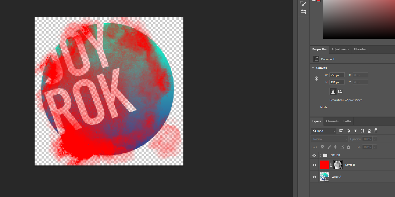
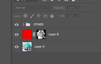
Layer A

Layer B

Layer B ontop of Layer A
Unreal Linear
Interpolation:
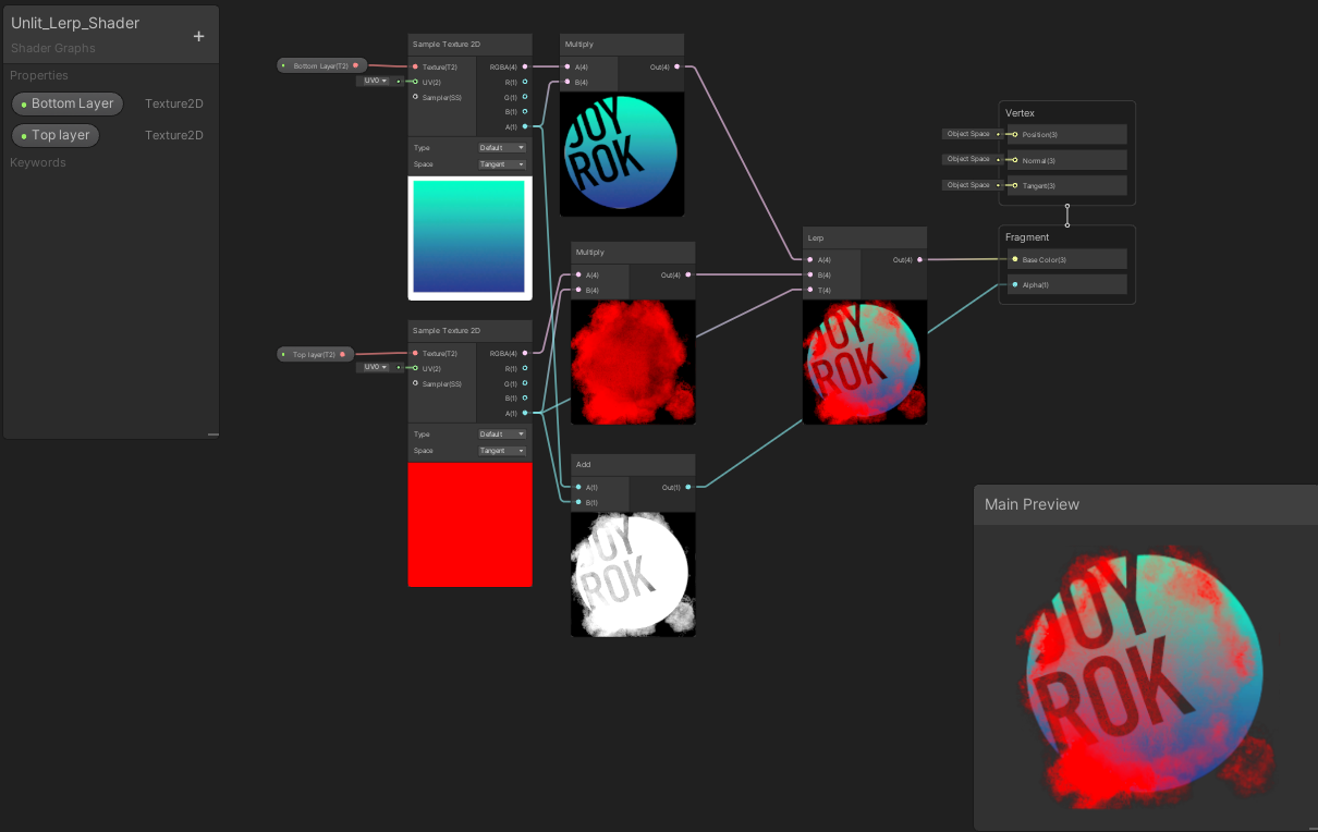
In Unreal if your textures are .PNGs and not in the texture group UI it will appear just as the colors of the texture and not include the alpha:
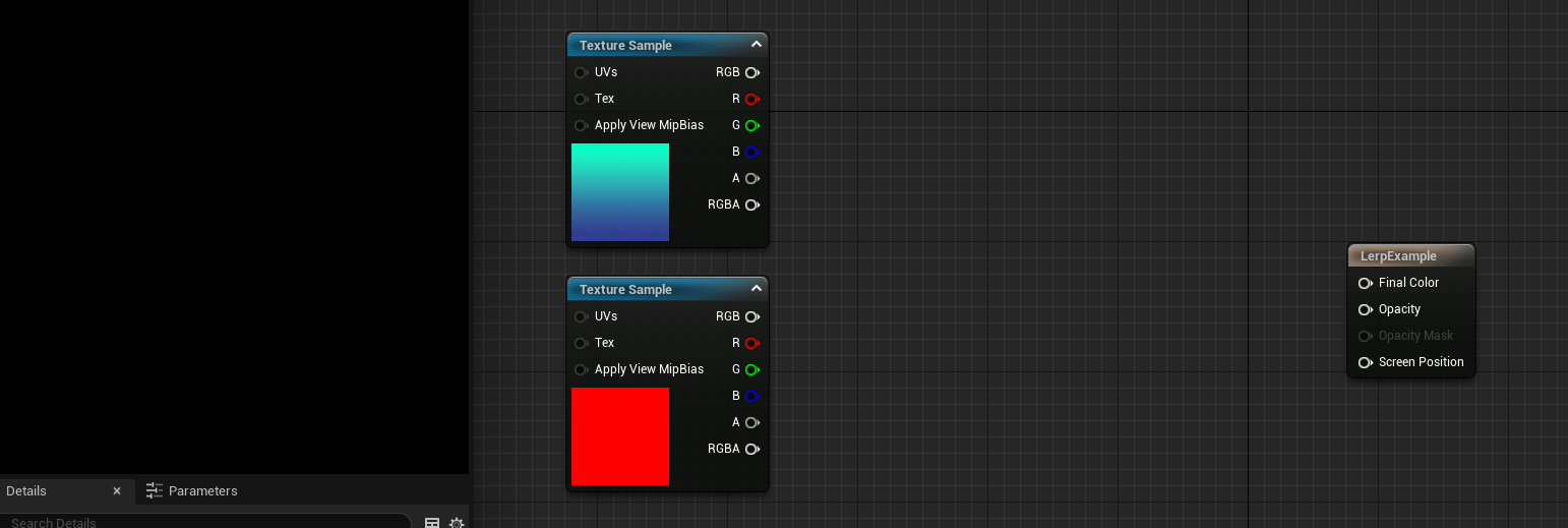
In general I like to multiply the Texture Sample RGB x Alpha to get my .PNG textures to act like they would in Photoshop for Unreal. This isn’t necessary all the time but oftentimes if I’m having weird alpha issues in my materials this will fix it most of the time, and this is my workflow when using “most” PNGs in materials for Unreal. This is my preffered method for demoing PNGs and not messing with the Texture group and texture settings since that’s how most users might encounter a .PNG in Unreal for the first time and if they are following this little article they likely haven’t changed texture groups or texture settings.
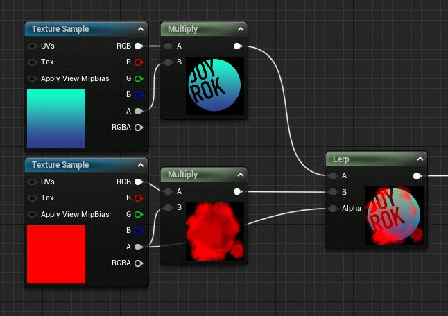
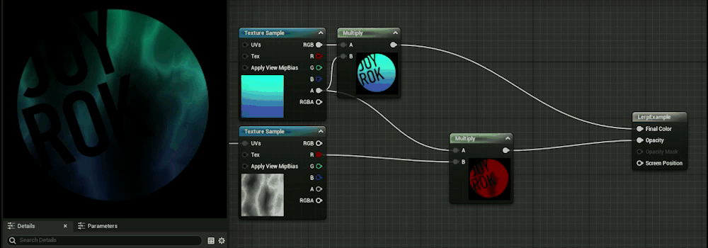
Now we can get to the Lerp Node:
Bottom Layer (Logo) - goes into A slot of Lerp
Top Layer (Grunge) - goes into B slot of Lerp
Alpha of Top Layer (Grunge) - goes into the Alpha of Lerp
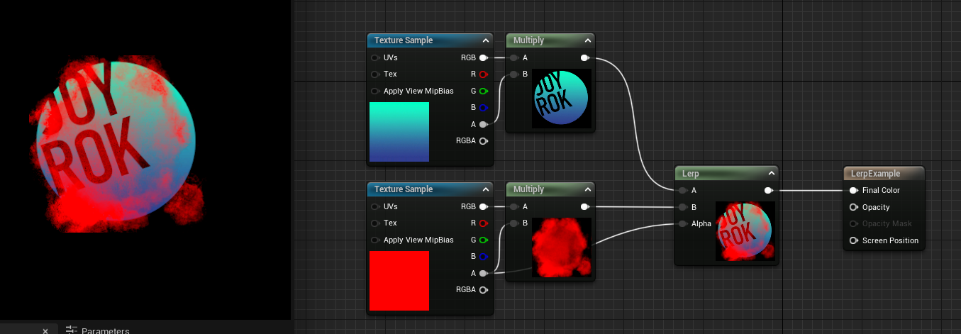
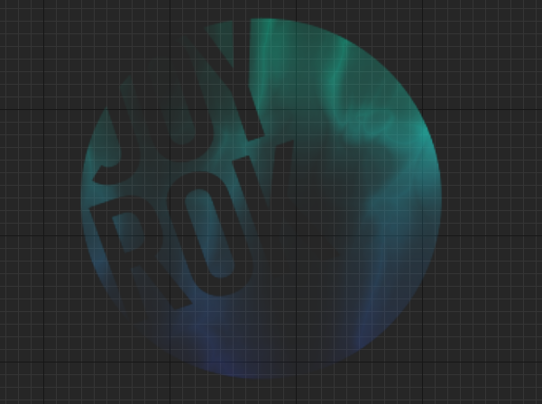
If we take it back to photoshop I can show off what’s happening:
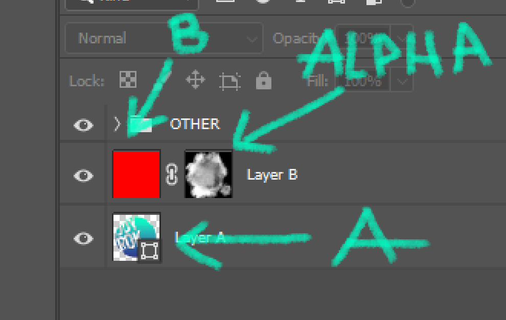
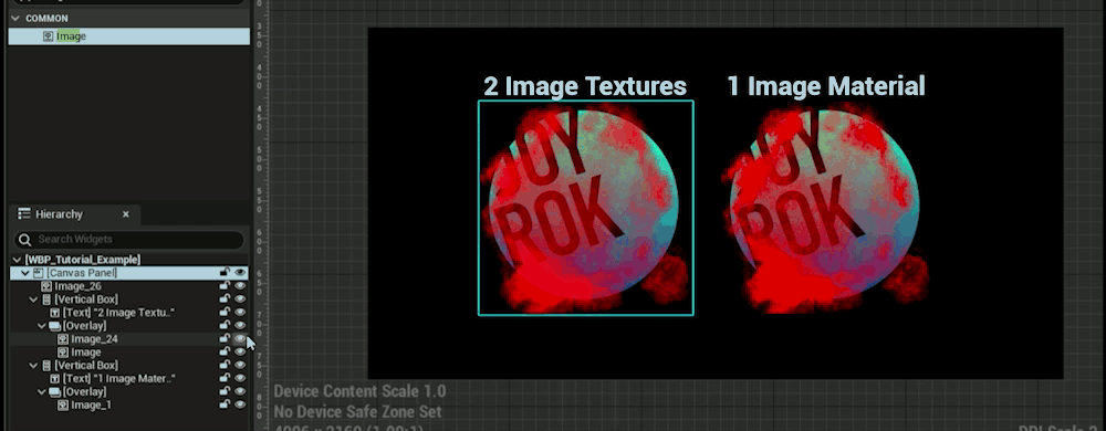
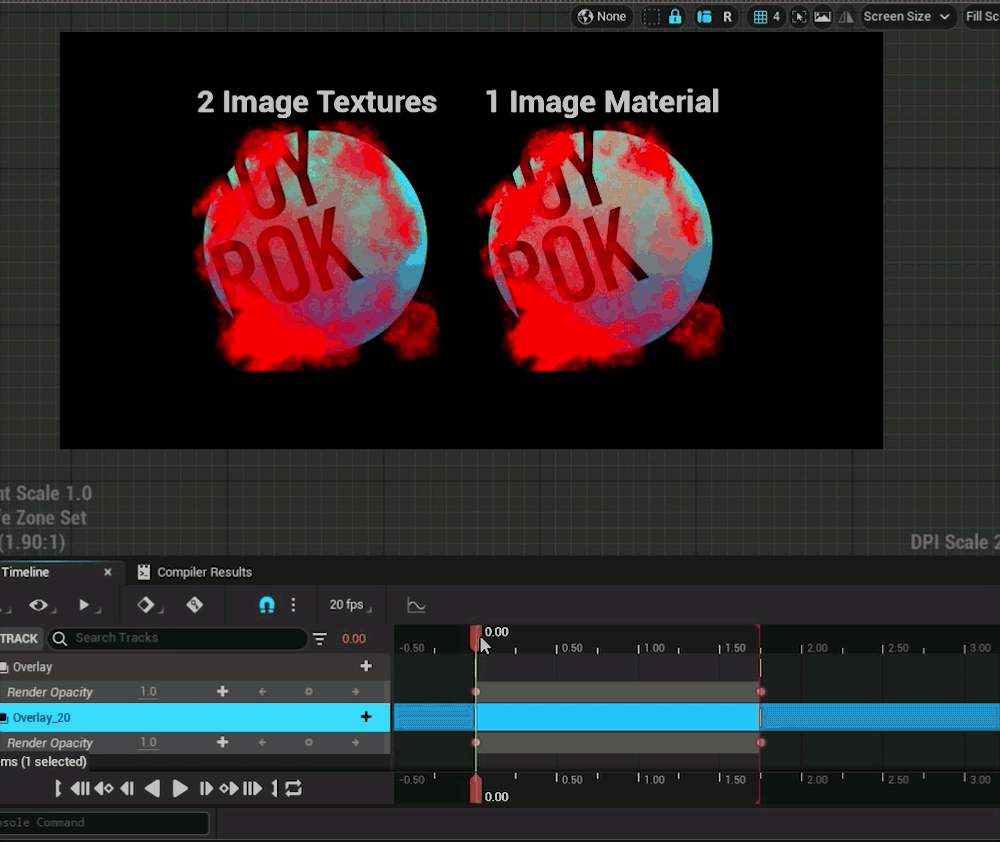
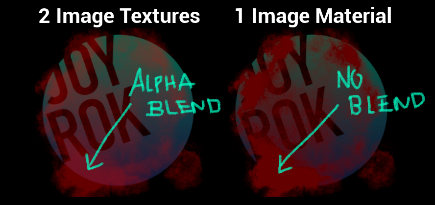
The clipping mask is basically the Alpha, the red color is the B layer and the A layer is the original bottom layer. Then you might ask why do this instead of just layering 2 images on top of each other in the UI editor? Say in Unreal - you layer a lot of Image Widgets in UMG ontop of each other is going to cause more alpha draw calls. That’s usually bad for performance especially if it’s taking up more space on screen. There’s also another issue that can happen which is alpha blending when you want to fade the group of images together.
Here’s an example of layered images vs the single image material animating opacity of the entire container down to zero.

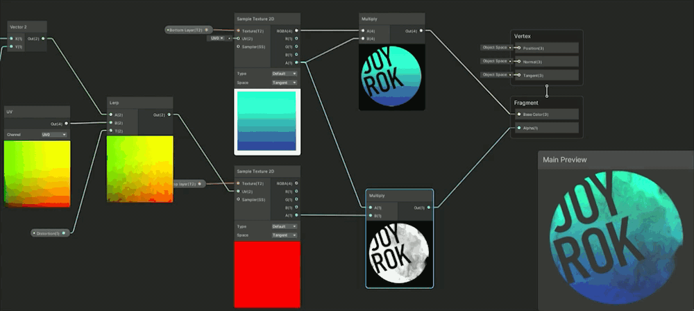
Unity Linear Interpolation:
In Unity similar to Unreal it has a Lerp Node and .PNG images previews lack alpha if just a basic texture import so I use the Multiply Node with my Sample Texture 2D, I set it up like this in the Shader Graph:
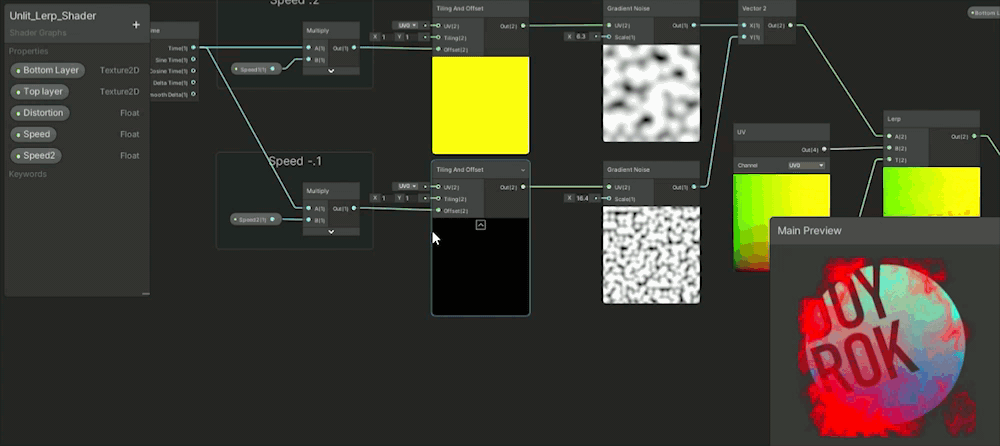
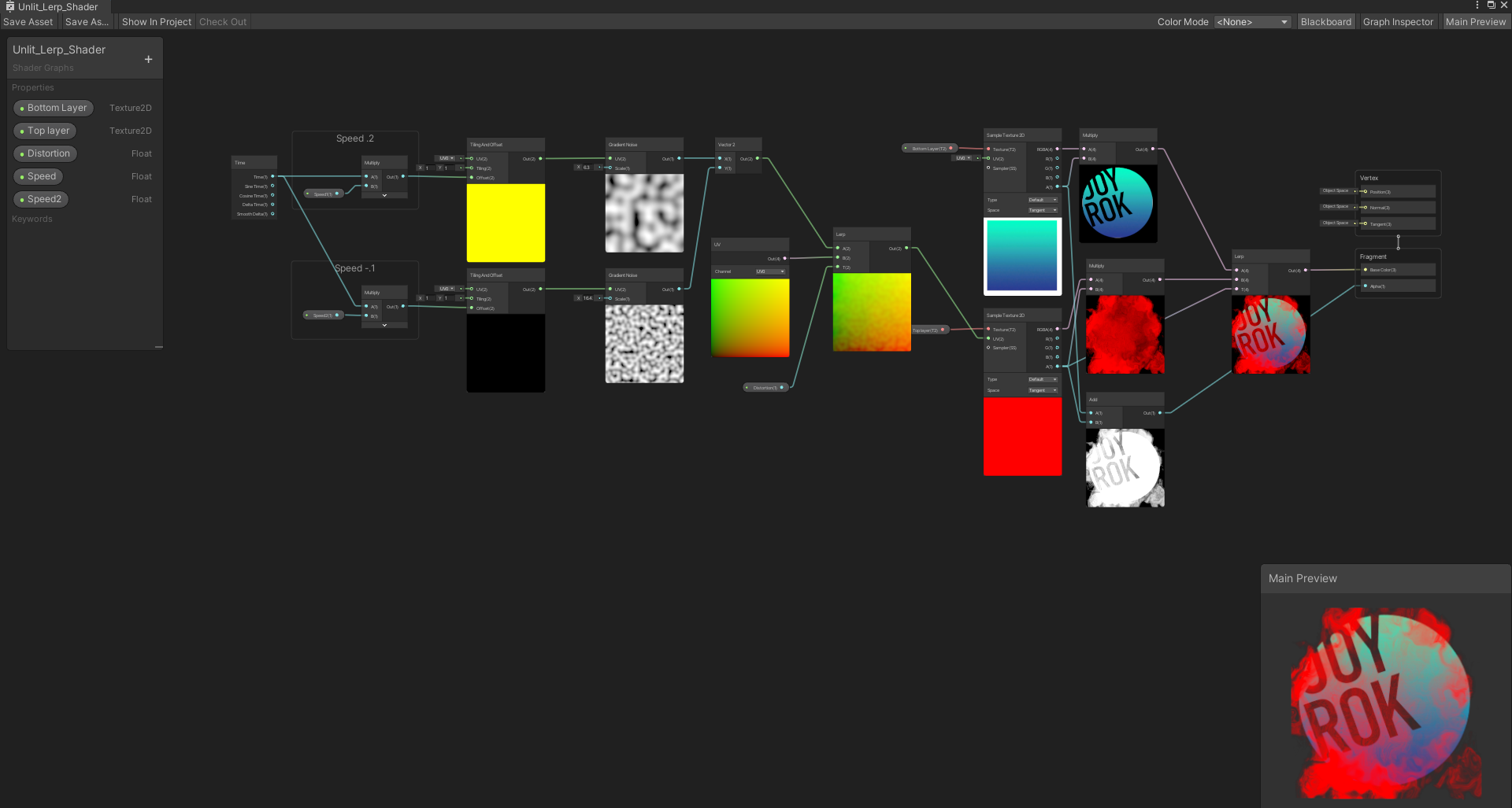
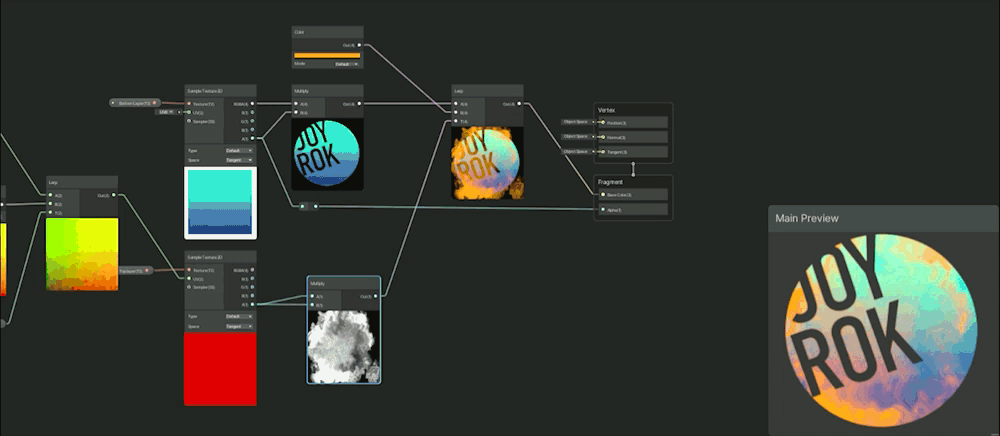
Here I’m actually adding the two texture alphas together and plugging that into my final alpha just to make sure it renders in the engine with alpha, just adding some extra functionality artists are likely to expect. Also I can use a fun UV distortion with shader graph Gradient Noise Nodes to make it animate:
Clipping Masks to Linear Interpolation/ Multiply
A good hint on how to make clipping masks in the last section was seeing the Lerp Node refferred to a clipping mask in photosohp because thats also what Lerps can doUnreal Multiply:
First up is Multiply Node and I’m usually using this in the context of alpha or opacity of the material.
The basics of the shader works by multiplying the texture’s alpha channel with the animating mask and that creates the effect of a clipping mask. In photoshop a clipping mask is grayscale, black means mask and white means show the original layer, gray is various opacity of masking. Multiply is the same concept. When you multiply 0 - black, you will mask something out because anything multiplied by 0 will be 0, when you multiply 1 - white, you will keep it visible, and gray would be various levels of opacity.
Unreal Linear Interpolation:
Lerp Nodes as hinted above can also be used to create masks and here I love to use them to create color fills very similar to this image (I’m going to keep showing this image to help re-enforce what lerp looks like in photoshop)
Unity Multiply:
You’ll notice nearly everything in Unreal is quite possible in Unity and these basic nodes are almost always the same name, thus it might be shocking to know but Unity’s graph will look quite identical to Unreal’s with the multiply node creating the alpha with it plugged into the Opacity output.
Unity Linear Interpolation:
So where in the Unreal Lerp example I wanted to brighten up the clipping mask texture in unity I wanted to darken this particular texture and how I like to do that is by multiplying the clipping mask effect to itself and you can see that will darken the darker areas and lighten the lighter areas. Then of course the Lerp Node masks the clipping mask and I can change whatever color I want in the B slot to be anything!
That’s a little bit of the basics on clipping masks and masking in general through Multiply Nodes and Lerp Nodes but other nodes could be used too those are just the ones I tend to fall to right away as they are easy direct comparisons to photoshop and usually get the results I’m expecting.
2D Tech Art Chronicles: Gradient Mapping
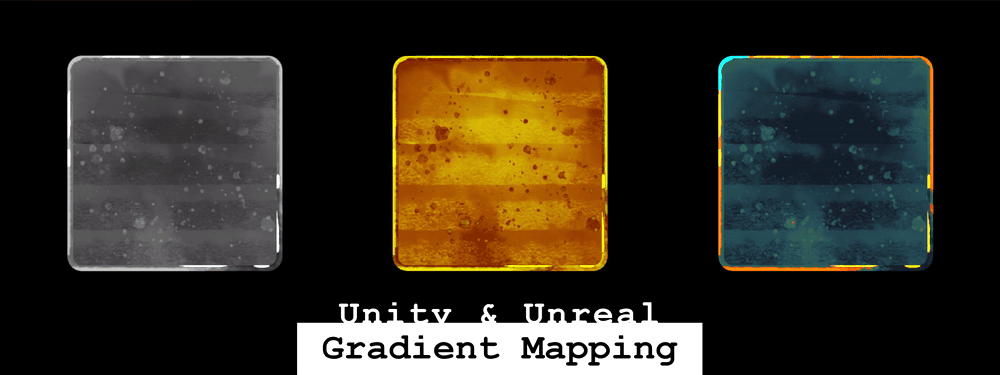
Gradient Mapping
With an Atlas Texture - Unreal
First I want to explain the difference between a gradient map and say a tinting a color on a grayscale texture.
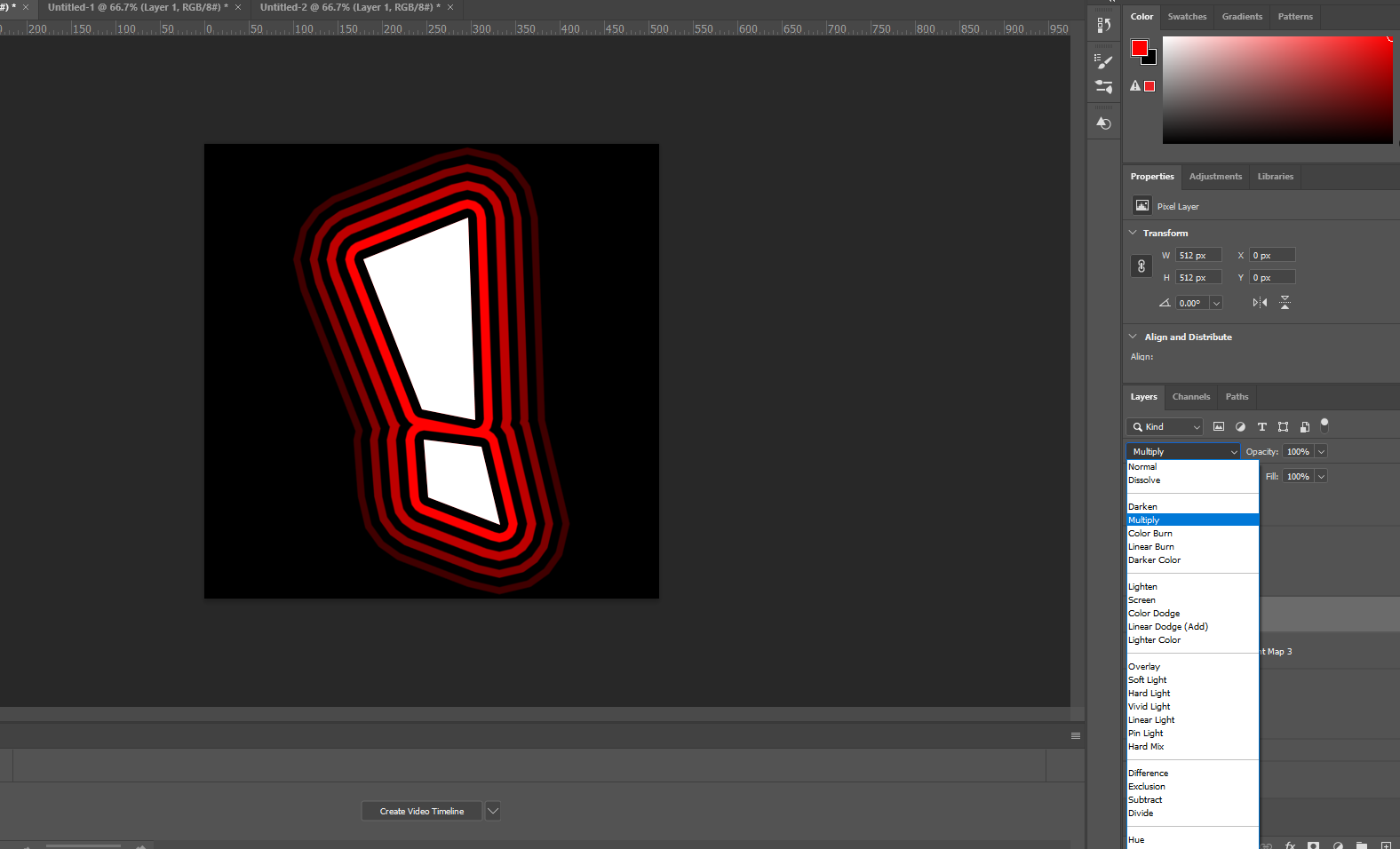
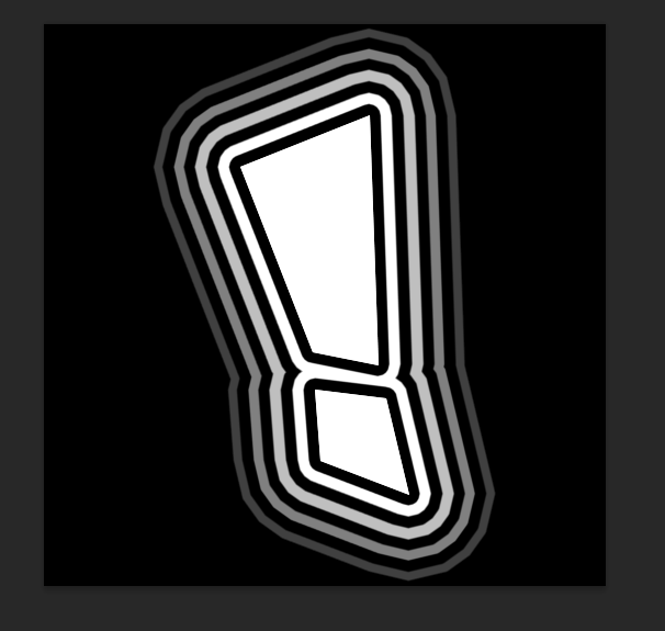
This pretty easy to show with photoshop or any image editing software, therefore I made myself a photoshop shape vector and put a unique glow around it that makes these nice lines.
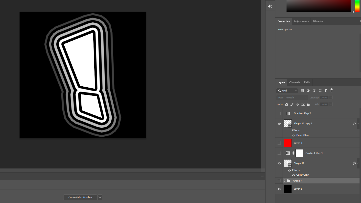
What an engine color tint does if I were to tint this in Unreal or Unity would act as if I were to multiply a red color on my stroke layer:
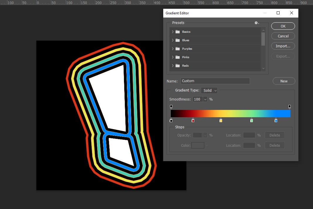
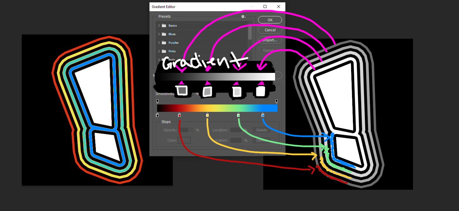
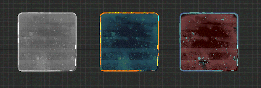
This is a gradient map in photoshop:
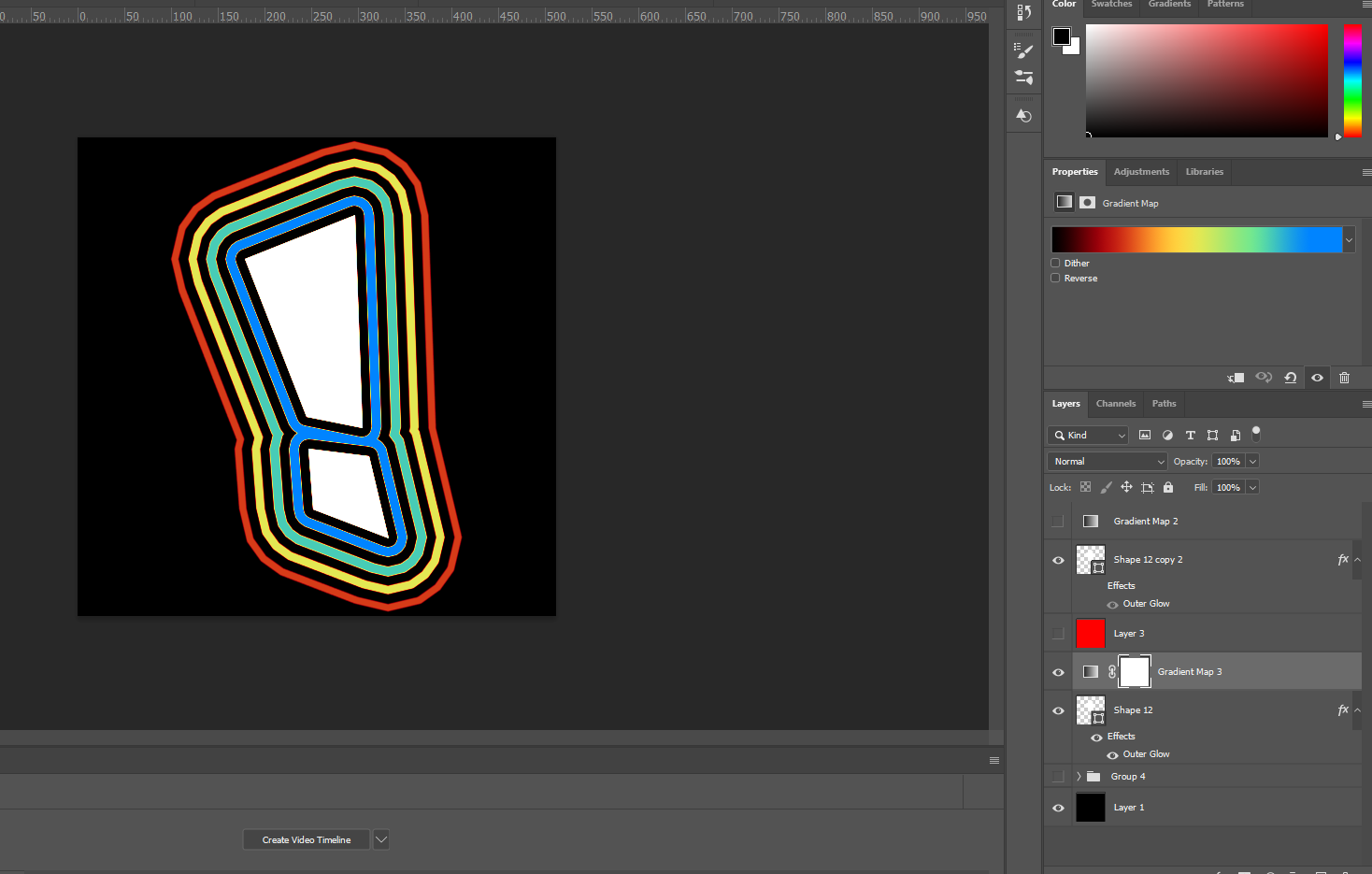
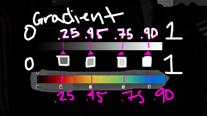
Here is how the gradient works:
The completely black part of the gradient will map to black
(0 in the grayscale texture will show black)
Dark gray will map to red
(.25 gray on the grayscale texture will show red)
Middle gray will map to yellow
(.45 gray on the grayscale texture will show yellow)
Lighter gray will map to green
(.75 gray on the grayscale texture will show green)
Light gray to white will map to blue
(.95 gray on the grayscale texture will show blue)
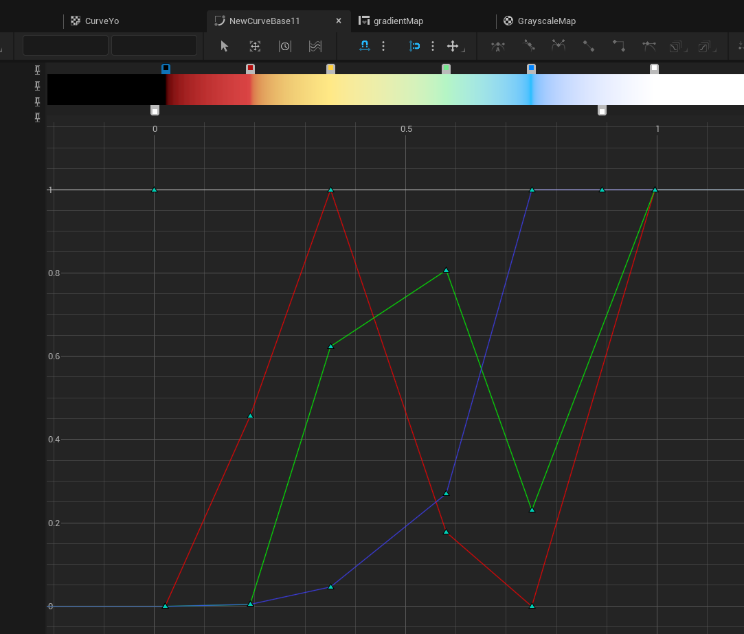
To bring it all together here’s hopefully the most intense diagram in this article:
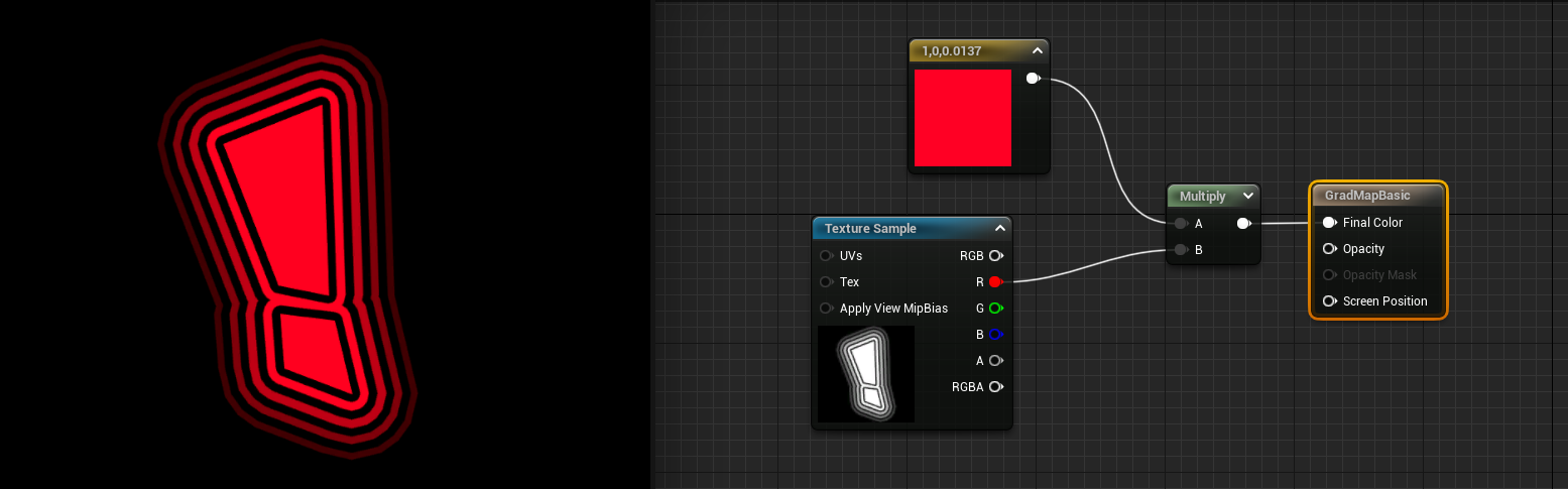
In Unreal if I take this texture in a material and multiply node it by a color that would be the same as tinting or a multiply layer in photoshop:
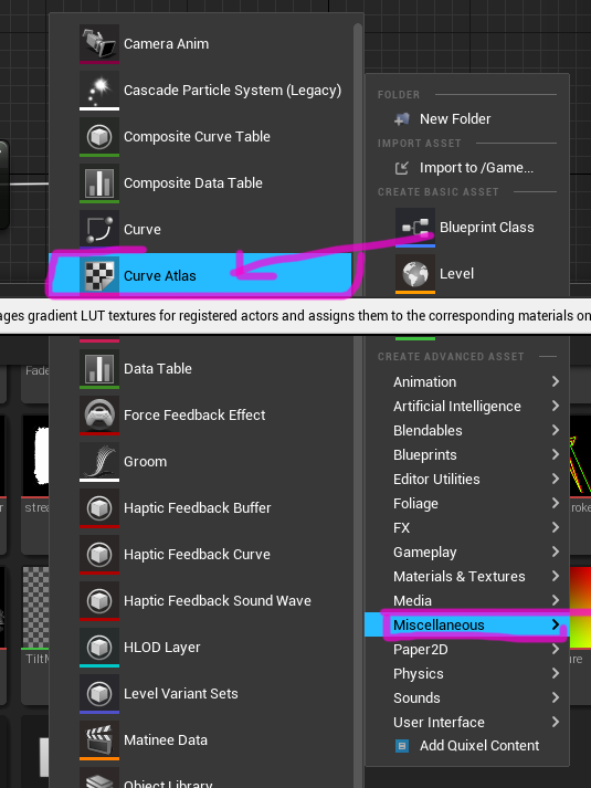
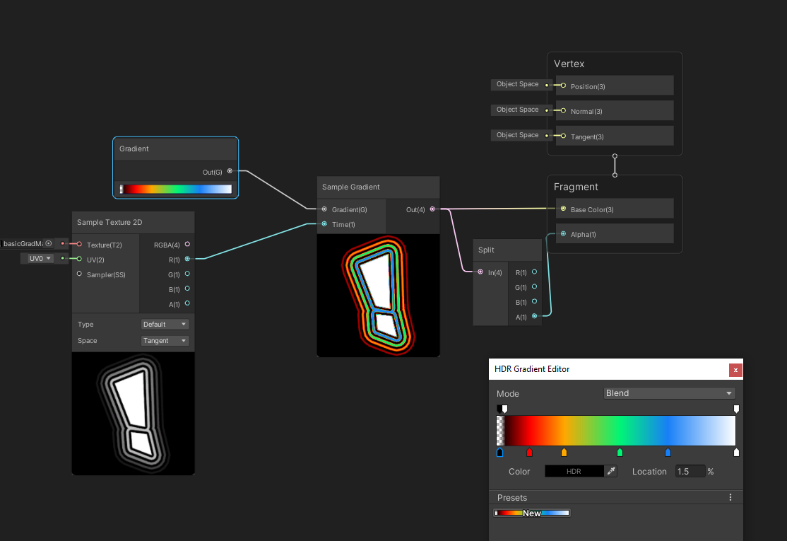
But Unreal can also do a gradient map and to do this one way is to make a Curve Atlas asset
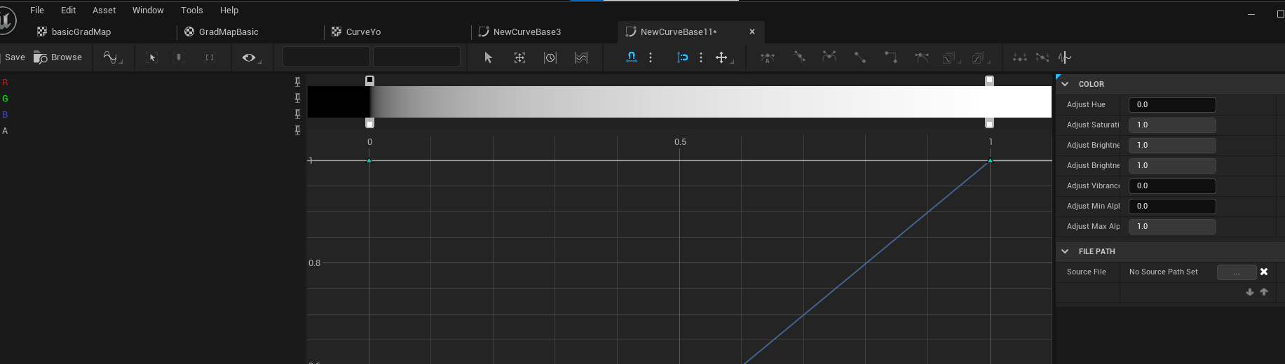
One of my curve atlas assets looks like this:

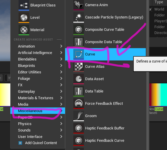
And the curve I want is the CurveLinearColor

Add the new gradient curve to atlas curve texture:


And in this node I can specify the atlas curve texture and the gradient curve I made which was “NewCurveBase11” great default naming...
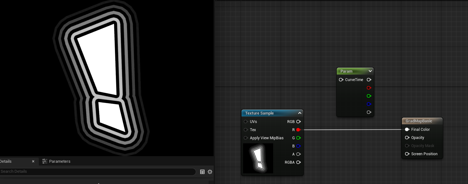
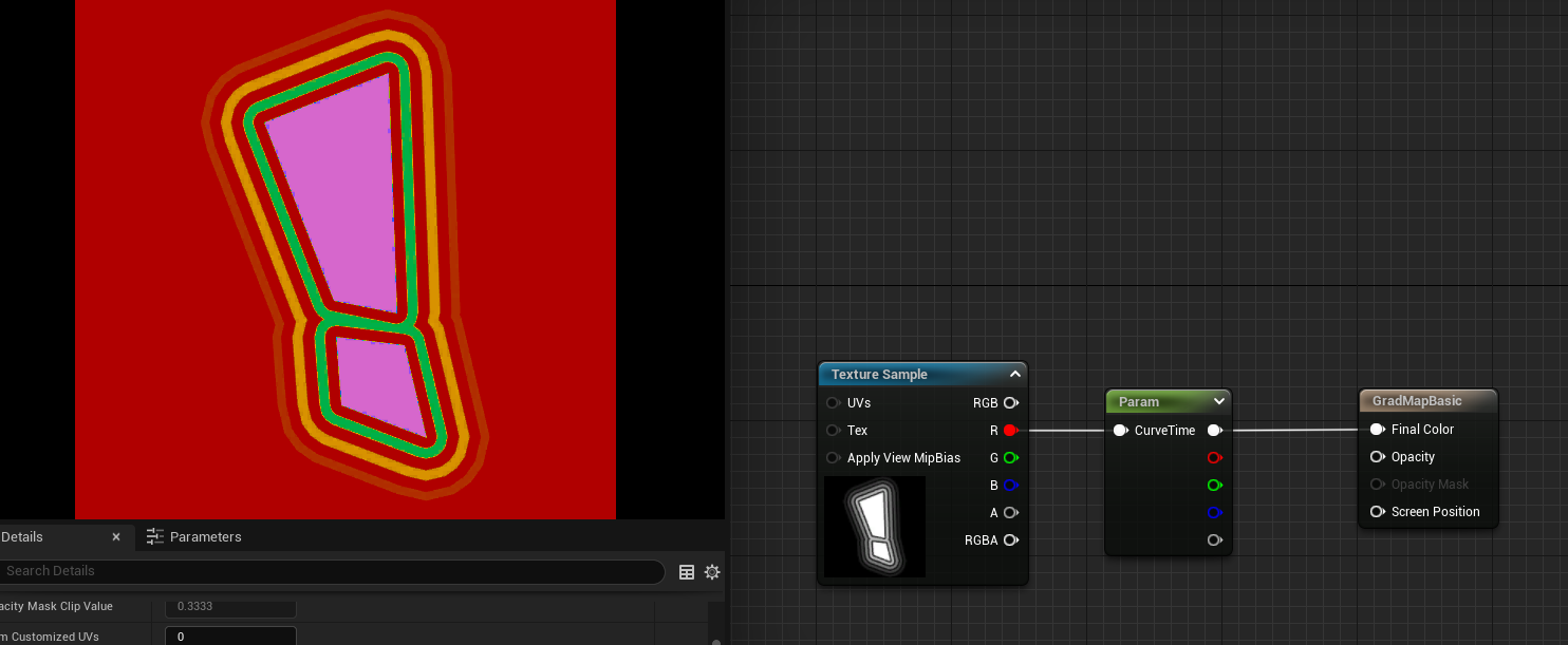
Now I can plug in one of the channels (it’s a grayscale texture so it’s the same texture on R/G/B channels) into the node and output the Final Color
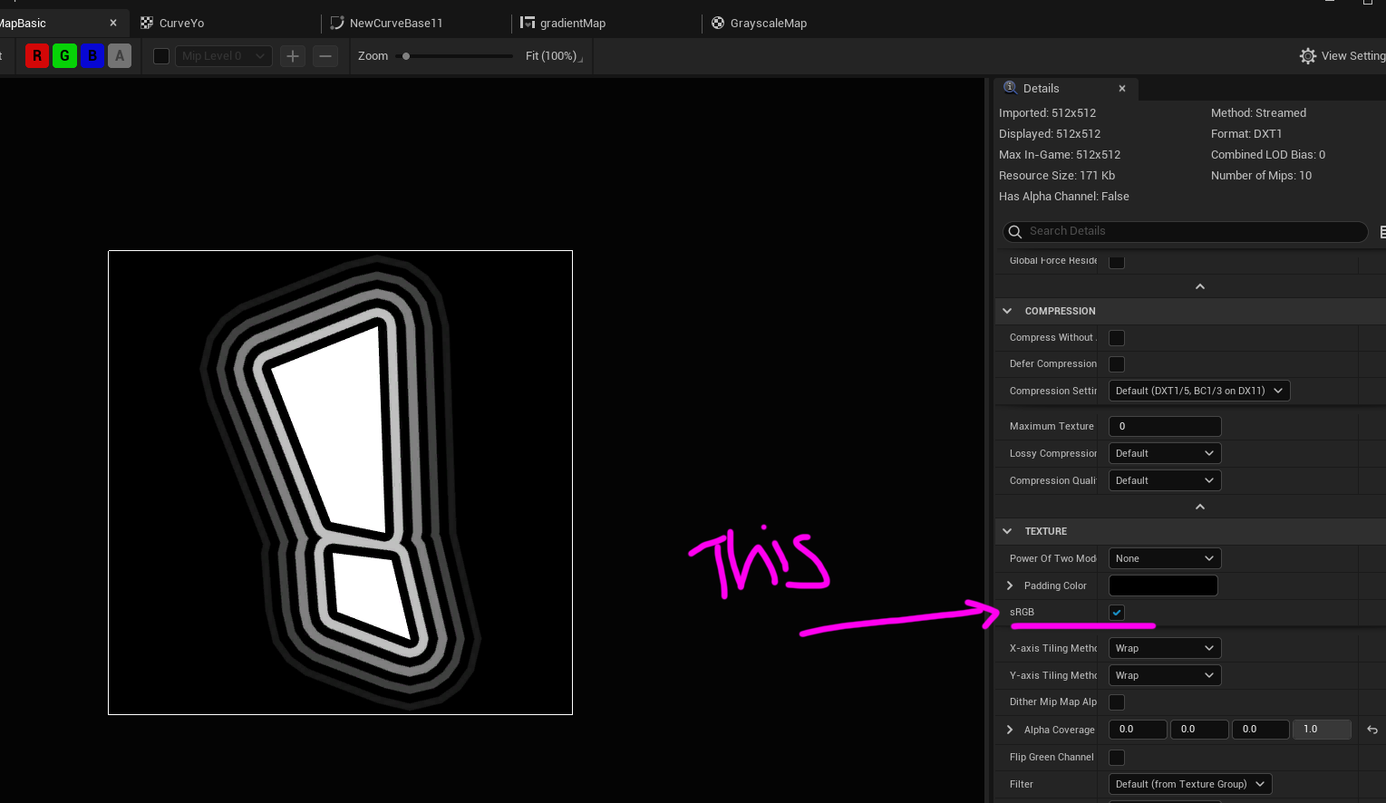
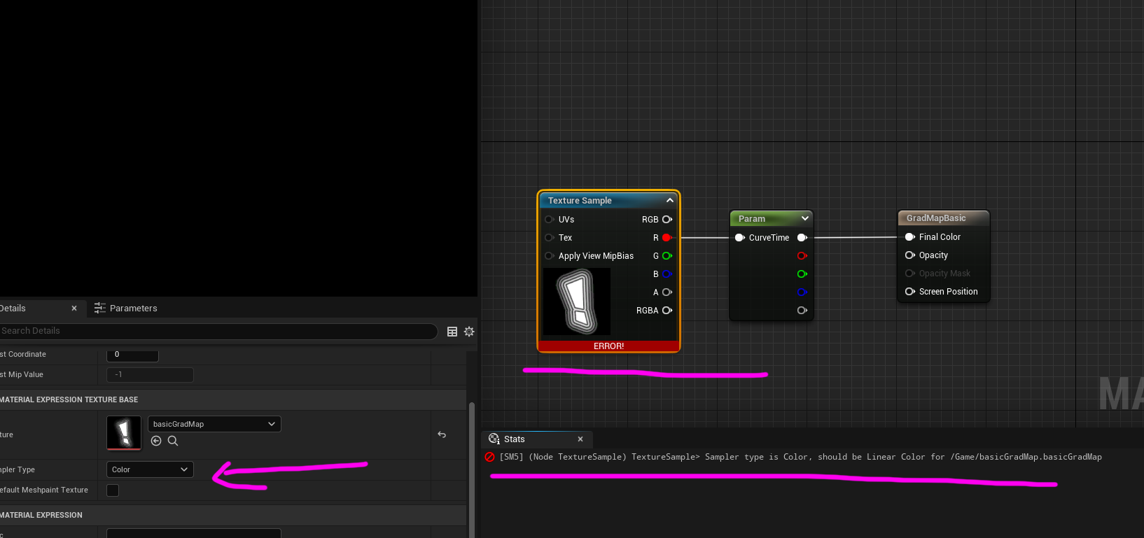
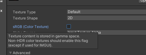
Well it turns out unreal has a sRGB curve it applies to textures so if you want to have the texture the REAL grayscale values you need to turn off the sRGB.
Then it should look as expected:

And where this can be helpful is coloring say buttons:
Then you can do crazy things like animate between the gradient mapped colors or parts of the colors:
Unity Gradient Mapping
Unity is pretty lucky as it’s got a gradient node that plugs into a simple gradient node where the “time” input will be the texture and the gradient is the one I made
I’m assuming more tests on Unity per device to see if this is true for sRGB unchecked out of principle to make sure the grayscale values are the same ones that came from Photoshop or whatever software created the texture, but feel free to ignore that or not depending on what results you the reader might find.
GRADIENT MAPPING
Without an Atlas Texture - Unreal
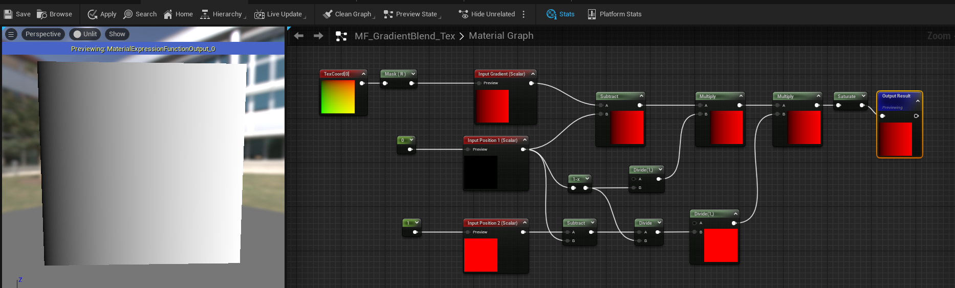
Sometimes, and it’s most of the time, I wont use the Curve Atlas Texture for my gradients in UI shaders. And that’s because instead of making the Altas and Linear Curve and adding that curve to the atlas row I have a material function instead and pack all that information in the shader. Now the benefit this might have is not needing to sample that Atlas Texture, but if you plan to have lots of gradient curves then sampling that texture should be no issue in the pipeline. But as a one-off ocassionally needing a couple gradients I tend to use my material function instead, however it’s less visually intuitive for artists to work with. My function is based on this blog post about gradient mapping, I highly recommend folks read through that as it’s super detailed and explains a lot.
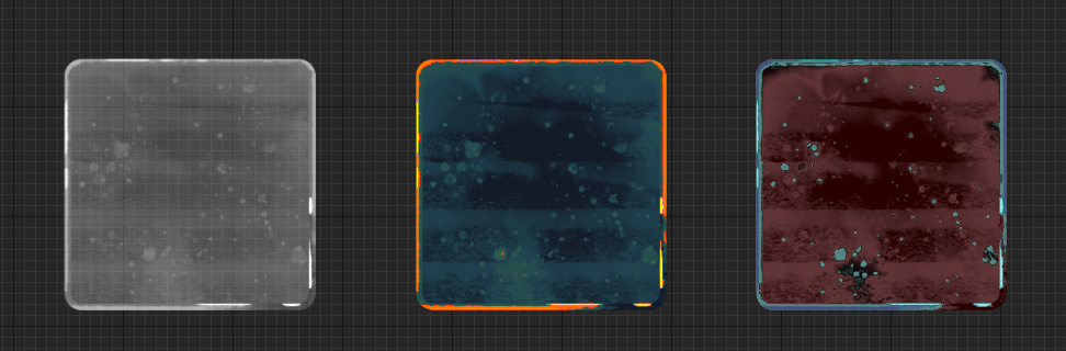
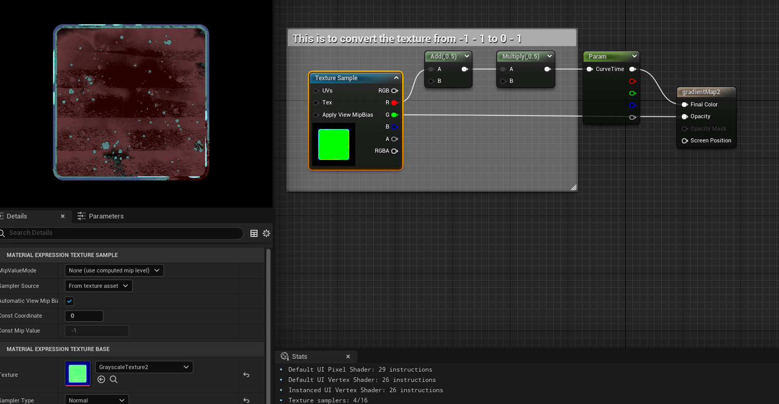
Here’s a gradient mapping using that function it’s called MF_GradientBlend_Tex and I put in the “position of color 1” and “position of color 2” as their own parameters so I can control them and of course the colors, then you pass the lerp of A/B and the alpha is the result of the gradient.
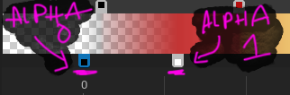
Again I’m using a texture with BC5 compression which I need to remap the values back to [ 0 - 1 ] instead of [ -1 - 1 ]and that’s with the multiply .5, and add .5 are doing. If you are not channel packing and using BC5 compression you can skip this step.
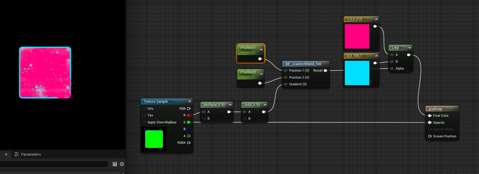
Here’s what the MF_GradientBlend_Tex function looks like:
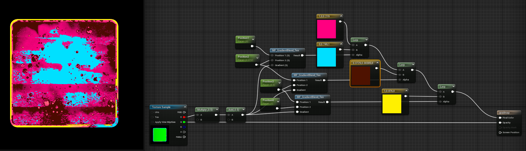
And it can support endless colors by adding more of the function with lerps:
You could also add in some easing at the end of the function to play with gradient maps using different kinds of easing. I took some easing formulas from this site here, and plugged them into custom nodes and tested them:
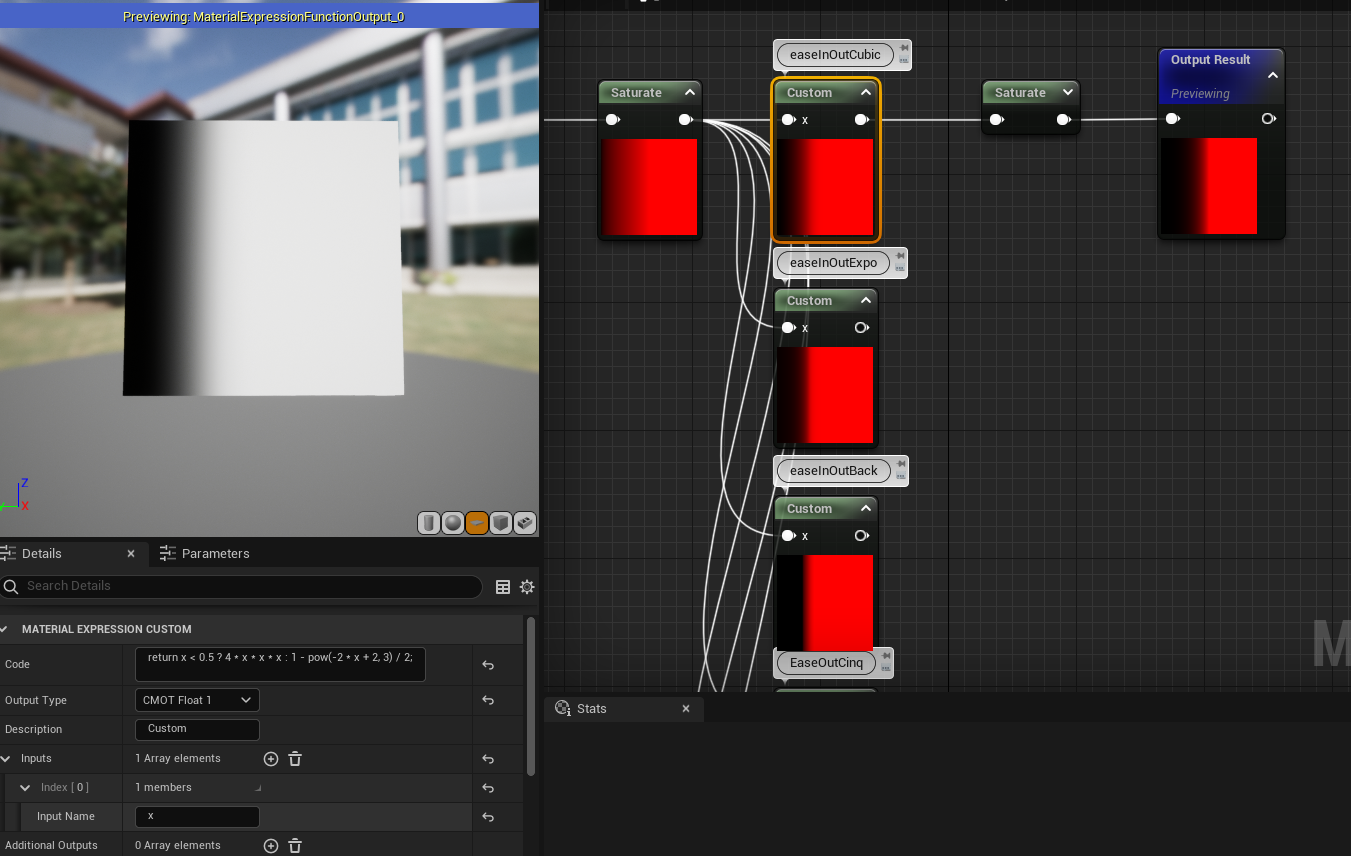
UPDATE - Literally a day later I see this awesome tweet talking about only one function that can do a lot of basic easing and I put it as a custom node and only ONE node which is great
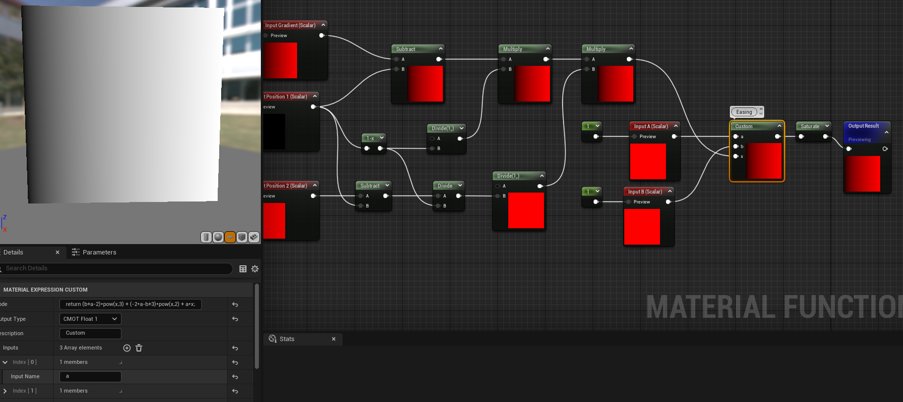
This is the forumla: return (b+a-2)*pow(x,3) + (-2*a-b+3)*pow(x,2) + a*x;
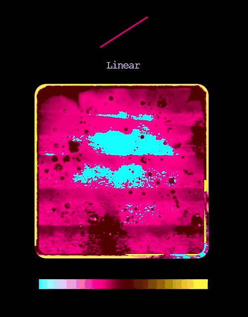
Using that formula I can make a bunch of easing curves and only use one custom node and so here are some examples of the curves it can make:
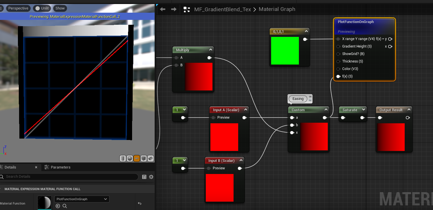

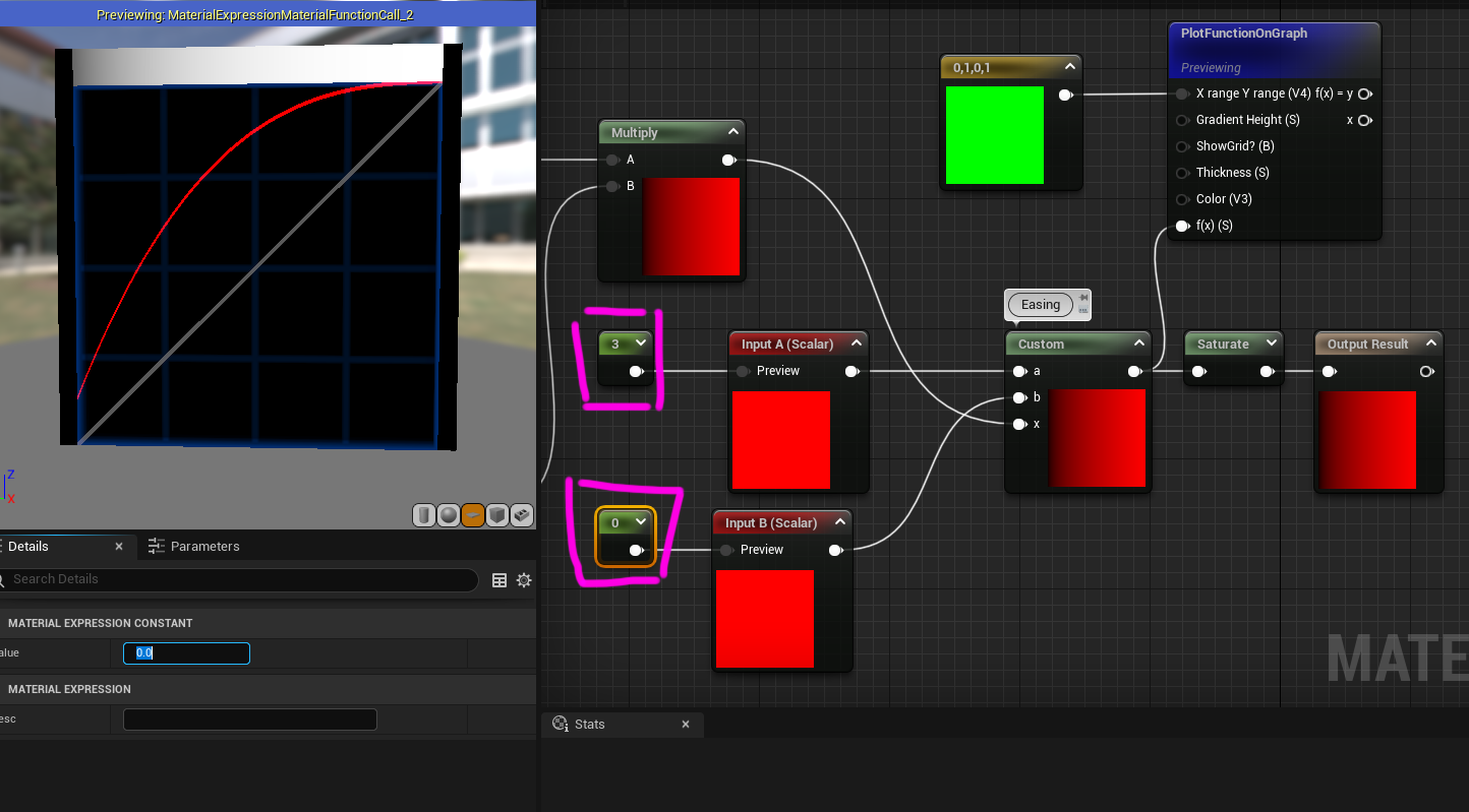
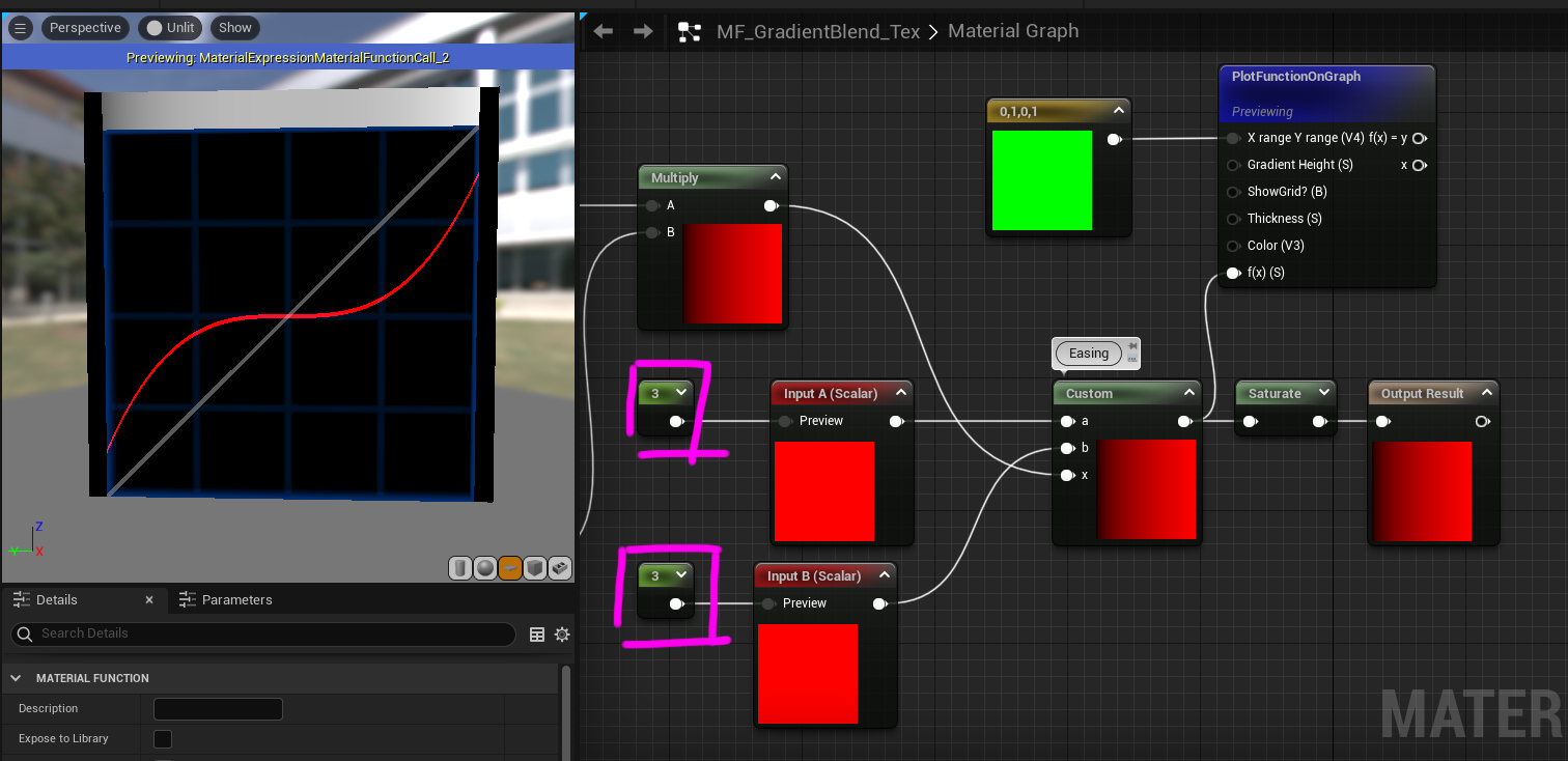
Just by changing A and B parameters it can change the gradient mapping + easing and thus get the results seen earlier much easier and more options as well.
So that’s gradient mapping (let’s hope I don’t get another update) but wait... there’s more... what.. about highlights? Animations? And other things we can do to the texture now we have a grayscale map of it!?
Now this isn’t the end of gradient mapping but as I’ve been sitting on this tutorial for 7 months I think I’ll do a part 2 later... where I showcase how to do various animations on icons using gradients:

Tech Art Chronicles: UMG Tips and Tricks
Unreal’s UMG doesn’t have much documentation or examples so here’s what I’ve learned so far.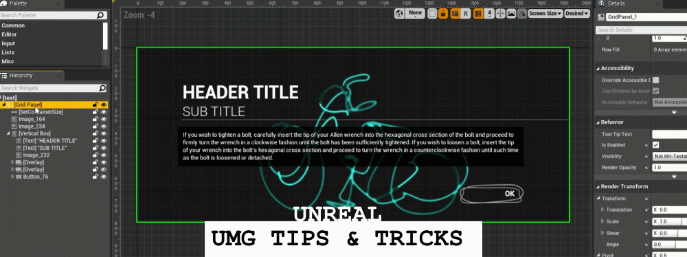
I’ve spent maybe the last 9 months learning and understanding UMG and it’s not intuitive off the bat if you did not learn web design along with absolute vs relative pixel layout spaces. Ontop of that the widgets they provide you to design with are often super robust or simple or over designed and inflexible. So I wanted to just record down a bit of tips and tricks that helped me navigate UMG well. This wont be a full blown tutorial of all the ins and outs of UMG but hopefully this is more for those who are just beginning to design with UMG or for those who have been in it for a while to pick up some useful tidbits of information.
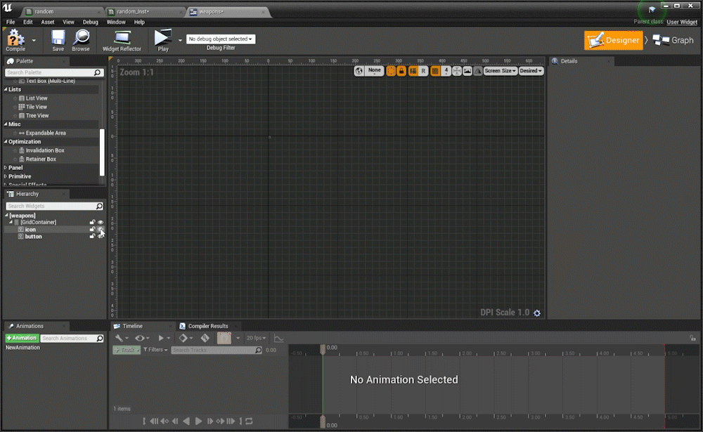
TIP 1: Container Widgets
Container widgets only take up layout space to the largest thing inside themWith UMG widgets I see 2 kinds of widgets normally, ones that take up layout space such as images/text and the containers that hold these widgets such as grid/overlay/horizontal and vertical boxes. Note Canvas is a weird widget and I generally ignore in all of my layouts until the very end. To get the hang of designing in UMG just remember that a container will only be as big as the largest widget inside it.
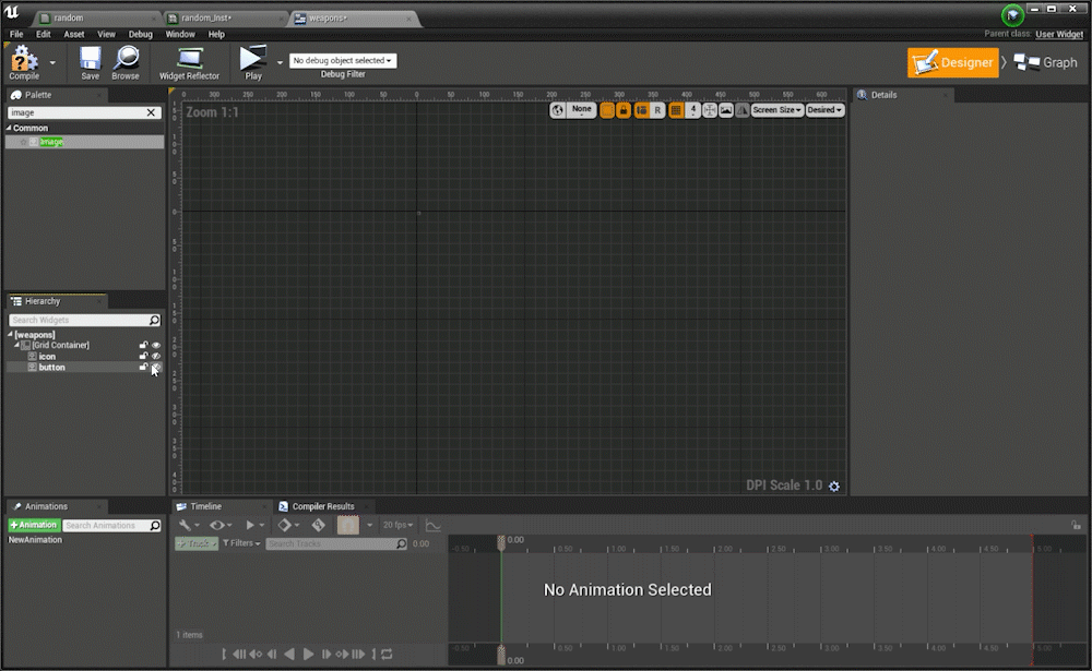
The grid container here is only as big as the largest thing inside, so it’s 0x0 pixels then the icon gets turned on the grid becomes 256x256 pixels in size, and even when turning on a smaller sized image it still stays at 256x256 because the layout depends on the largest thing inside. I also use grid containers more like smarter overlays I rarely use the row/column features
Most of the time when I’m working I see lots of crazy layouts including multiple size boxes and canvas nested in another canvas and all these other ways to try to control the layout size. These then become fragile and overly complicated widgets (that also have bad performance) because the designer/programmer is wrestling UMG’s core desire of a container to be the size of the largest thing inside. It’s very much like web design and divs, a div is only as big as the screen percentage it renders at OR the largest thing inside a div taking up space.
These are some examples of the widgets I use on the regular:
Container Widgets
- Grid
- Overlay
- Horizontal Box
- Vertical Box
- Scale Box
- Grid
- Overlay
- Horizontal Box
- Vertical Box
- Scale Box
Layout Space Widgets
- Image
- Text
- Progress Bar
- Button
- Spacer
- Size Box
- Image
- Text
- Progress Bar
- Button
- Spacer
- Size Box
Now vertical and horizontal boxes are a tad bit different as their layout space is the SUM of the content inside them either in the vertical Y axis or the horizontal X axis
The vertical box container here is as big as the sum of the Y heights of all objects inside, so it’s 0x0 pixels then the icon gets turned on and it becomes 256x256 pixels in size, and then turning on a smaller sized image it still stays at 256x256 + 128x128 so now it’s a container that is 256 + 128 in the Y and 256 in the X.
Container is now: 256x384
Container is now: 256x384
TIP 2: Negative Padding
Now that containers are the size of their images/text inside how do you get around power of 2 textures? Negative Padding should allow you to change or adjust layout sizes and maintain your layout space.The next puzzle to solve is if you’re using power of 2 textures in your UMG (which is arguable you probably should) And say you’ve got a button with a hit area of this texture and the texture has white space and isn’t flush to the edge? The trick is to negative pad your button to compensate for the blank space in your texture.
I’ve got a photoshop PNG made of a button and then I put that into my button widget inside a grid container and it’s now got this hit area that’s much bigger than button itself:
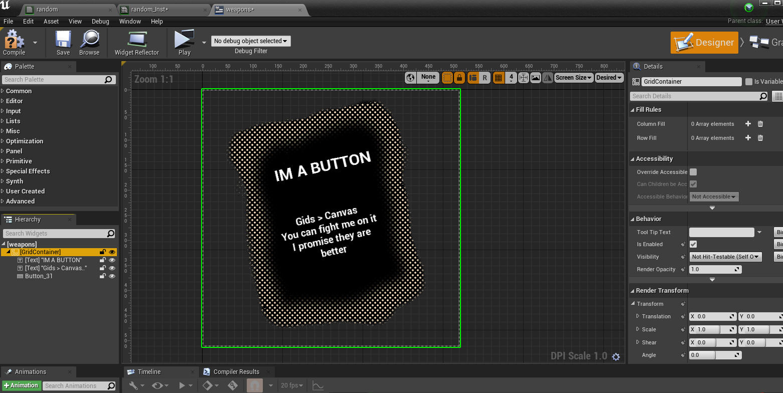
To fix this in the layout I’m going to NEGATIVE pad the button to make the overall container tighter around the power of 2 button texture that is 512x512.
First thing’s first I’ll show off how you can have pixel perfect accuracy in photoshop with a hit area:
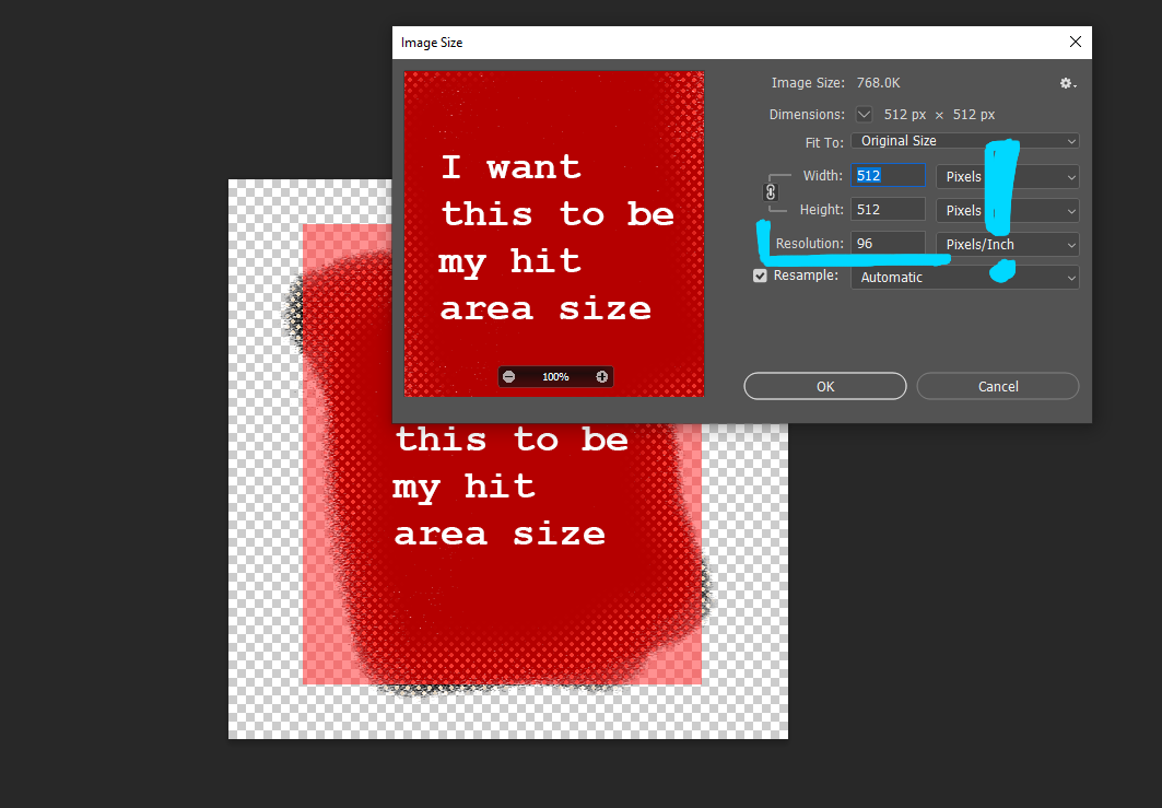
You want to make sure your photoshop document is in 96 DPI this is important because SLATE is at 96DPI and not at 72 therefore none of your pixel coordinates will be 100% acurate at 72. What does this mean for your layouts!?? Well if you set a font size to like 33pts in photoshop at 72 DPI it will not be the same font size you need to set in Unreal at 96DPI, instead 33pts in photoshop at 72 is 24.75pts in photoshop. This also is true for say pixel perfect anchoring, like if you know in your photoshop file from the edge of your document up 100 pixels to have it work in editor the same way you need to use 96 DPI in your photoshop file to match editior. This does not affect images or textures and they do not need to be at 96 DPI (but I do just because photoshop file is set that way) The industry standard is 72DPI for images and if you just know to get pixel perfect accuracy you need to change your photoshop file to 96 DPI but keep the same size (1920x1080 for example keep the same size but change to 96 DPI) you should be good.
Hopefully this is a great summary by a anonymous dev I talked to on this topic:
“The goal of using 96DPI in Photoshop is to be able to measure pixels accurately [from Photoshop to UMG]”
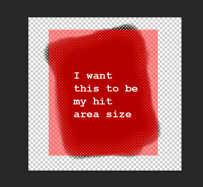
After I make sure my document is 96 DPI I want to measure the bottom-left corner and the top-right corner’s width/height to get the hit area dimensions:
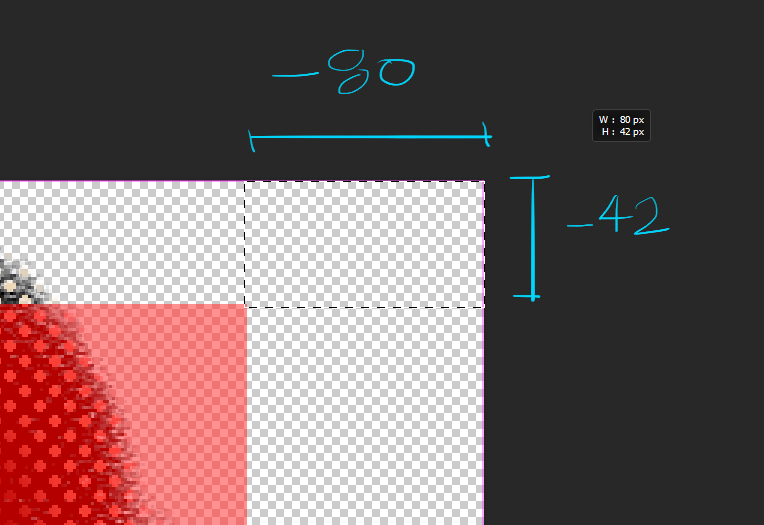
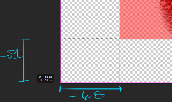
So now when I go back to my padding on my button I can put in these negative values:
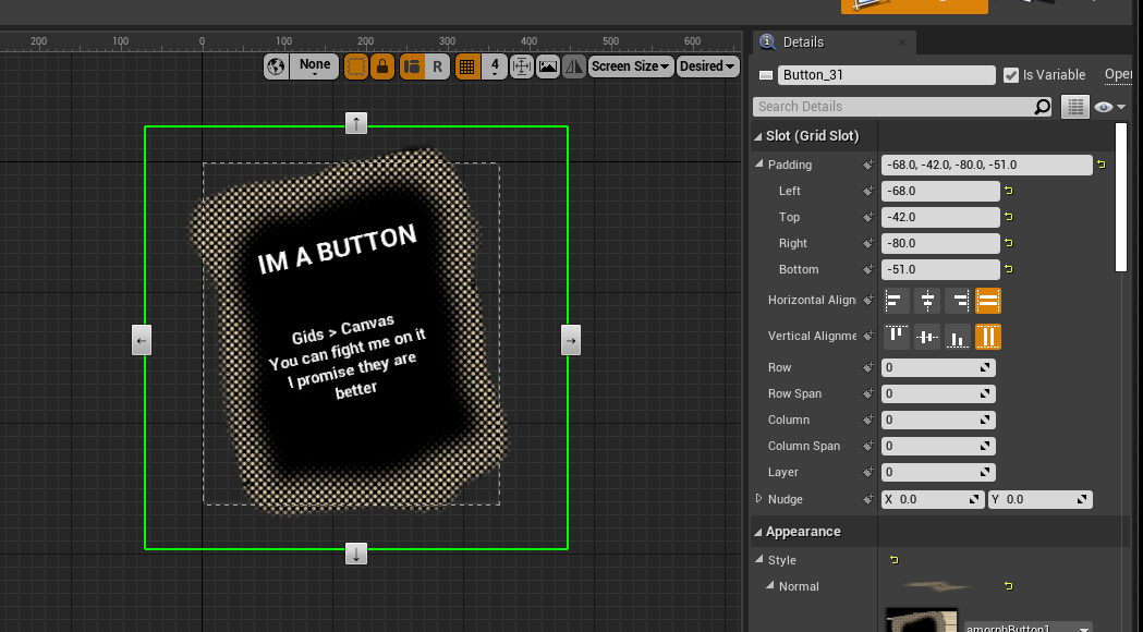
And now my container size is pixel perfect exactly to my photoshop hit area:
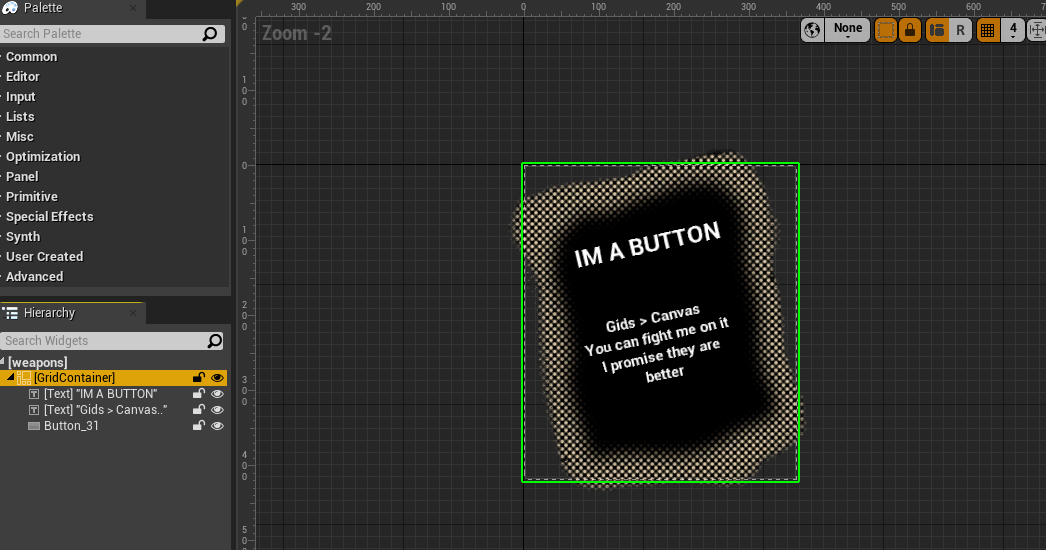
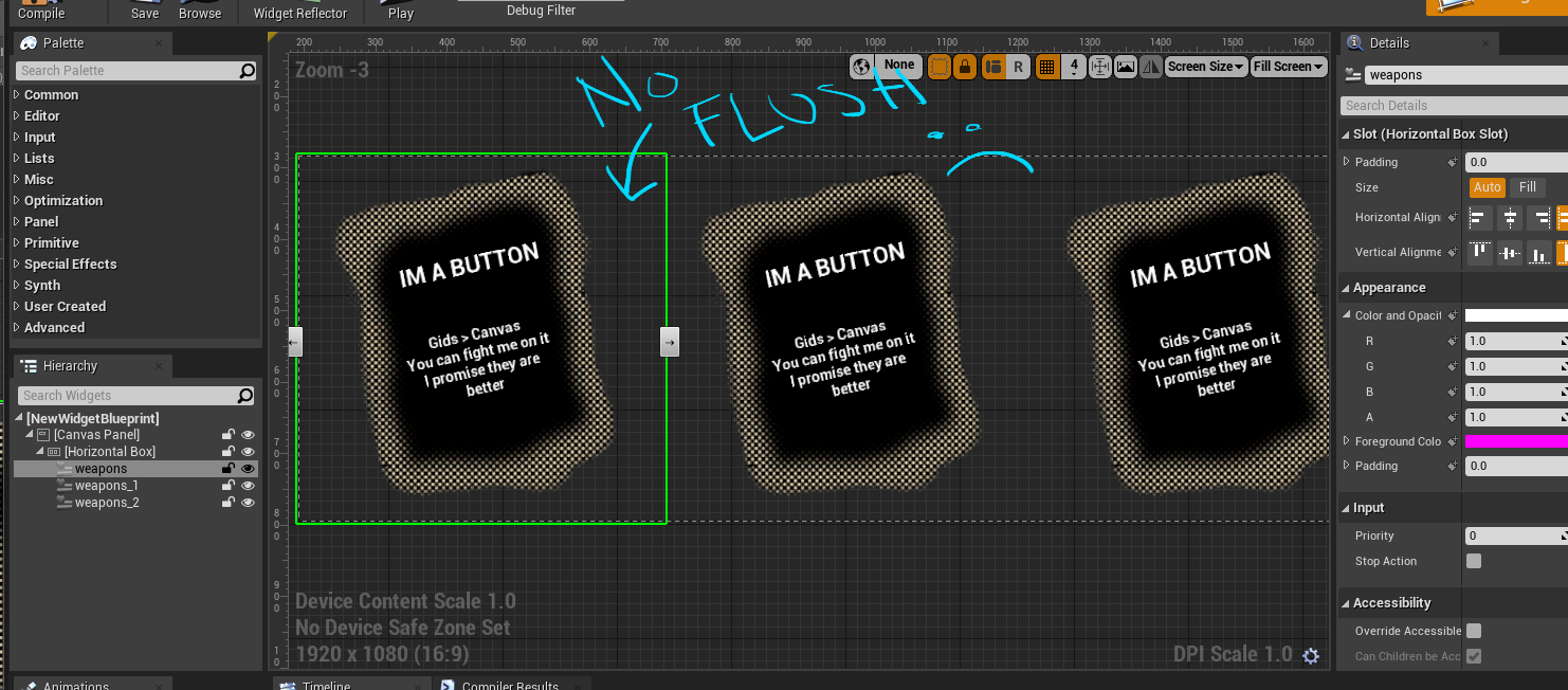
So flush that if I were to nest this widget in another widget and say horizontal stack them they would overlap a bit because Unreal thinks the UMG widget is as only big as it’s container size... and because of negative padding it’s size is smaller than a 512x512 texture. But if you have no negative padding then you wont get nice flush widgets and instead will likely try to force a scale box, size box or canvas size to counteract the texture white space. This costs you more performance, so get the hang of negative paddings and control UMG layouts much better.
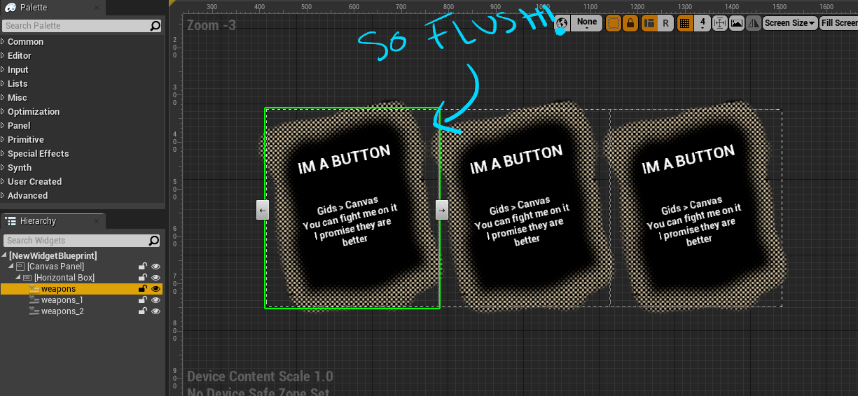
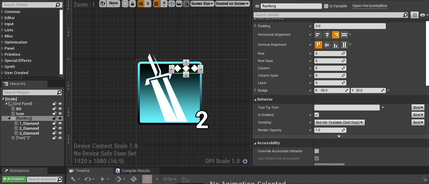
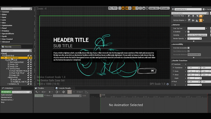
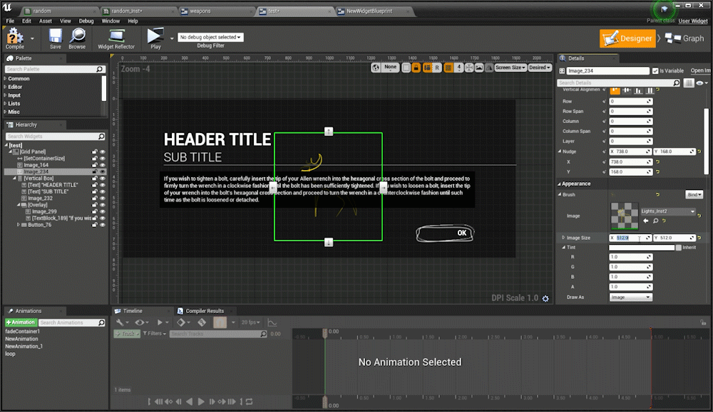
TIP 3: Grid Panels are so useful - use them over Canvas
Grids are the most useful widget in UMGI have a whole twitter thread on my grid appreciation over canvases and it’s because they are really useful widgets with the NUDGE and LAYER you can do a lot of crazy and great things with them. I’mma basically just copy what I posted on twitter but Grids allow you manipulate the things that will or will not take up layout space AND allow you to layer stuff with z-order quite efficiently.
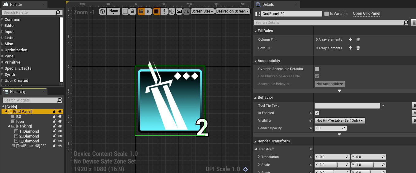
The layout goes like this:
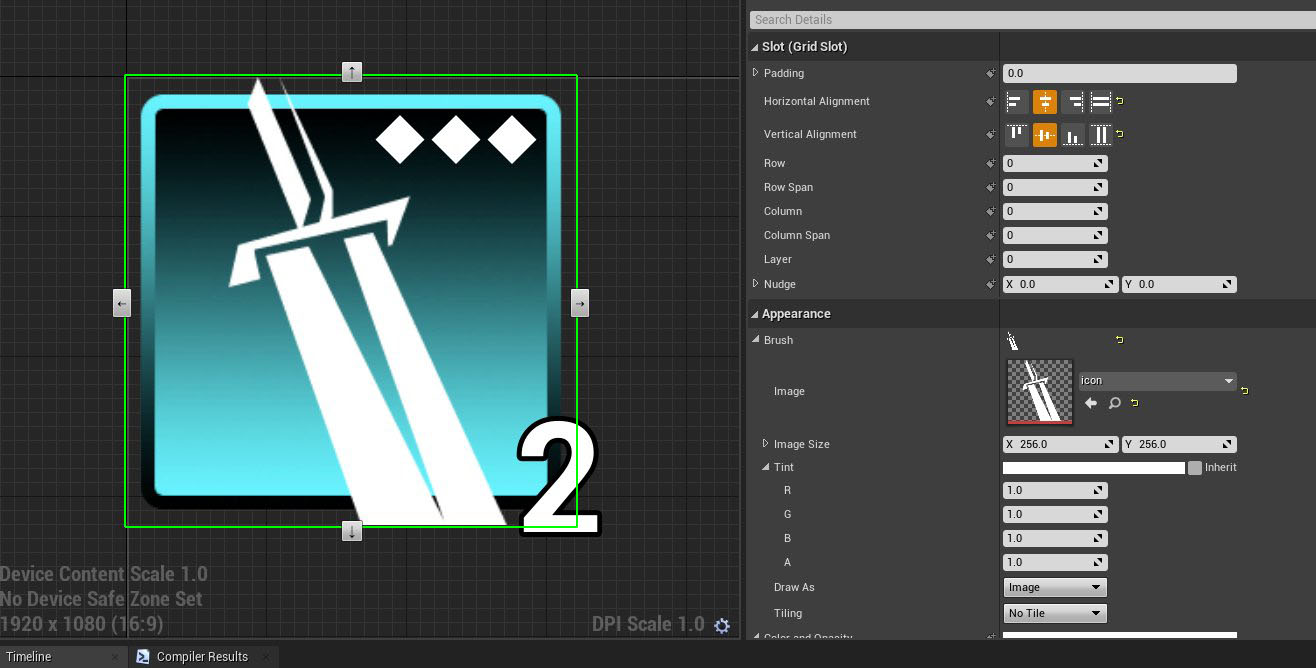
Grid Panel (Total size 256x256)
- BG Image (256x256)
- Icon Image (256 x 256)
- Horizontal Box (Aligned Top Right with a nudge)
> Diamond Image (32x32)
> Diamond Image (32x32)
> Diamond Image (32x32)
- Text (Aligned Bottom Right with a nudge)
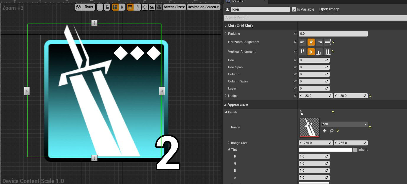
Inside my horizontal box slot for the Grid I’ve aligned it to be top right, and then I counter nudged it to be
-30 in the X and 20 in the Y so it sits super nice in that top corner:
For the text I’ve done something similar but I’ve aligned bottom right and nudged it OUTSIDE of the container by 20 in the X and 30 in the Y.
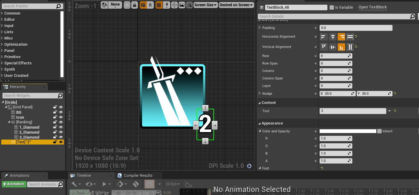
However when you nudge with the Grid container you do not take up layout space therefore my “2” is super flush when I load them together in a horizontal box:
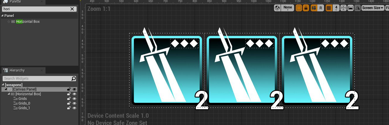
This is also how I got the icon to extend past the border of the background, I nudge negative up and negative to the left and now I have a dynamic layout that’s always 256x256 but peaking outside the layout calculations are my “2” text position and my icon sword’s top position.
Use Grids as like a smarter Overlay widget where you can control the z-sorting independently with Layer AND you can use Nudge and alignment to place anything anywhere inside/even outside your grid widget.
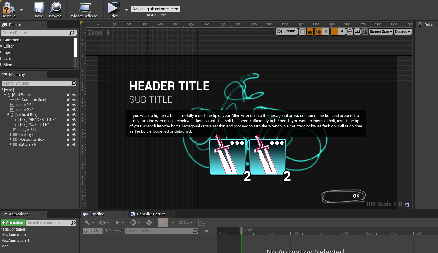
TIP 4: Use Wrap with/Replace with
UMG has this handy wrap with and replace with, use it often to try out new things in your layoutUMG layouts are a constant trial and error of wrapping/replacing containers with other containers and testing out your layouts. So use the handy “Wrap With/Replace With” often to keep the same slot settings but trying out different containers quickly and effectively.
When you want to get rid of a widget use “replace with child”:
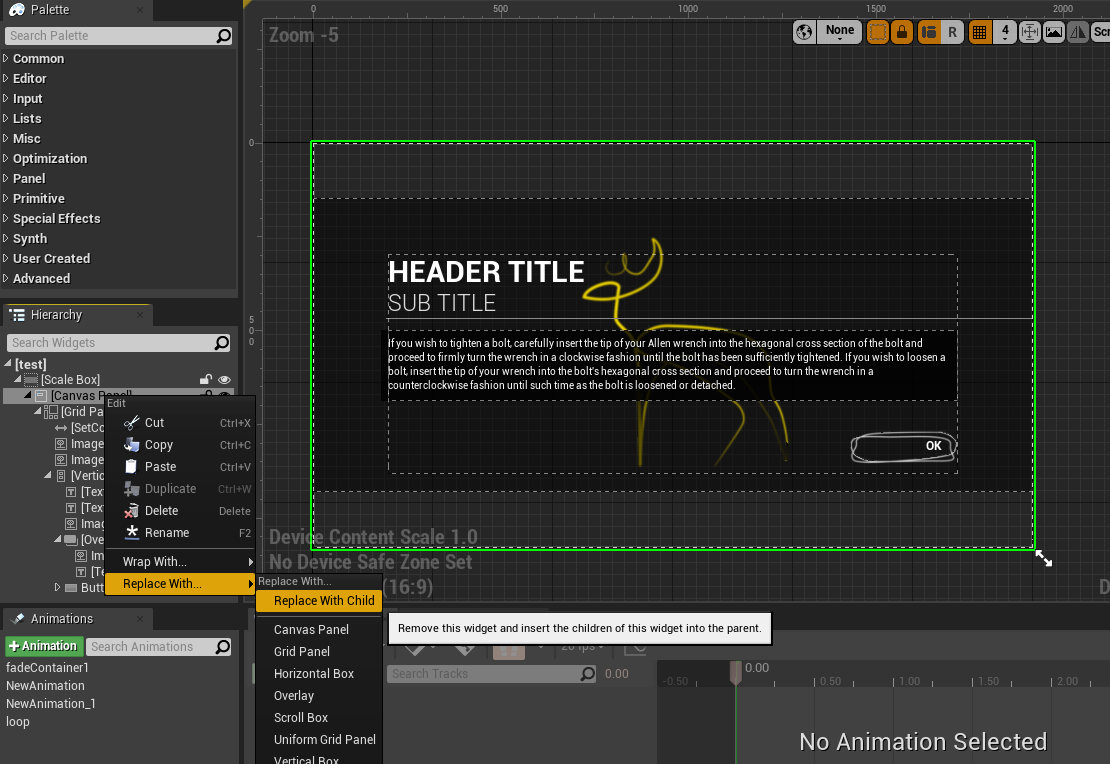
I can easily replace my canvas and scale box without messing up my layouts too badly and work quite effectively:
The same goes for “wrap with” and “replace with” you can quickly change any kind of layout container to use what you want:
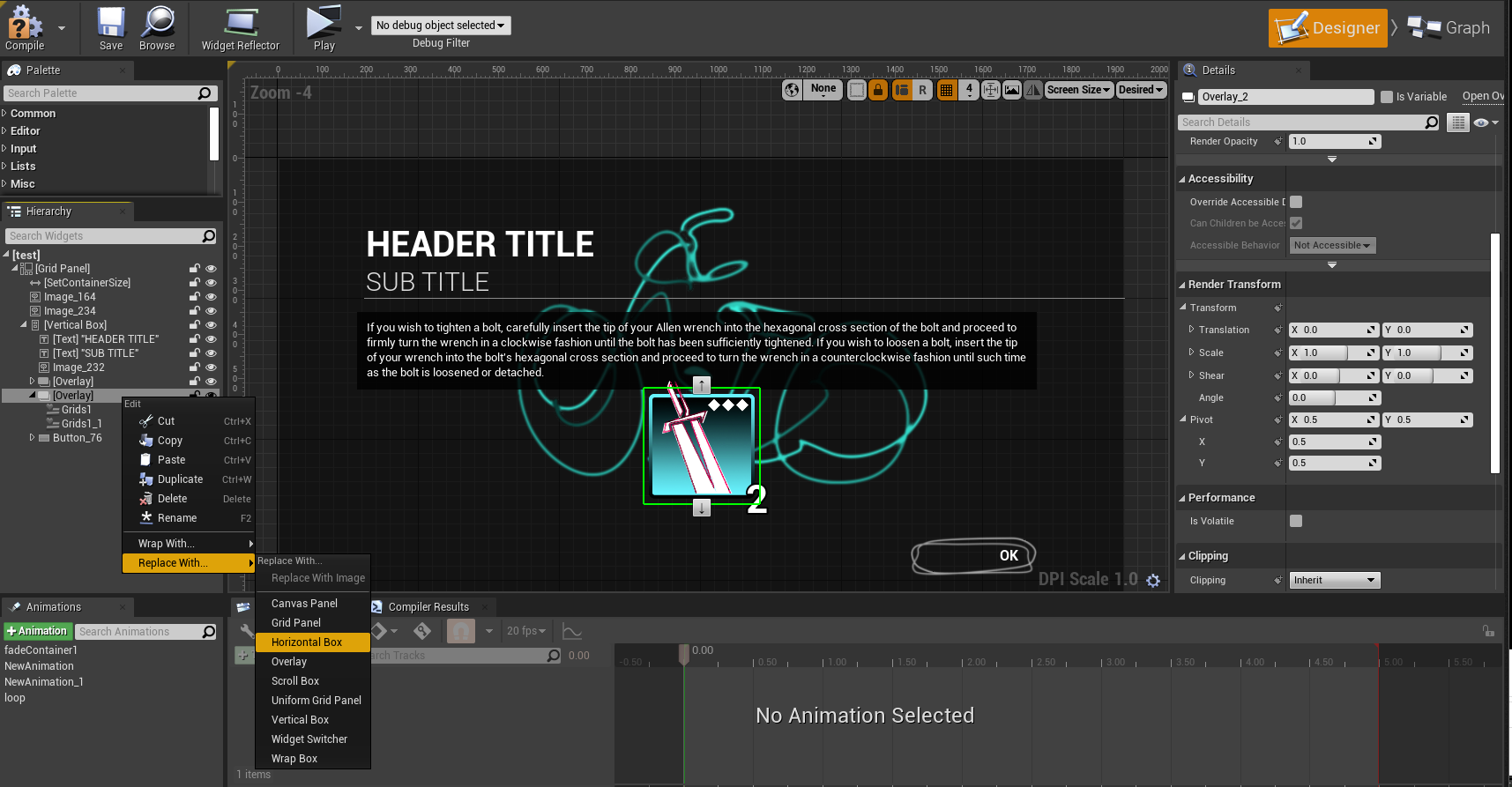
Using these should quickly speed up your workflow and allow you to adjust your layouts quickly and test out all kinds of containers and layouts.
TIP 5: Render Transforms when to use them
Render transforms are quite useful when you want to scale/size/rotate/pivot something but do not want to change your layout size.UMG has a useful bit of settings called Render Transforms and these are what UMG wants you to animate with. But they also can be useful for modifying your layout but not changing your rendering layout scale. Take for instance here I have a layout where I want to scale up this image that’s a material I made:
I can attempt to scale it by changing the image size:
But that will ultimately scale my entire widget size because again a container is only as big as it’s largest thing inside of it. The same goes for using a scale box or even size box because those widgets take up layout space therefore my layout will get larger if I scale up the image in that way.
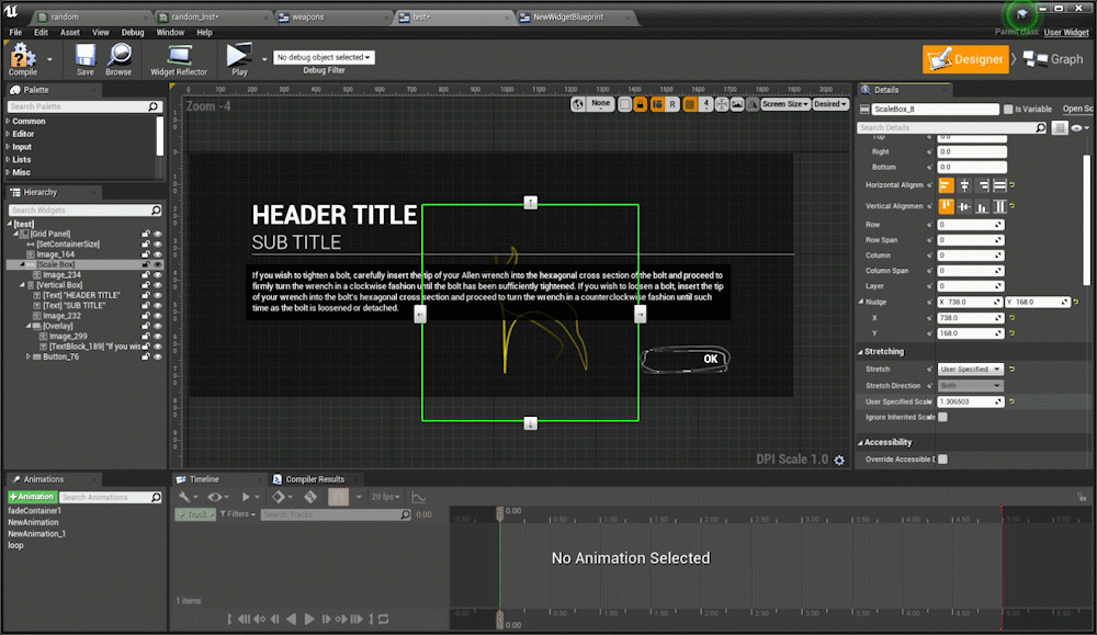
Scaling via a Scale box set to user specified
Then of course people then want to use canvas widgets for a scale but that’s not necessary because UMG has a way to scale/rotate/translate things without changing the layout and that’s through Render Transforms. So if I scale this image via render transforms while UMG “thinks” it’s image size is 512x512 in the layout size calculations it’s actually rendering it at 1024x1024.
This is also how the UMG sequencer animations work they use the same transforms so you can animate and not change your layouts/positions. This all goes back to understanding UMG’s layout calculations, what is your container size? Do you need to use render transforms to avoid changing that container size? Or do you want your widget to take up layout size space? Mastering when and when you do not want an object to take up layout space will make quick work of having more flexible and modular UMG layouts.
Here are some videos discussing some of these topics and more I’ve made as a test template for video content:
Tech Art Chronicles: SDFS - Part Two
Distance Fields
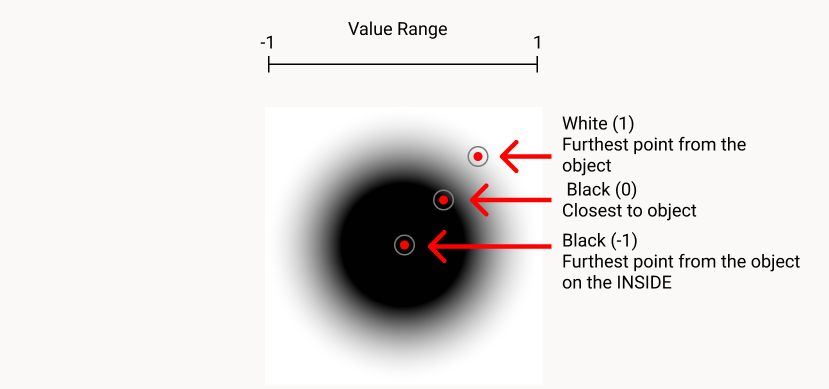
There is no S in SDF without the Distance Fields!In the PART1 of SDF tutorial I covered texture distance fields and how they mostly aren’t “signed” because they aren’t negative values without re-mapping some ranges. That makes sense and the effects still you can make some amazing things with textures like this:
That’s cool but how do I get the crazy math generated signed distance fields and not need to use textures to make our distance fields at all? Without textures, math SDFs can do amazing gradients/crazy animations/add/mask:
The examples below will work in Unreal and Unity and I will try to show off both of the engines. I also will reference Adobe products but none of these are necessary to understand the concepts below.
Math Signed Distance Fields
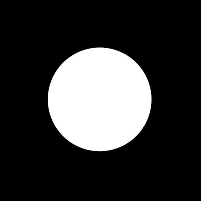
Let’s start with a basic circle
Signed Distance Fields as textures are quite useful and do cool things but perhaps the more interesting concept with SDFs is replacing textures with pure math instead! Say for instance you wanted to have a nice circle background for some icon. The classic approach might be to make a circle in an image editor like Photoshop, save it out as a texture, import that texture into the engine, and place it under the icon. However, there is a way to use MATH to generate the circle instead. The benefits of creating SDF visuals in engine include the flexibility to change size/gradient/animations/strokes and much more. So let’s start that circle example.
In terms of all things SDF, I head over to IQ’s website as it’s an amazing resource for SDFs that include the equations to make all kinds of shapes. But for the example sake say I wanted to generate a circle, that’s pretty easy if you look at IQ’s 2D primitives and the first shape is a circle:
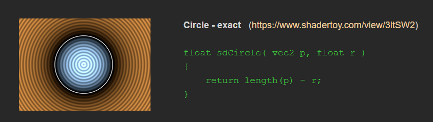
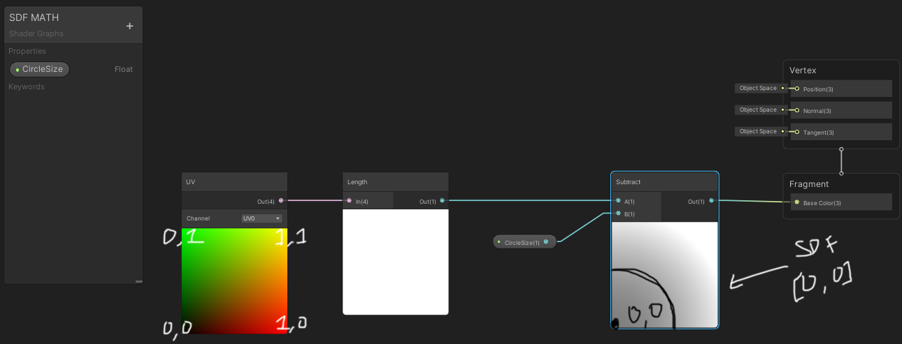
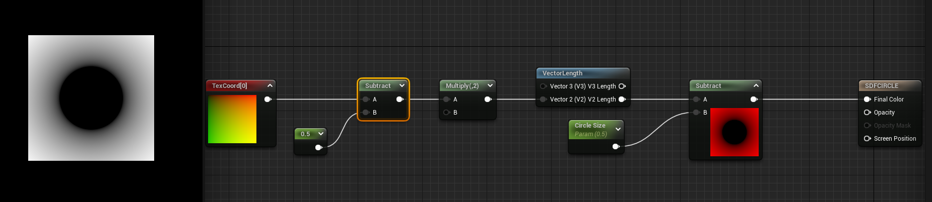
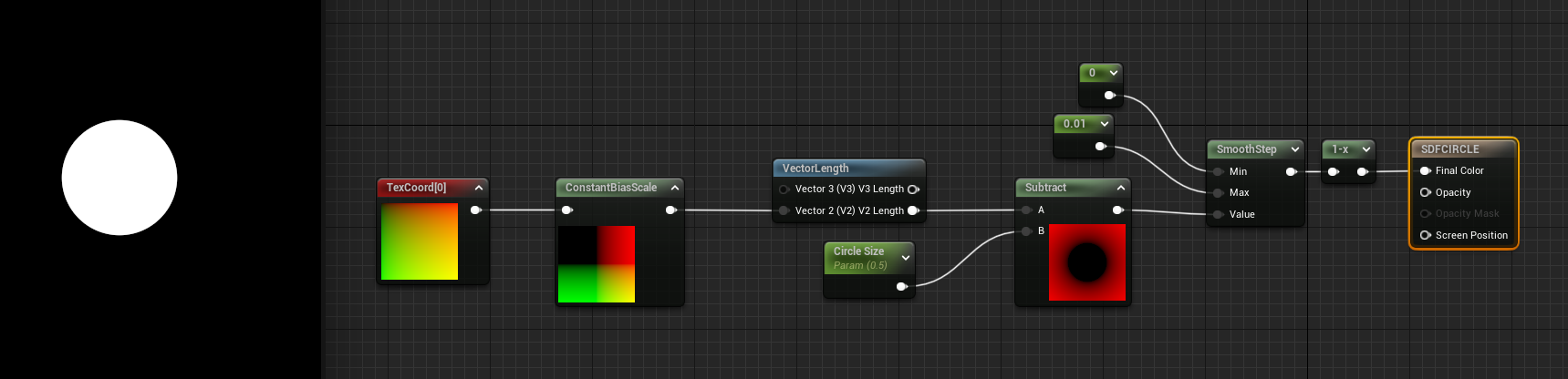
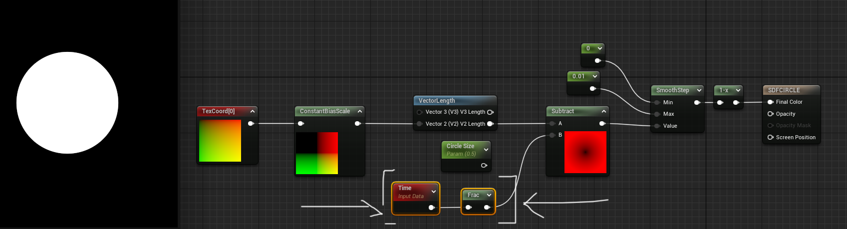
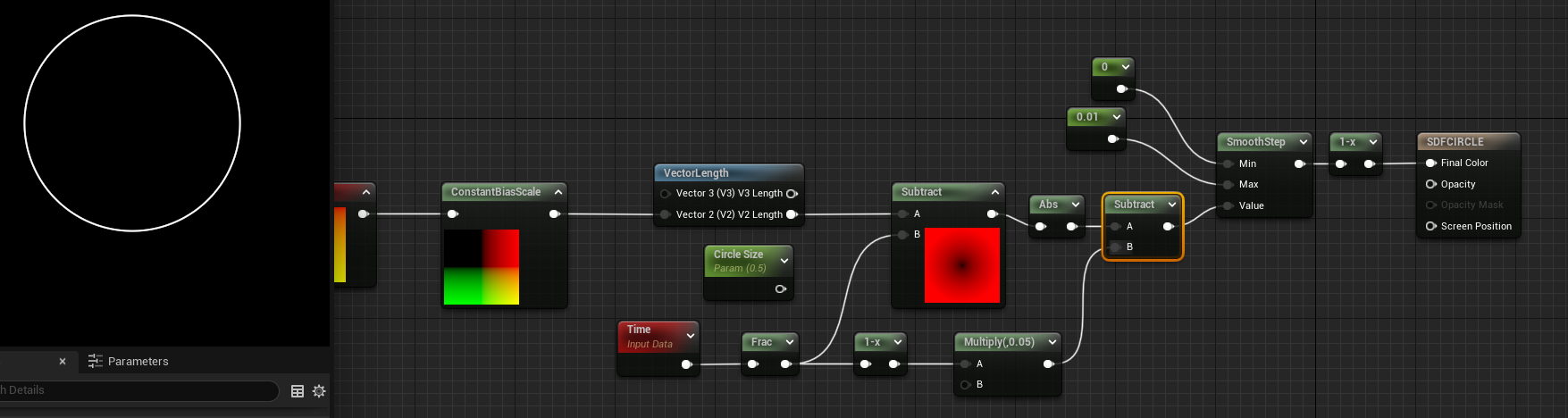
Now to translate this equation into Unreal or Unity, you don’t even need to make a custom HLSL node though I’ll go over that later. With an equation this simple I just need to take the length of the UV in IQ’s equation the UVs are always called vec2 p and subtract it by the size of our circle r.
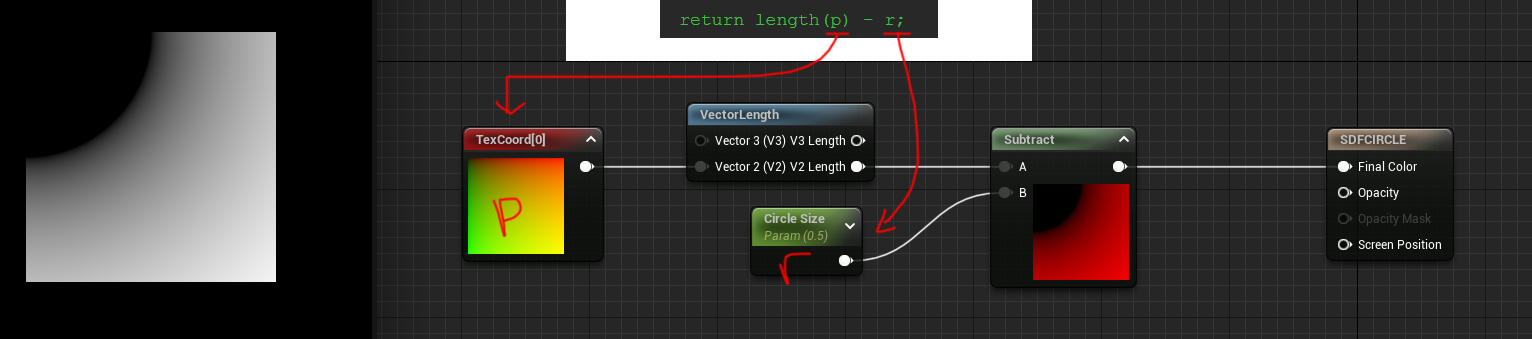
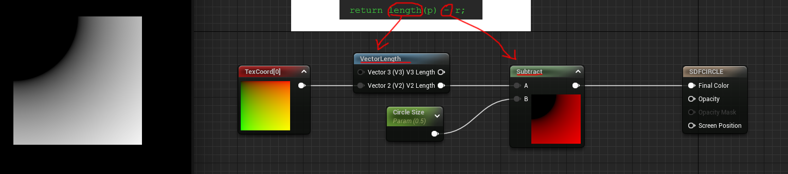
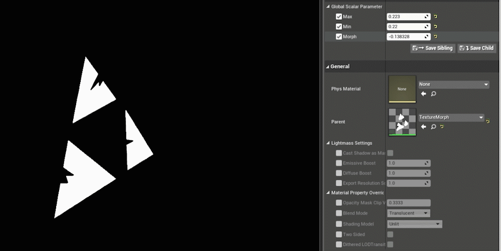
I took that equation from IQ and broke it into nodes in Unreal. P is the TexCoord[0] then take the length and subtract a parameter I’m calling Circle Size and that makes me a circle.
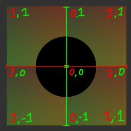
BUT there’s something wrong, the circle is actually in the top left corner and not in the center of the material. That’s because the coordinate system is in the wrong range. I’ll draw a really crude diagram to demonstrate this:
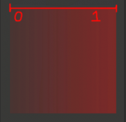
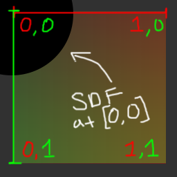
The X axis on this diagram here represents is the RED channel and Y axis is the GREEN channel. So based on this graph the SDF is drawing it’s center at [0,0] and drawing it’s radius at .5 (our circle size) from the center. NOW for fun we can look at Unity here and you can see Unity has the Y coordinate flipped so it’s always drawing [0,0] in the bottom left:
So Unity draws the circle SDF a little bit different, it’s actually showing it in the bottom left and not the top left like Unreal. Because if you look at the UV coordinates they have the Y-axis start at the bottom as 0, rather than Unreal which has 0 start at the top of the coordinates.
Regardless of the engine I need to get the coordinate system to center [0,0] to be in the middle of the material. To make this happen I need to actually scale the coordinates down and shift it over. Here’s a gif of what it’d be doing in the shader via Photoshop transforms:
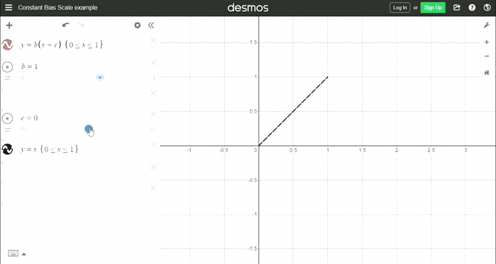
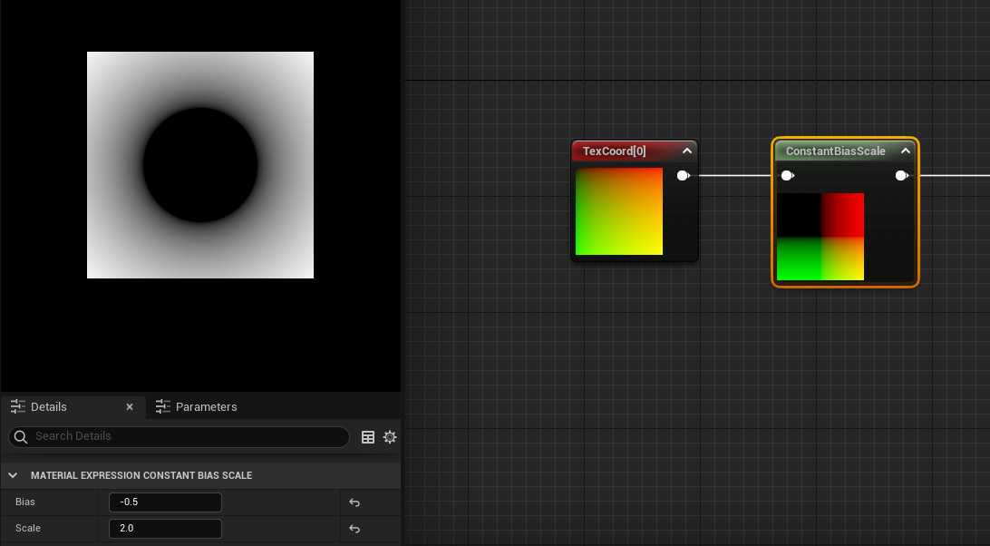
What I’ve essentially done in terms of the math is remapped the range to be from 0-1 to -1-1. To do this I am using a concept called the Constant Bias Scale and to see that graph here’s what it is:
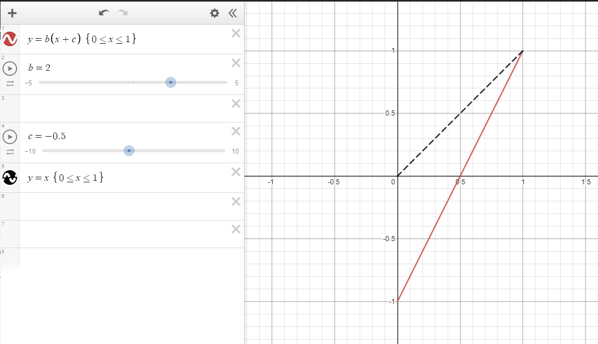
Using this graph here you can see if I want the range to go from 0-1 to -1-1 I just need to subtract .5 and multiply by 2. But why these random numbers?
To remap the range if I just multiplied by 2 it would go from 0-2 so to offset scaling, first I need to subtract .5 as that will shift the range in the negative first -0.5-0.5 and then when you multiply .5 by 2 you get 1. Hopefully the visual gives a good idea of the math at work.
Because the ranges are between -1-1 the SDF should now have the true negative values to get the internal distance and external distance.[See previous tutorial for more on this concept]
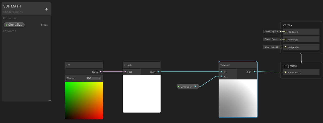
The Unreal graph now includes the new UV coordinate range that has the subtract node and multiply node that go BEFORE the length calculations:
And this is that same UV coordinate range remaped in the Unity graph:
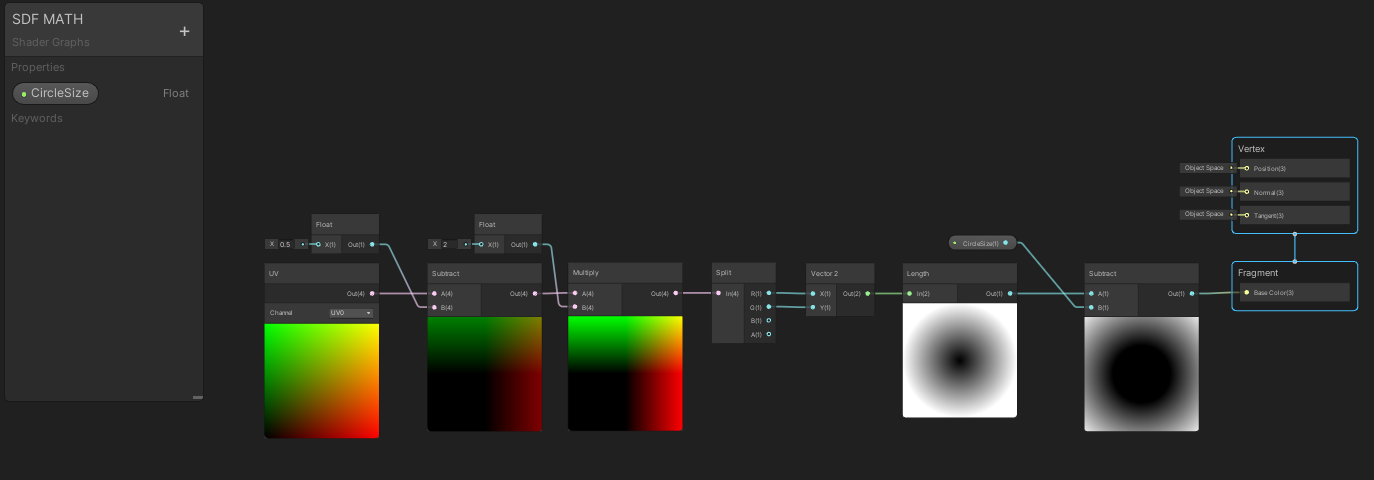
Unity is a bit more picky as it wants the UV to be a vector2 for this calculation. I solved this by splitting the vector4 into a vector2. Sadly I needed to do this to for this part of the tutorial but this step isn’t needed later with custom HLSL shapes. So just note I did this for the circle demonstration but shouldn’t be necessary when using custom code nodes.
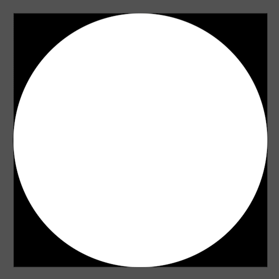
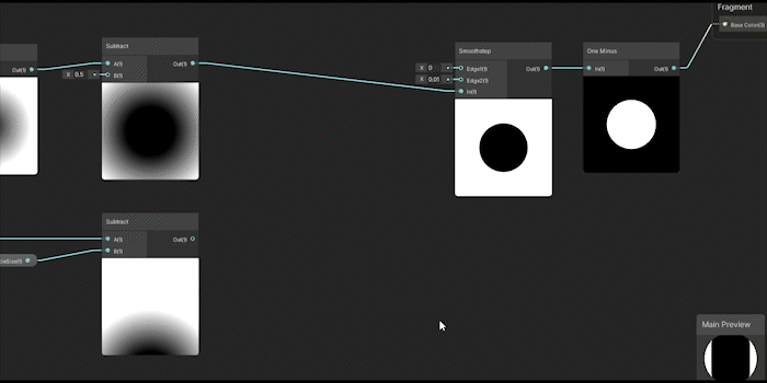
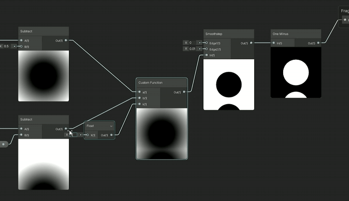
GREAT now I’ve got myself a math SDF circle... what can I do with it? Like a texture distance field I can make it feathered or less feathered and that’s pretty basic but let’s add that in so I can solidify the circle to be less feathered by adding a smoothstep node and inversing the colors with the one minus node.
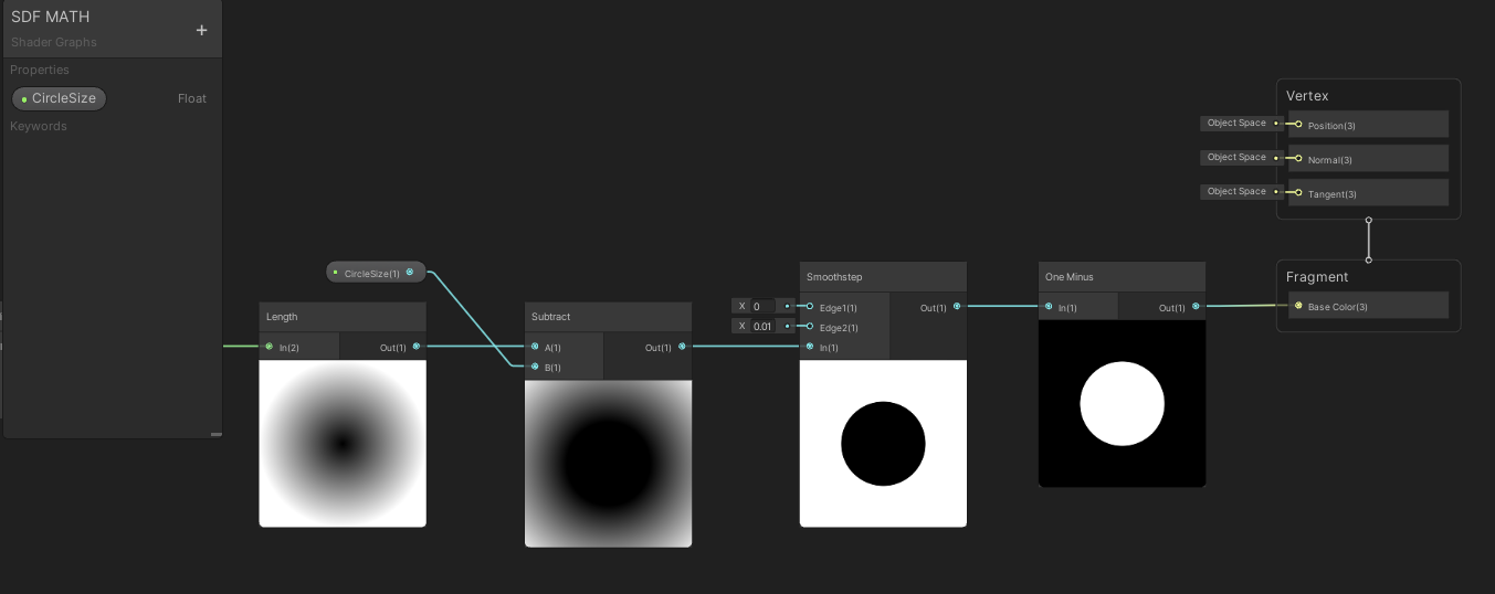
For Unreal engine, it’s same concept: Smoothstep node then invert the colors with a one minus node. My smoothstep values are Min: 0 and Max: 0.01
Now how about animating the size of the circle? That’s easy I made that little circle size at .5 so I can replace that with some time animation:
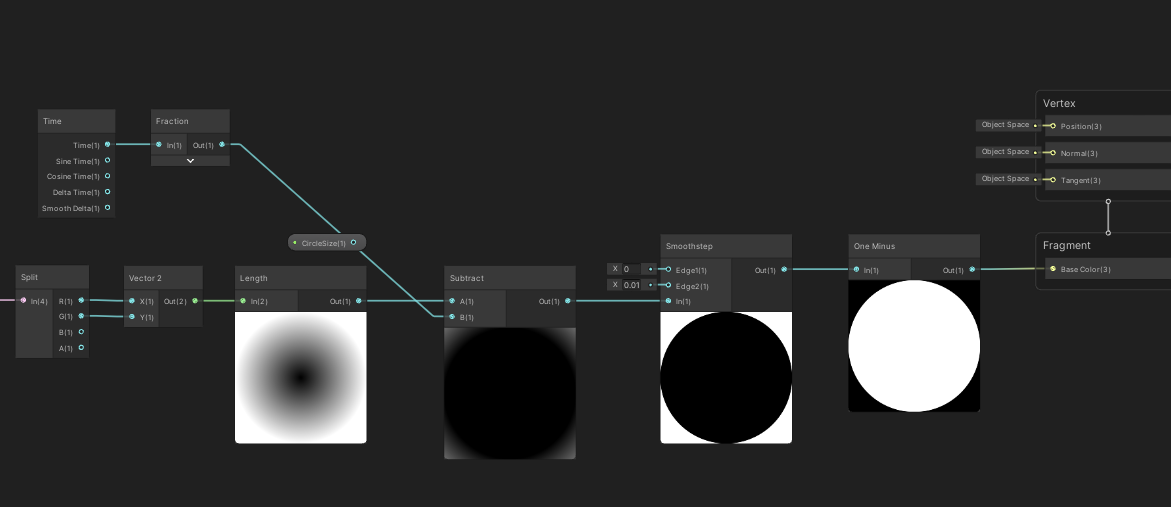
Sending time node through a frac node will reset the time to always animate between 0-1 and that’s perfect to scale up the circle from 0-1! Voila! Easy animation? Yes please!
And it’s exact same graph in Unreal.
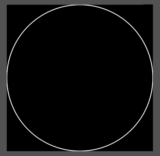
But I can do more... I can convert the circle into a stroked circle easily with SDFs... and why not animate the stroke thickness?
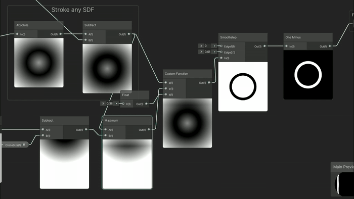
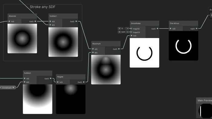
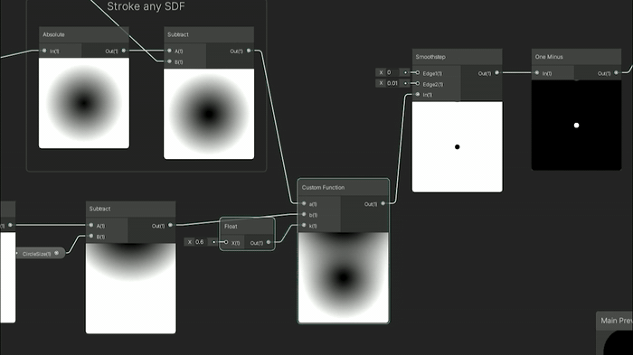
As a reminder from my previous SDF tutorial you can stroke any SDF with an absolute node then go into a subtract node and the number in the subtract is the thickness of the stroke:
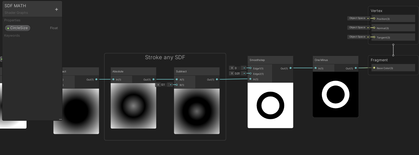
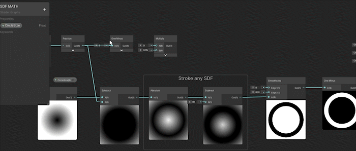
I got confused and almost plugged it into the smoothstep instead of the thickness of my stroke in the gif above. But as the circle gets larger the opposite is happening to the thickness of the stroke.
Here’s that same animation but in Unreal:
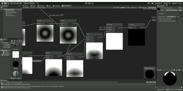
This material doesn’t use any textures, any extra animations, or layers, it's all simply done with some basic math... But this is where the fun starts... combining MULTIPLE SDF math shapes!
Math Signed Distance Fields - COMBINE, BLEND, AND MASK SHAPES
Just like vector graphics (kinda...) For the combining and masking of SDF shapes I’m going stick to just Unity for this section as their graph editor animates each node unlike Unreal by default. Those animations will hopefully help show what’s going on with the SDFs more clearly. However all of these nodes in the following section exist and are possible in Unreal so don’t worry it’s all the same until you get into custom HLSL but I’ll go over that.
COMBINING SDFS:
To combine SDF shapes I need to make myself another shape. So I’m going to add another circle to my little material here and this circle should animate across the material going from top to bottom. The Unity graph below shows how I animate the circle starting at the top of the material and animating down to the bottom.
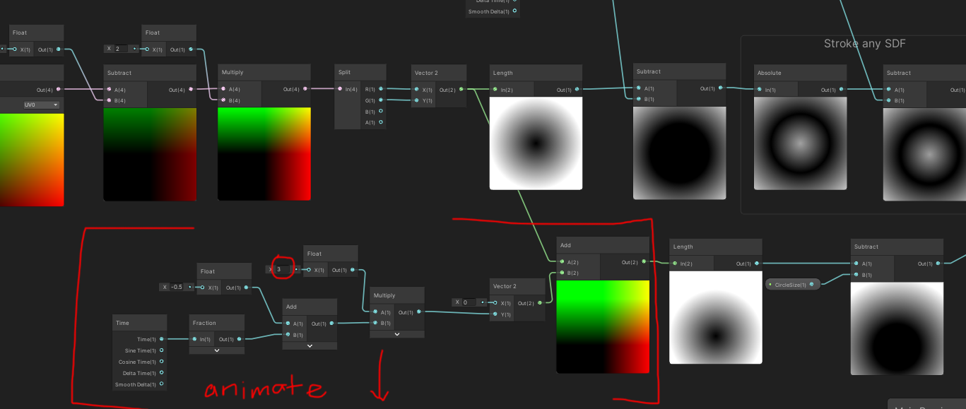
The little detail of this graph is that I changed the multiply to 3. This was to make sure the circle looks like it’s animating from outside the material -> into the material frame -> then outside of the frame cleanly. This sounds a bit complicated however in practice it’s quite easy to visually understand as it is an seamless scrolling circle from top to bottom:
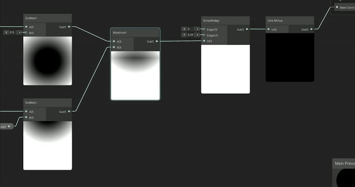
Now I can demonstrate how to combine the static circle and the scrolling top to down circle. To do that I use the minimum node:
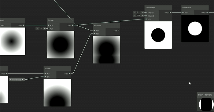
It’s essentially as if you were layering the static circle with the animating circle ontop of each other. Imagine the circles as Photoshop layers or After Effects layers ontop of each other that’s what a minimum node will do. From what I understand with my limited math it will do a quick branch to find the minimum values of these combined SDFs using that logic to combine them.
MASKING SDFS:
If I used a minimum node to combine SDFs it hopefully makes sense that the maximum node would be used to mask the SDFs. .
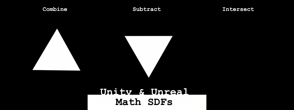
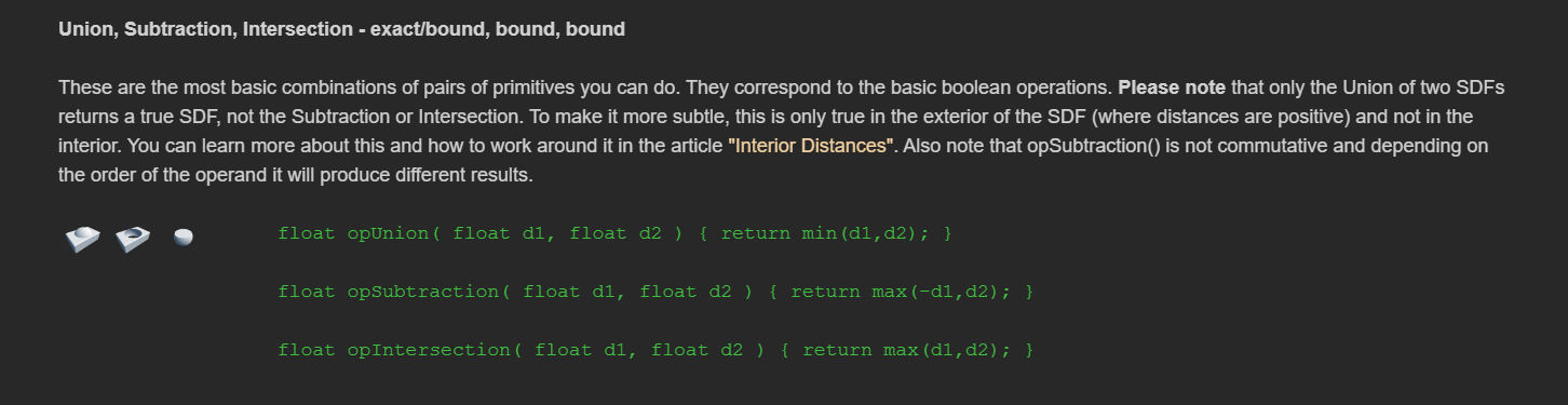
Taking a page from another IQ article on 3D SDFs this article has a union/subtraction/intersection section. While this article shows examples for 3D SDFs it also applies to 2D SDFs. So I will use these concepts to mask and intersect the SDF shapes.

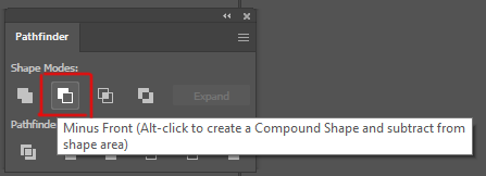
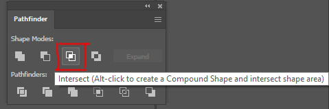
These are screen shots from Illustrator and it’s the pathfinder shape tools, Unite, Minus Front (subtraction), and Intersect. These are amazing icons to help show what the shapes are visually doing with our SDF combinations!
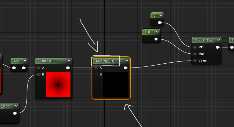
First let’s go into the Minus Front or subtraction! To do this I just need max(-d1,d2). I will put the SDF through a negate node (make it negative) that will be the SDF that will subtract from the second SDF in the maximum node:
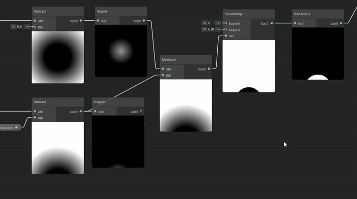
Depending which shape you want to be in front subtracting from the shape under it is the shape you want to turn negative with the negate node. If I want the static circle to subtract the animating circle then you want the static circle to be the negative SDF. To make the animating circle to subtract from the static circle then you would turn the animating circle negative (with a negate node) and run it through the maximum node. What’s interesting is with the two circles here with the different subtraction method ontop make fun moon/eclipse animations. The static circle ontop subtracting from the animating circle kinda makes an eclipse - the shadow of the moon blocking out the sun - and the other subtraction looks like a moon phase where the moon is going through it’s whole moon cycles:

Fun to see which SDF is negative before putting them both in a maximum node changes the masking effect!
After that semi complicated setup for subtraction, the intersection is much easier. Intersection is just the maximum node between the two SDFs and you can see it only shows where they intersect:
There’s also smooth union/subtraction/and intersection equations from IQ but I’m not going to quite go over that in this article. Instead I want to re-iterate just like the pathfinder tool in Illustrator you can unite/subtract/intersect your SDF shapes:
Unite: min(SDF1, SDF2)
Subtraction: max(-SDF1, SDF2)
Intersection: max(SDF1, SDF2)
Quick note Unreal doesn’t have a negate node that I know of, so just multiply your SDF by -1:
BLENDING SDFS:
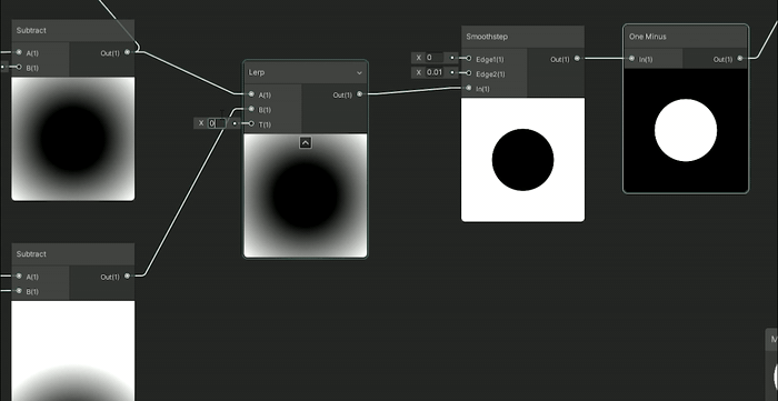
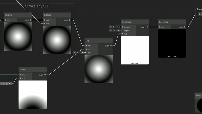
Another fun thing to do is blend the two SDFs using a Linear Interpolate node, or Lerp for short, which will allow you to determine the weight of how much of each SDF will attempt to blend together. This makes the following results where the circle drop animation is now affecting the static circle to various degrees by changing the lerp between 0 (the static circle) and 1 (the falling circle) somewhere in the middle you can get this lovely teardrop animation.
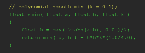
I’ll go into custom nodes a little bit later in this write up so do n’t worry about that part here. The results from the custom SmoothMinimum are quite different from the lerp blending but the blends are amazing:
IQ’s blend shows off the power of math SDF’s shapes vs textures. The visuals of combining these two distance fields can get that goopy delish middle area that would be very difficult to do with just textures. The blend works when the circles are close to each other they will almost merge into one circle and as they get further apart they into seperate circles. Unlike the lerp which is a weight between the two shapes of which shape is more dominant to show visually, this blend will actually work to merge the two shapes when they are close and separate them when apart. I can also choose how much blend to use, so in this gif above, a little blend keeps each circle their own distinct shape, more blend merges the circles into one big blob.
There’s also different equations for cubic and quadratic blends as well. I believe this blend is the easiest and gets the general results at a fairly cheap cost, so I figured that’s the one I would demo here. But if you feel inclined go see some of the other ways to blend and try them out.
NOW if I were to add back our stroke and grow the stroke over time with some of these blends/combine/subtract/intersect I can already get some amazing crazy animations with just messing around with a few of these nodes in combination:
Again these are just made from 2 circles with various ways to blend/combine/mask them together to make these different animations. The combinations of shapes and animations seem quite endless and this is but two circles... what if I do MORE shapes? Well let’s do it!
Making SDF Shapes
Convert GLSL into HLSL with custom nodesThis is where we begin to use the Custom HLSL node a lot more and I’ll show you what I mean. So for a circle the math was quite easy:
But when getting into more 2D SDF shapes it turns this simple length(p) - r into a bit more complex programming. Say for instance you want to do the triangle shape:
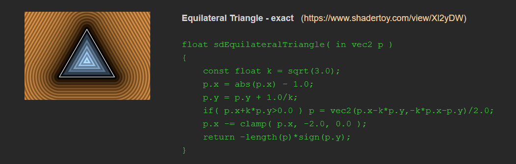
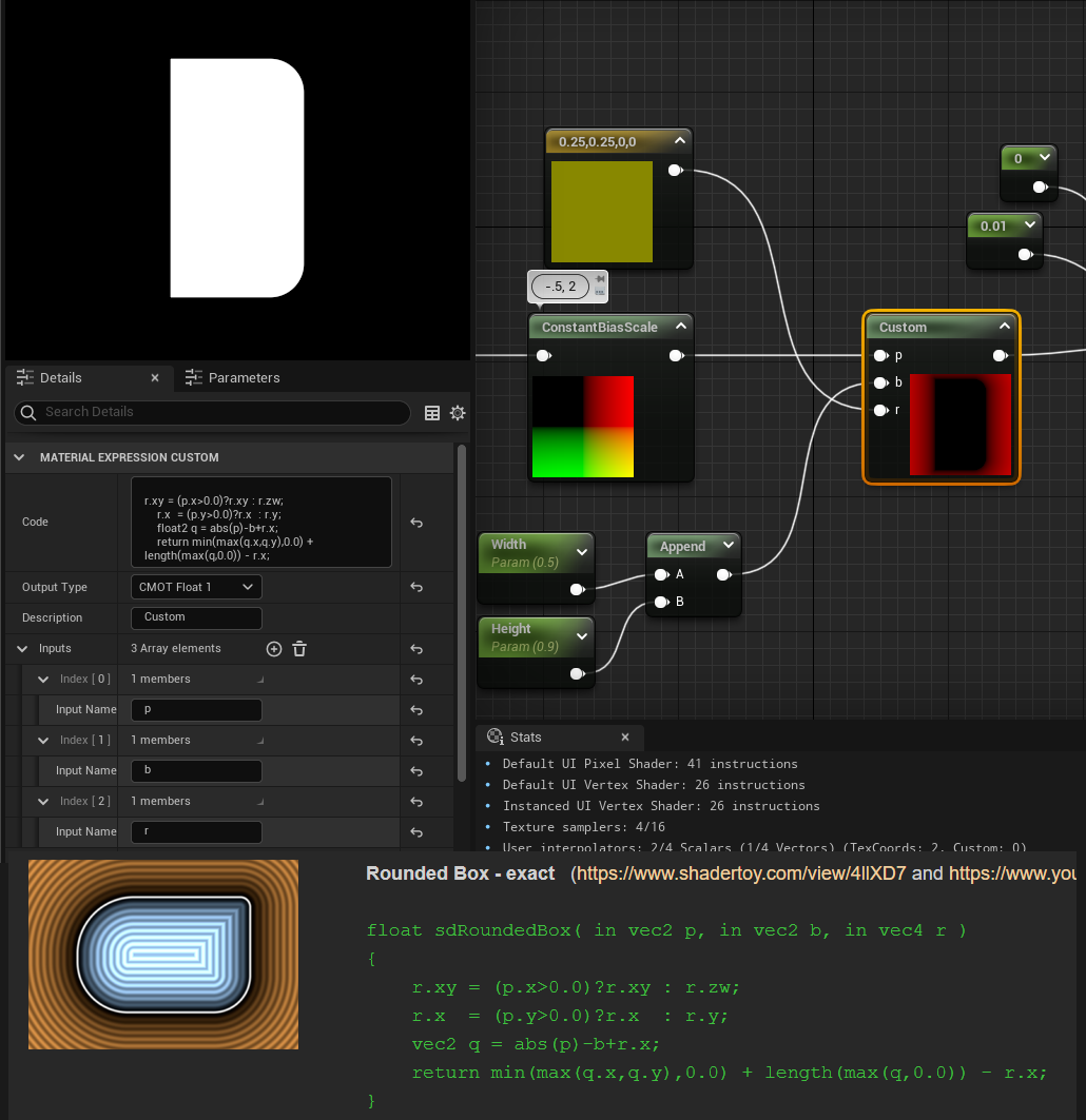
You could do with the nodes and recreate all of it... which I have done... but I do not recommend it! Instead you can often copy and paste this code in with a little bit of conversion into a custom HLSL node in unity and unreal to make all that math go away. I’ll show the steps I take to import custom SDFs into my graphs:
The first step I do is copy the text into some kind of notepad editor:
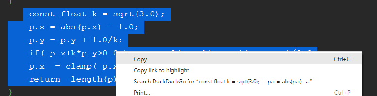
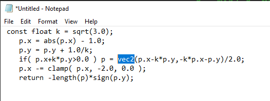
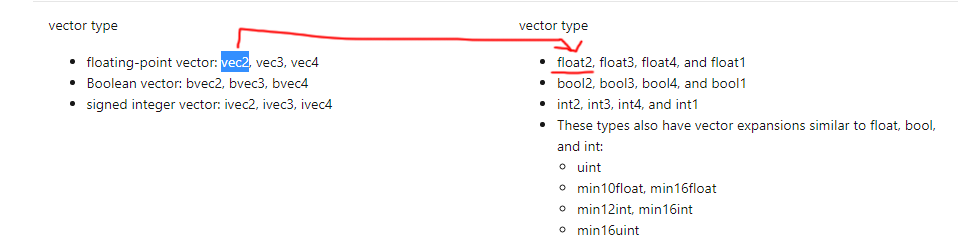
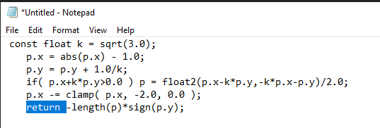
Then I need to convert everything that’s in GLSL to HLSL. Both GLSL and HLSL are shader coding languages and are quite similar. Game engines tend to use HLSL and shadertoy and some web applications use GLSL. IQ’s shapes are written in GLSL so I need to convert them to HLSL for Unity or Unreal. There’s a handy site I pull up if I find something that I don’t know how to convert from GLSL to HLSL via Microsoft. You can see here I need to change over the vec2 into a float2:
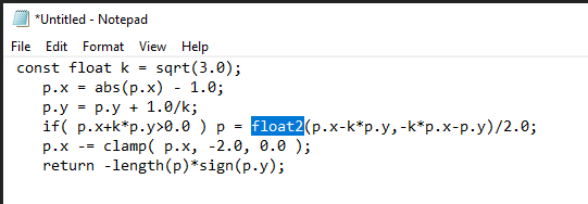
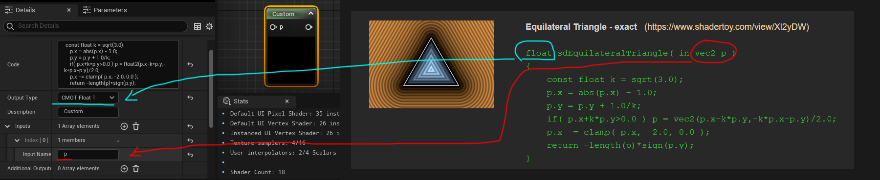
And if I’m using Unity I do a little extra work here by just changing the Return to Out =
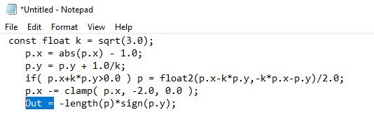
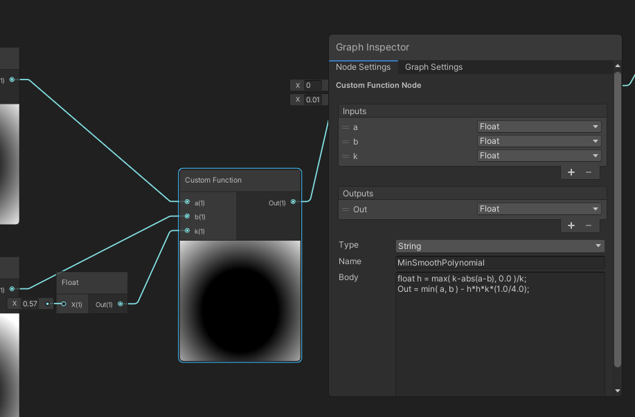
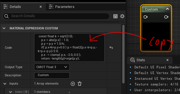
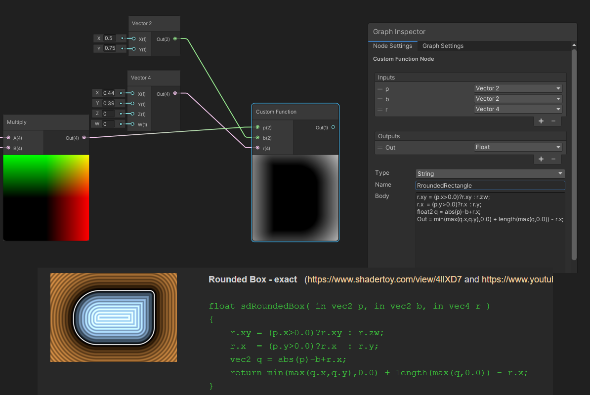
Great now I can make a custom function node in Unity or a custom node in Unreal:
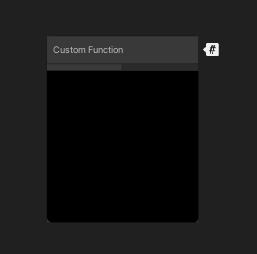
And copy the respective code into the right sections:
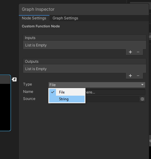
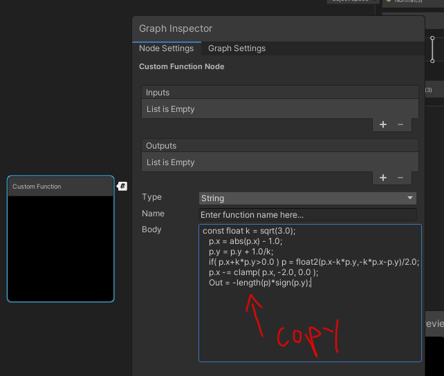
For Unreal:
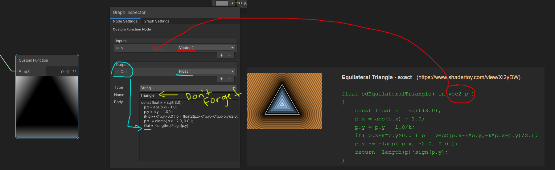
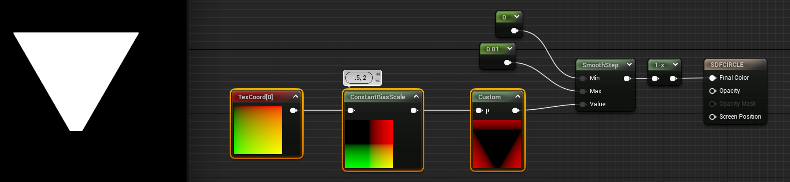
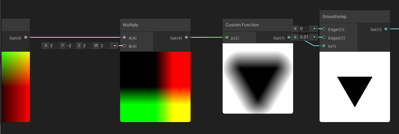
Then you should be able to plug in the UV coordinate for p so make sure it’s the UV in the right coordinate space with the constant bias scale I showed off earlier. Then after your SDF run it through a smoothstep node at the end to sharpen it, one minus node to invert the colors, and voila I’ve got a triangle SDF:
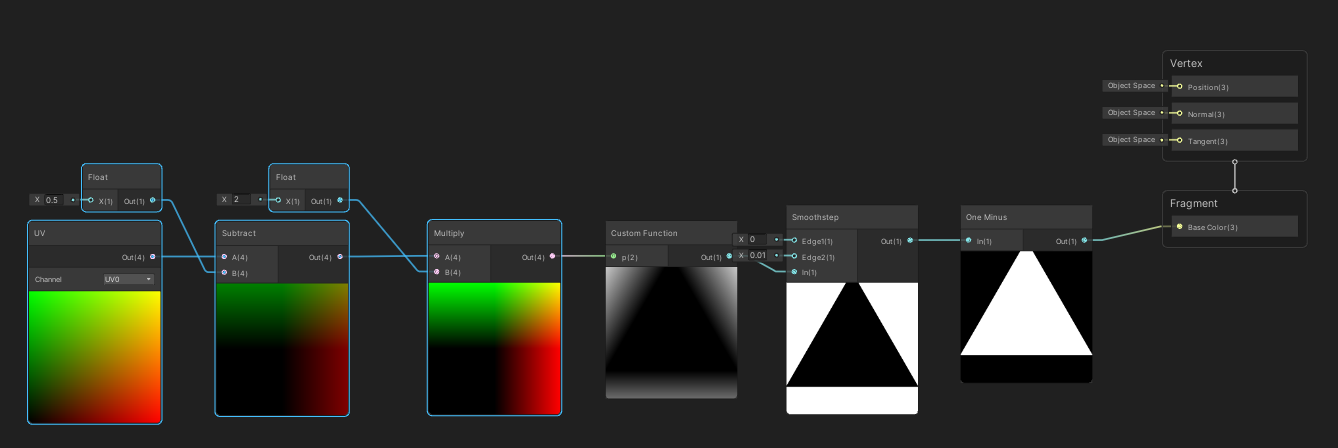
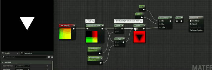
Multiply/Divide will scale the UV coordinates which inturn will scale the SDF down or up depending on the values. For instance if I multiplied by .5 it would scale the triangle to be larger but if I multiply by 2 like in the example gif it’s scaling the triangle down by half. I favor multiply over divide just because you can accidentally get divide by 0 which computers REALLY dislike so I tend to use multiply in most of my scaling UV adventures.
To do this in Unity and flip the triangle you can specify more easily in Unity what parts of the vector to multiply:
In this case I multiplied the Y by -2 to both scale by half and flip/mirror the triangle to point down and X by 2 to scale down the triangle by half.
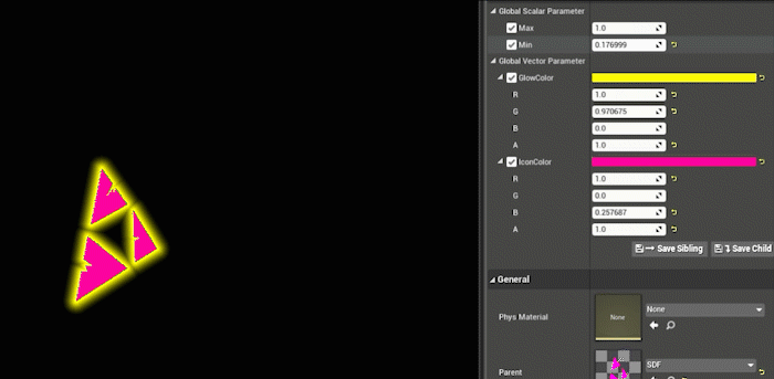
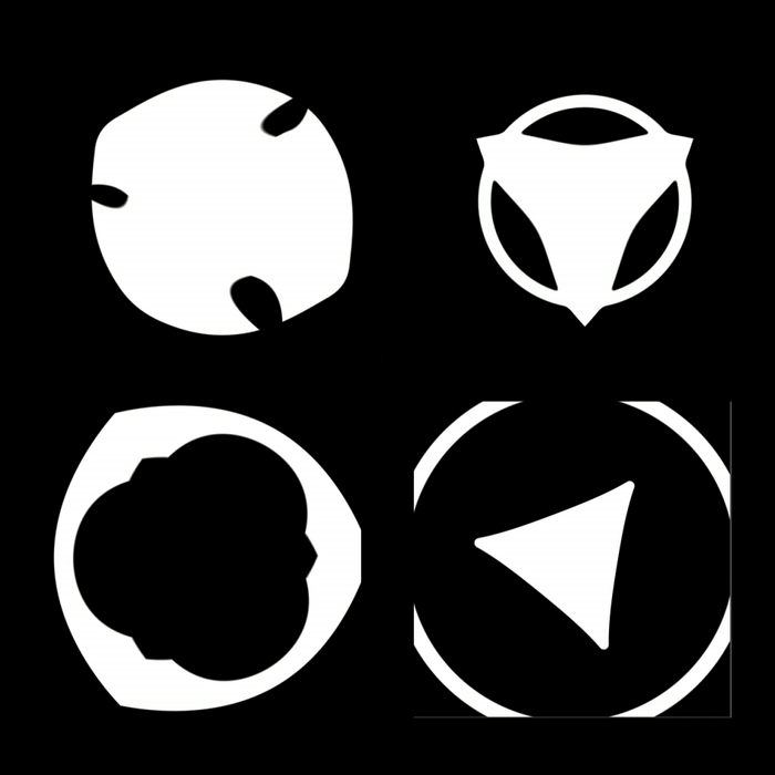
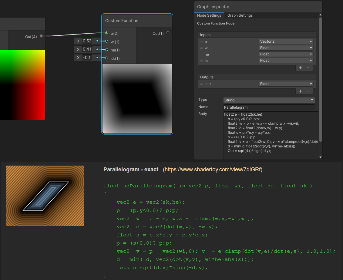
Lastly here’s just a few other custom HLSL nodes making a few other shapes so you can see the examples of converting a few other SDFs:
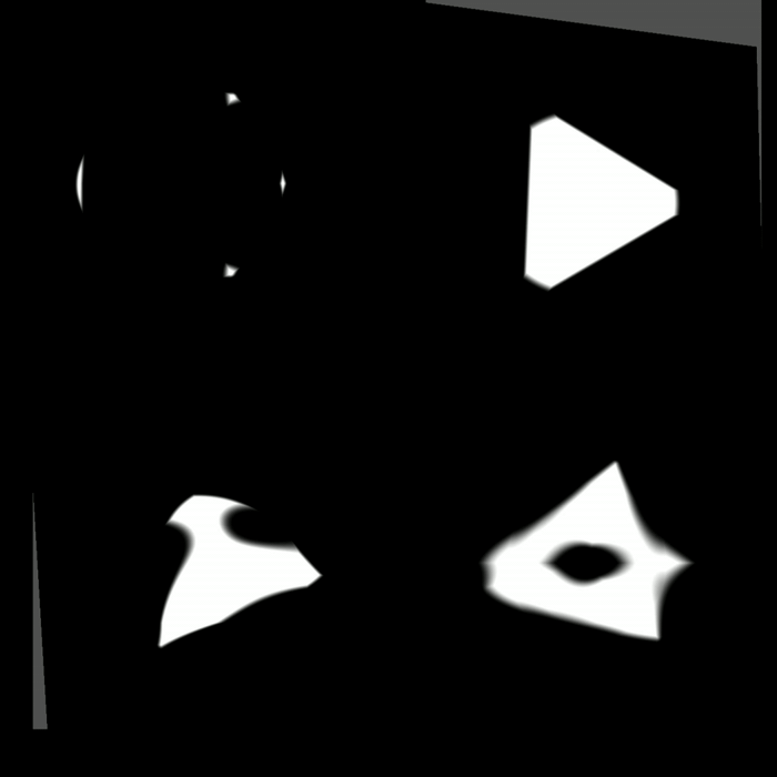
Now you can combine a bunch of SDFs together, stroke them, round the edges, and animate them to do crazy things. When I started to explore SDFs I was amazed at all the really great looking outcomes from just experimenting with the various methods to animate and combine them.
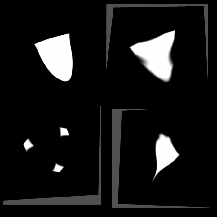
Here’s just a few random lerping animations with time and scale I played around with:
Enjoy the endless options for SDFs and maybe next time we’ll get into persudo randomly generating SDF patterns/time/and particle system like animations:

This is a terrible example but I had nothing else on the mind.